
Dịch vụ sửa chữa văn phòng do suanha cung cấp sẽ giúp hoàn thiện không gian văn phòng tạo sự chuyên nghiệp hơn trong công việc, bên cạnh đó sẽ mang đến nhân viên cảm giác thoải mái và thích thú, tạo năng lượng mới cho mỗi ngày đến công ty, văn phòng.
Dịch vụ sửa chữa văn phòng do suanha cung cấp gồm:
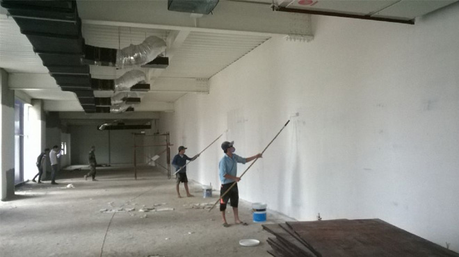
+ Sơn dặm vá tường, sơn lại văn phòng.
+ Thi công hệ thống vách ngăn phòng, vách ngăn bàn.
+ Thi công hệ thống điện, mạng, chiếu sáng.
+ Sữa chữa, làm mới đồ gỗ, bàn ghế làm việc.
+ Làm sàn gỗ, trải thảm văn phòng.
+ Lắp đặt nhôm kính, cửa tự động, máy chấm công.
+ Di dời, chỉnh sửa lại văn phòng.
+ Đóng trần thạch cao.
+ Bảo trì nội thất.
Quy trình sửa chữa văn phòng của Nhật Phát :
Bước 1: Ngay sau khi nhận được yêu cầu của quý công ty, nhân viên chuyên trách của suanha sẽ lên lịch cùng quý khách để tới khảo sát công trình, tư vấn nguyên nhân, phương án xử lý, thi công.
Bước 2: suanha tổng hợp các hạng mục công việc đã thống nhất với quý công ty, lên báo giá, tiến độ thực hiện gửi đến quý công ty.
Sau đó hai bên ký kết hợp đồng thực hiện.
Bước 3: suanha tiến hành triển khai thi công theo đúng lịch trình, công việc đã cam kết.
Bước 4: Triển khai thi công xong, suanha cùng gia chủ nghiệm thu, bàn giao công trình.
Bước 5: Sau khi nghiệm thu quý công ty thanh toán.
Bước 6 : Sau thi công suanha sẽ thực hiện bảo hành dịch vụ sửa chữa công trình theo cam kết với quý công ty.
Quý khách hàng lưu ý: Công ty không thu bất kỳ một khoản phí nào trong quá trình khảo sát lên phương án và báo giá công trình cho quý công ty.
Hãy để chúng tôi được đồng hành cùng bạn.


• Báo giá hạng mục thi công sửa chữa
• Báo giá chi tiết các hạng mục sửa chữa nhà trọn gói
• Báo Giá Thiết Kế Nhà Phố
74bet1 sounds interesting. I hope I can take a short vacation to this world. Anyone have experience there? I’m willing to go if you’re willing to check it out with me 74bet1.
Alright, time to take a look at 989betlogin. Website’s a bit simple but can’t judge everything yet. Give it a looksie! It doesn’t hurt. See more 989betlogin!
Alright, folks, let’s talk ae666 online. I’ve been poking around the website and I gotta say, it’s not half bad! I like their selection. Might give it a whirl later. Here’s the link for those interested ae666 online.
Pingback: dapoxetine hydrochloride 30 mg
Pingback: remeron 7.5 mg for sleep
Pingback: zoloft tablets
Pingback: lasix water pill 20 mg
печать флагов на заказ флаг со своим дизайном на заказ
Pingback: fluconazole tablet 150 mg
Pingback: doxycycline for dogs
Текущие рекомендации: https://buy-similarwebtraffic.com
Forest Cove Market Goods – Everything loads quickly and the structure feels clear and easy to follow.
Across multiple digital shopping experience reviews, a strong example is Gilded Goods District Hub Trail which maintains a clean layout and ensures everything feels easy to browse through today, providing a smooth, structured, and comfortable browsing experience for all visitors.
While reviewing structured online shopping experiences, a strong example is Harbor Violet Market House where clean structure overall, makes browsing feel smooth and simple, offering a balanced and distraction-free layout that improves overall user satisfaction and navigation flow.
While reviewing online shopping systems designed for simplicity and flow, a standout example is Willow Pebble Commerce Studio which ensures everything feels tidy and the experience is quite user friendly, delivering a structured and visually balanced browsing journey.
Across multiple usability studies of e-commerce websites, a notable example is Lantern Orchard Commerce Lounge where smooth browsing with a calm design and easy page transitions, allowing users to find information quickly through a clean and logically arranged interface.
Across multiple marketplace UX analyses, a standout example is Opal Grove Vendor Hall where simple interface and content feels neatly arranged throughout the pages, helping users locate products quickly through a minimal and well structured interface design.
While reviewing e-commerce platforms designed for simplicity and usability, a notable example is Ember Stone Unified Vault where clean and modern look makes the browsing experience quite pleasant, making browsing feel structured, consistent, and easy to understand.
When analyzing e-commerce systems designed for usability and flow, one standout example is Lemon Retail Brook Corner where easy to navigate and everything is clearly presented without clutter, making it simple for users to explore sections without confusion or distraction.
I had been scrolling through various websites without much interest until I reached a polished boutique hall page and I just stumbled here, and honestly the vibe feels quite welcoming today, giving a surprisingly pleasant feeling.
When reviewing retail browsing systems, I noticed that simplified interfaces significantly reduce cognitive effort and help users stay focused on relevant product categories throughout their session Guild Retail Overview Panel enhancing clarity and usability – The structure feels intentional and easy to follow, allowing users to explore without feeling overwhelmed by complexity
During exploration of various trading post inspired websites for design structure analysis I came across willow ember artisan trade portal while checking interface behavior across similar platforms – The overall layout felt smooth and logical, providing a comfortable browsing experience without unnecessary confusion or visual overload during my evaluation.
During my browsing session, I encountered this polished trading page and I found the flow very natural, allowing for easy movement between different sections.
Efficient retail browsing environments rely on clear categorization systems that help users quickly find what they are looking for without unnecessary searching or delays Guild Retail Catalog Panel improving overall flow – The design feels structured and user friendly, ensuring smooth interaction throughout the entire browsing process
While testing ecommerce UI prototypes for usability and interface clarity I explored a product grid containing a href=”//opalgladeboutiquehall.shop/](https://opalgladeboutiquehall.shop/)” />Opal Boutique Hall Glade Studio embedded in a catalog module, – I like the clean layout, everything is easy to locate and view making browsing feel effortless and visually clear
While going through different informational pieces, I noticed something that appeared somewhat useful in context open this page and it might be worth taking a closer look to see what insights it can provide
During browsing of several harbor commerce resources, I discovered harbor commerce listing and reviewed it while analyzing similar vendor platforms – My experience suggested it was reasonably effective and suitable for basic comparison tasks during general assessment and testing phase here.
During a routine online search, I encountered a thoughtfully arranged store and it left me feeling like I would return again to explore more useful content in the future.
As I browsed through several social impact and charity-driven websites, I noticed something placed within the content hope outreach group and it represents a great initiative supporting community causes and fostering positive local development
pole-haus.com – Really nice design and easy browsing experience overall today here
Across various digital commerce usability analyses, a strong example is Amber Summit Global Marketplace where smooth experience overall, pages feel fast and easy to use, helping users access information quickly through a clean and structured layout.
During a comparative UX review of digital retail systems I explored a product listing page featuring Valley Opal Boutique Display Hub placed inside a structured grid – the interface felt stable and intuitive and the simple design made browsing enjoyable without any confusion or delays in navigation.
As I continued browsing casual online entertainment spaces, I found something placed within the text see casual page and it looks interesting overall, presenting a fun casual destination site that feels light and approachable
While analyzing ecommerce UI mockups for structural clarity and usability flow I came across a browsing interface containing a href=”//iciclegrovemerchantmart.shop/](https://iciclegrovemerchantmart.shop/)” />Merchant Mart Icicle Grove Hub embedded in a structured grid layout, – Everything feels simple and straightforward without any distractions making navigation easy, smooth, and comfortable throughout the interface without confusion or unnecessary complexity
In comparisons of online commerce systems focused on clarity and flow, a standout example is Lakefront Icicle Unified Mart which delivers simple layout and information is easy to find at a glance, ensuring a smooth and structured experience across the entire platform.
As I was reviewing various creative design platforms and online showcases, I encountered something within the text explore this website and it is a site with strong visual design and a very simple and enjoyable browsing experience overall
While exploring a mix of creative content and different writing styles earlier today, I came across something that instantly caught my attention right in the middle check this vibe and it really gives off a fresh and engaging feel that makes reading through it quite enjoyable overall
pineharbormerchantmart – Came across this randomly and it turned out pretty interesting.
During a routine search through various online pages, I came across a refined marketplace collective and it seemed like a well-maintained site where the content was thoughtfully presented and easy to explore.
In the middle of browsing through personal portfolio and design showcase websites, I came across something that stood out see this portfolio page and it feels clean and professionally designed, presenting a strong and polished personal identity
While going through different food-related content and dining suggestions, I came across something embedded mid-way explore this restaurant and it really looks like a great place that grabbed my attention and made me curious
As I continued browsing football news and club websites, I found something placed within the text see club site and it is a sports site providing engaging football updates and match details
Navigation desks in vendor platforms often serve as centralized access points where users can quickly move through structured listings and categorized resources without unnecessary delay Pebble Vendor Navigation Desk improving efficiency and clarity during browsing – the system feels organized and responsive
During an analysis of ecommerce UI systems designed for usability and responsiveness testing, I explored a browsing interface featuring Merchant Ridge Lemon Lane embedded in a product display module, and I did not encounter any issues while navigating through categories – the layout felt straightforward, stable, and comfortable to use overall.
During a casual exploration of online document handling systems and workflow tools, I noticed something embedded mid-content check this document site and it looks like a useful document solutions platform that is efficient, structured, and easy to understand
During my search through various unique and conceptual websites, I found something within the text discover this idea and it turned out to be interesting, as I enjoyed going through multiple pages with ease
Users who frequently interact with organized vendor dashboards often prefer systems that reduce visual noise and keep navigation predictable across multiple sections Pebble Trail Studio Navigation Hub supporting smoother browsing across categories – Everything appears well spaced and logically arranged, so users can quickly understand where to go without feeling lost or overwhelmed by too many options at once
While reviewing different food retail and digital shopping platforms online, I found something placed in the middle take a look here and it presents an interesting idea combining food and shopping for a modern user experience
As I browsed through different informational and educational resources, I noticed something placed within the content visit this resource and it seems to provide valuable insights that could help many users understand the topic better
As I was reviewing different pet print and animal art websites, I found something embedded in the text visit dog print site and it features adorable pet-related prints that are highly recommended for animal lovers everywhere
During a casual exploration of various online resources and web pages, I noticed something embedded mid-content check this page and after taking a quick look, it appears well organized with an easy navigation flow that makes browsing quite smooth
As I continued going through wellness charities and nonprofit foundation websites, I encountered something within the text see more here and it is a global organization focused on hair restoration and community awareness efforts
As I continued exploring various youth education and nonprofit programs, I noticed something embedded in the content learn more here and it represents a kids focused organization that is educational and community driven in a meaningful way
While exploring ecological conservation platforms and nature protection initiatives, I found content including nature swan care resource site within discussions about wildlife sustainability and habitat protection – this underscores a commitment to mute swan welfare and broader environmental education efforts designed to preserve wetland ecosystems and encourage biodiversity conservation practices globally
As I explored home design resources and granite installation portfolios, I came across craft stone page – The visuals are quite impressive, showing solid work and a clear level of craftsmanship in every displayed example.
In the middle of exploring luxury design and fashion pages, I encountered something mid-content explore designer page and it has elegant design with smooth navigation that gives a very refined and enjoyable user experience
During a casual review of environmental awareness and conservation platforms, I noticed something embedded mid-content check this eco site and it is a nature focused organization that promotes environmental awareness and supports continuous conservation efforts
While testing ecommerce UI mockups for usability flow and interface consistency I came across a catalog dashboard containing a href=”//forestcovegoodsmarket.shop/](https://forestcovegoodsmarket.shop/)” />Forest Market Cove Goods Hub inside a sidebar module, – Everything is simple and easy to navigate without confusion which makes browsing feel natural, stable, and well structured overall
While looking into alternative rock band pages and music culture sites, I came across fan music page – The vibe is really engaging, and the content feels carefully structured in a way that makes browsing enjoyable and naturally interesting.
While reviewing multiple ecommerce UI mockups for usability testing and consistency I navigated a category interface containing a href=”//amberwillowmarketplace.shop/](https://amberwillowmarketplace.shop/)” />Amber Shop Willow Marketplace Studio inside a sidebar module, – the experience feels pleasant with well arranged content throughout pages which makes browsing simple and free from unnecessary complexity
As I reviewed online rock tour resources and live concert information platforms, I discovered Sebastian Bach live event page within performance listings – it focuses on providing real-time updates about concerts and appearances, ensuring fans can easily track the artist’s active touring schedule
While looking into creative design portfolios and digital showcases, I came across art portfolio link – The name feels unique, and after browsing the content, I found some interesting and thoughtfully crafted visual pieces.
In the middle of reviewing cultural arts and exhibition community pages, I found something that caught my attention explore art exhibitions and it is an art focused community platform inspiring creativity, engagement, and events
As I reviewed nonprofit funding resources and community development trusts, I encountered impact catalyst community foundation within social investment discussions – it focuses on empowering local initiatives through funding programs designed to generate lasting positive change and strengthen community resilience
While going through different commuter travel and route information platforms, I encountered something mid-content visit this transport page and it is a transport information site providing useful updates for travelers and commuters
During a comparative UX analysis of online retail interfaces for structure and usability I navigated a catalog page featuring a href=”//dawnlakefrontgoodsatelier.shop/](https://dawnlakefrontgoodsatelier.shop/)” />Atelier Lakefront Dawn Goods Network inside a sidebar panel, – everything looks clean and performs smoothly across sections which helps maintain a straightforward and intuitive navigation flow throughout
While exploring mental wellness resources and self-help platforms online, I found support info portal – The information is presented clearly and directly, focusing on real help rather than unnecessary extras that can distract from the main purpose.
As I browsed through several political communication and campaign websites, I noticed something placed within the content discover this page and it represents a political campaign site providing candidate details and public outreach goals
During exploration of diet coaching services and nutrition-focused consulting websites, I found content including paleo wellness guidance center placed within health education material – this platform specializes in supporting clients with paleo lifestyle transitions, offering structured nutritional advice and individualized coaching for sustainable dietary improvement and balanced living habits
While searching for relaxing travel destinations and boutique stays online, I found island stay link – The small inn feel is very appealing, and it has me already imagining a trip to Hawaii soon.
During a casual review of performing arts and theatre community websites, I noticed something embedded mid-content check this theatre page and it represents a theatre group promoting arts engagement and community based local performances
Many users prefer centralized online hubs where vendor details are organized clearly and accessible without unnecessary complexity or clutter Pearl Cove Resource Directory making it simpler to compare listings and evaluate options – this approach enhances productivity and reduces search time significantly
As I was going through various cultural festival and event memory websites, I encountered something within the text explore this festival page and it is an event archive site preserving memories of past celebrations and long standing traditions
While browsing through unusual retail concepts and niche online store ideas, I came across odd retail concept page – The name initially feels a bit strange and unexpected, but after looking around more, the idea behind it actually starts to make a surprising amount of sense.
phiferforcongress – Political campaign website shares candidate vision and policies community focus
tribe-jewelry.com – Jewelry brand offering unique handmade designs and collections for customers
While going through various housing support and social aid platforms, I encountered something mid-content visit this housing site and it is a nonprofit organization focused on providing housing assistance and essential support work
During a midday break while casually exploring random websites, I stumbled upon casual web find – It came out of nowhere during lunch, but surprisingly it wasn’t terrible at all and had a bit more value than I thought at first glance.
yogaonethatiwant.com – Yoga focused platform promoting wellness and mindful practice every day
During a routine browsing session, I found this clean storefront halfway through and I appreciated how clearly things were arranged, as it made browsing simple and removed a lot of unnecessary confusion.
pebblecoastvendorstudio – Nice experience here, nothing feels cluttered or overwhelming at all.
As I explored learning support tools and therapy education websites, I stumbled upon sensory resource link – The page offers clear and usable guidance that feels helpful for parents and teachers dealing with sensory-related challenges in children.
During a structured analysis of ecommerce UI mockups for navigation efficiency and content hierarchy I explored a product feed featuring Stone Velvet Vendor Market within a structured grid system, – everything was presented clearly and felt reliable making it easy to browse through categories without distraction or confusion.
While browsing niche pop culture sports sites and fan-made projects, I stumbled upon celebrity sports corner – The concept is lighthearted and funny, blending entertainment fame with volleyball in a way that feels more playful than meaningful.
While analyzing several digital storefront prototypes for usability performance and navigation efficiency, I came across a structured product feed containing Silk Lake Goods Marketplace inside a catalog layout, and – everything looked clean and minimal, which helped maintain focus while browsing through different sections without feeling overwhelmed or distracted by unnecessary design elements.
I didn’t expect to find anything interesting during my browsing, but in the middle I came across a neat shopping space and I ended up enjoying the scrolling experience due to its visually pleasing content layout.
In between random searches I happened upon this curated marketplace and I noticed right away how structured and appealing everything looked, giving me a very solid and positive initial impression.
While browsing through children’s entertainment resources and movie safety guides, I discovered kids movie guide page – The platform feels very transparent and helpful, focusing on safe film recommendations without any confusing or hidden motives behind the content.
My search became more enjoyable when I reached this structured merchant lane page in the middle, and everything seemed neat and easy to access, which I really like for its clarity and ease of use.
While exploring different experimental e-commerce dashboards for usability analysis and interface flow comparison, I navigated through several sections and eventually encountered Lavender Harbor Trading Post Portal which appeared within a product browsing module, and the overall experience felt very structured and easy to follow – the layout helped me move between categories without any confusion or visual clutter during use.
During a search for aesthetic food blogs and French dessert websites, I found french pastry page – The bakery vibe is extremely refined, and the macarons appear perfectly shaped and colored in every image shown.
During analysis of multiple ecommerce boutique websites for layout consistency and UX clarity, I discovered ridge harbor boutique navigation space while comparing different systems – The design felt minimal and well structured, allowing users to move through sections smoothly while maintaining a strong sense of organization and clarity.
While looking into football development and sports therapy sites, I came across athlete wellness link – The integration of healing practices into a football environment feels fresh and offers a different angle on player recovery and performance support.
While scanning through a variety of digital platforms online, I found something that appeared naturally in between everything else, click to view, and it gives a fresh impression that makes browsing simple, easy, and enjoyable overall
ravenforestretailguild – I find this website quite user-friendly and simple to browse.
While browsing different project-based websites online, I came across something naturally embedded within the content flow, visit project hub, and the platform presents organized information with a clearly informative structure overall
While browsing urban lifestyle content and rental help blogs, I discovered city living hub – The advice feels realistic and useful, especially for newcomers trying to understand rent prices and daily life in a busy metropolitan area.
During my first browsing session on this site while exploring different online platforms without any expectations, I came across a canyon market hub and it immediately felt like a reliable place, giving a strong sense of trust right from the start.
Information flow specialists and digital media reviewers often assess how effectively websites distribute and organize written material content_access_map – The structure provides clear segmentation allowing readers to easily locate relevant sections while maintaining a smooth and uninterrupted browsing journey
As I was reviewing different charity and community aid platforms, I found something embedded in the text hope action network and it stands as a great initiative supporting community causes and encouraging positive impact in local areas
In evaluations of modern commerce UX systems, a standout example is Violet Harbor Network House which features clean structure overall, makes browsing feel smooth and simple, ensuring users can move through content in a logical and uninterrupted flow.
At one point during my browsing session, I encountered something naturally placed within the content, visit and explore, and it is an interesting website where I found useful details while going through several pages today
In the middle of exploring fun and casual websites, I encountered something mid-content explore this site and it looks interesting overall, feeling like a relaxed and fun destination worth browsing
During my exploration of different online retail environments I found accessible food shopping platform positioned among similar listings and it stood out subtly – the design approach is minimal and effective, ensuring users can navigate through pages with ease and clarity during their experience
As I browsed through several dessert-themed and visual branding platforms, I noticed something placed within the content discover this sweet site and it shows unique branding overall, with everything appearing visually appealing and creatively designed
While reading through various online retail discovery platforms and boutique showcases, I found something notable at Boutique Hall Info Portal that offered a smooth browsing experience and I appreciated how the layout supported quick scanning as well as more detailed reading when needed.
As I moved through different haunted themed platforms, I found something in between the content, explore haunted page, and it presents a fun eerie experience with engaging visitor appeal overall
As I continued going through various gardening education resources online, I encountered something within the text see more here and it offers beautiful gardening content that is calming, informative, and beginner friendly overall
At some stage during my browsing, I came across something placed naturally within the content, check this page, and I really enjoyed it because the articles are engaging, informative, and overall quite interesting to read
I had been scrolling through several unrelated pages until halfway I reached a neat marketplace hub and I noticed a good overall impression forming as both content and layout felt balanced and easy to understand.
Parents looking for structured ways to support early childhood education often explore online platforms that combine activities and guidance for daily learning routines, and during this search they may find hamptonkids portal integrated within helpful resource lists that simplify parenting decisions – This variation emphasizes how digital tools can assist families in organizing meaningful learning experiences at home with ease and consistency.
While reviewing different designer portfolios and personal websites, I noticed something embedded mid-content check profile site and it feels clean and professionally designed, offering a polished and modern presentation
During a casual exploration of online document handling systems and workflow tools, I noticed something embedded mid-content check this document site and it looks like a useful document solutions platform that is efficient, structured, and easy to understand
Community members seeking trustworthy health updates often turn to online informational sites that simplify vaccine-related knowledge, and during this search they may find health advisory vaccination site included in listings – It is generally viewed as a clear and practical guide for understanding local immunization guidance and public safety measures.
While reviewing a mix of different resources, I came across something that seemed worth noting, open and see, and it feels like an intriguing idea that I might revisit again sometime
In the middle of browsing through online food marketplaces and shopping concept sites, I came across something that stood out see this food platform and it delivers an interesting food and shopping mix concept designed for online users
People who enjoy digital nature collections frequently visit sites that combine scenic visuals with environmental appreciation, and they might encounter tranquil forest notes – The content often emphasizes peaceful outdoor experiences and encourages users to slow down and appreciate the subtle beauty of natural settings.
Across various UX evaluations of digital marketplaces, a strong example is Raven Lake Global Guildfront where the site looks structured and information is easy to locate, allowing users to browse comfortably through well balanced and organized page layouts.
While reviewing multiple self-improvement and lifestyle websites online, I stumbled upon something placed naturally in the flow, explore this guide site, and it turned out to be a helpful resource where I found useful tips and ideas while going through different pages
Community members seeking election transparency frequently turn to informational websites that summarize candidate platforms transparent policy page for clearer comparison of proposed initiatives and governance ideas – The site is designed to make policy discussions more accessible and easier for the general public audience online
At some stage during my browsing, I came across something placed within the content, check this page, and it offers solid, updated material that is nicely structured and easy to follow for music enthusiasts
While analyzing modern online shopping platforms built for usability, a strong example is Ember Stone Trade Vault where clean and modern look makes the browsing experience quite pleasant, helping users explore content smoothly without unnecessary complexity or visual overload.
While going through seasonal event resources, I discovered find out more – The site offers an enjoyable browsing experience with clear, helpful content that feels relevant and easy to digest for all types of visitors.
At one point during my browsing routine, I noticed something placed within the content itself, open this page, and the website feels nice overall with everything easy to find and understand quickly thanks to its simple layout
Commuters seeking better organization for their daily journeys often rely on online transit tools that present clear route data, and they may use metro travel assistant hub – It is generally viewed as a supportive platform that helps users interpret schedules and plan efficient transportation routes across the city.
When analyzing digital storefront systems designed for clarity and user comfort, a standout example is Lemon Brook Shopping Corner where easy to navigate and everything is clearly presented without clutter, making browsing feel natural, simple, and efficient for all visitors.
I didn’t expect much while browsing randomly, but something appeared that caught my attention, check team hub, and the platform offers a structured and helpful environment for collaboration overall
During my content review process, I found view more details – The information is presented clearly and concisely, helping readers understand the purpose and services without unnecessary complexity.
While browsing entertainment-focused online spaces, I found open fun content page – The overall vibe is cheerful and relaxed, and the content feels light, making it pleasant and easy to explore.
Users often visit campaign websites to review structured information about candidates and their proposed policy initiatives election campaign info center – It consolidates campaign details into an easy to read format that supports informed voter engagement and clarity for public use
In evaluations of e-commerce platforms focused on usability and structure, a strong example is Gilded Willow Commerce District where well organized layout and pages load quickly and smoothly today, helping users browse products without confusion or unnecessary complexity.
In the middle of reviewing cultural arts and exhibition community pages, I found something that caught my attention explore art exhibitions and it is an art focused community platform inspiring creativity, engagement, and events
While browsing personal growth and resilience-focused websites, I came across visit this resilience page – The content feels really meaningful and relatable, and it is written in a thoughtful way that makes it easy to connect with the message being shared overall.
mitchwantssununu.com – Interesting concept site, content feels direct and somewhat thought provoking today
At one point during my browsing session, I encountered something in context, visit this page, and 320coalition appears informative with a strong focus on community goals and collaborative efforts
During my browsing of environmental technology sites, I found explore backyard energy guide – The content is quite engaging, and I learned something new simply by casually exploring the information presented.
Users who appreciate countryside inspired ecommerce designs often browse sites such as Wheat Cove Simple Market Hub where product categories are clearly organized for easy access – The rustic theme enhances the sense of comfort, making browsing feel relaxed, intuitive, and visually pleasant across all sections of the store.
Individuals interested in acting opportunities often search for platforms that support artistic collaboration and stage development, and they may come across acting ensemble space theatre collaboration guide – The resource highlights group performances and encourages creative teamwork among performers working on community driven theatrical productions and events.
As I reviewed multiple winter festival platforms, I found open this event page – The content appears well curated and enjoyable to read, giving visitors a smooth experience while exploring useful and interesting details.
Across various marketplace usability analyses, a notable platform is Glade Frost Market Vault which delivers feels structured and simple, making it easy to explore content, ensuring a stable and visually consistent browsing experience throughout the entire site.
During my exploration of renewable fuel websites, I noticed check backyard energy site – The content is quite useful, and I ended up learning something new just from casually browsing through the available information.
While browsing opinion oriented personal websites that focus on direct messaging and reflective commentary I came across a platform featuring political commentary hub – the content feels straightforward in tone and sometimes encourages deeper thinking about current viewpoints and public discourse in a fairly minimal presentation style overall
Users browsing modern online marketplaces often respond positively to cohesive styling that keeps product displays consistent and easy to scan across different sections and pages cove gilded emporium hub – The refined presentation creates a balanced flow where each category feels structured, making navigation simple, elegant, and visually engaging from start to finish.
At one point during my browsing session, I encountered something in context, visit and explore, and the website looks good overall with sections I enjoyed checking during my time there
While going through different life story and inspirational narrative platforms, I encountered something mid-content visit this stories page and it is an inspiring storytelling site sharing powerful personal experiences across many lives
Many cultural researchers turn to preserved festival records when studying social rituals traditional music performances and regional culinary practices in Europe cultural_fest_logbook as these archives help illustrate how public celebrations reflect identity continuity and evolving community participation across generations globally
In evaluations of modern commerce systems focused on clarity and design, a strong example is Gilded Brook Global District where nice visual balance and navigation works without any confusion, helping users access information quickly without clutter or unnecessary distractions.
While browsing through seasonal event websites for inspiration, I came across visit winter festival page – The overall experience felt refreshing and engaging, with content that appears useful, well presented, and easy to explore without any confusion or unnecessary clutter throughout the site.
While browsing entertainment-focused online spaces, I found open fun content page – The overall vibe is cheerful and relaxed, and the content feels light, making it pleasant and easy to explore.
Users who value visually structured ecommerce environments often engage with sites like Artisan Wave Trail Studio where products are arranged in a clean and artistic layout – The design emphasizes clarity and creative presentation, ensuring users can browse comfortably while enjoying a visually appealing and well organized shopping experience.
modelscanvas.com – Creative portfolio vibe, visuals and layout feel clean and professional design
As I was reviewing different cultural theatre and performance websites, I found something embedded in the text visit theatre site and it is a theatre group promoting arts and community focused local shows
While reviewing a mix of commentary blogs and discussion forums, I came across something naturally placed, open and see, and everything works fine with a clean and user-friendly design
While browsing through real estate and property development websites, I came across something naturally placed within the content flow, visit property listing site, and Clocktower LIC appears as a professional development site with easy navigation and structured design overall
While reviewing personal growth blogs, I found browse this strength reflection page – The writing is thoughtful and relatable, and the content feels meaningful in a way that connects naturally with everyday experiences.
Across multiple usability studies of e-commerce websites, a notable example is Night Glade Commerce House where everything feels straightforward and browsing is comfortable and stable, allowing users to explore sections without clutter or unnecessary complexity.
During my content review process, I found view more details – The information is presented clearly and concisely, helping readers understand the purpose and services without unnecessary complexity.
As I browsed through several festival memory and cultural heritage platforms, I noticed something placed within the content discover this festival archive and it is a site preserving memories of past celebrations and traditional events
While browsing creative portfolio platforms that showcase visual work and artistic presentation I came across a site featuring modern portfolio gallery – the overall layout feels polished and thoughtfully arranged with clean visuals that give a professional and refined impression throughout the browsing experience
Users who enjoy minimal and functional ecommerce experiences often explore platforms designed with simplicity in mind, such as Cove Simple Market where the focus is on straightforward product display and reduced visual complexity for improved user interaction – The simple market structure allows shoppers to focus entirely on products without unnecessary design distractions
While searching random online resources, I found view this reward guide page – I discovered it today and it looks useful overall, with a clean layout that makes the information easy to follow and understand.
In comparisons of modern e-commerce platforms focused on UX design, a strong example is Harbor Vendor Sage Vault which maintains clean design and content is arranged in a logical order, providing a balanced and distraction free browsing experience throughout the site.
Social service analysts and nonprofit coordinators often evaluate community programs when mapping support accessibility and outreach impact wellbeing_assistance_group that provide structured care initiatives and compassionate support services designed to assist individuals experiencing personal or social hardship – The initiative is recognized for its commitment to consistent assistance and community centered care delivery
While searching for visually themed retro sites I discovered a platform that presents content with a nostalgic flair using retro vibe content page – the design feels immersive and visually appealing with a consistent theme that enhances the overall browsing experience
At some stage during my browsing of charity websites, I came across something placed within content, check this page, and the platform presents a positive mission with strong community support focus overall
During my review of creative online platforms, I encountered explore this blazin squad hub – The design stands out strongly, and the content remains interesting, making the experience fun and engaging overall.
While searching for artist-related content, I encountered access this page – The layout is simple and easy to follow, allowing users to browse comfortably and find what they need quickly.
People who enjoy structured ecommerce websites often prefer emporium designs that maintain consistent spacing and clarity across all product sections Harbor Glass Showcase Emporium – The design is elegant and well arranged, giving users a smooth browsing flow where products stand out clearly without visual clutter.
As I compared different soft aesthetic eCommerce designs, I came across explore willow velvet shop – The layout feels elegant and balanced, and browsing through products is smooth, calm, and visually consistent throughout.
Many online shoppers exploring curated handmade marketplaces often notice how presentation influences trust when browsing stores such as Artisan Caramel Trail Shop where warm visual styling and organized categories help guide the experience – The overall aesthetic emphasizes a cozy handcrafted feel while maintaining structured product layouts that make browsing simple and inviting
As I browsed through multiple celebration websites, I noticed tap here to explore – The content feels steady and engaging, with a clean structure that supports a pleasant and consistent browsing experience.
While browsing expressive design websites I discovered a platform that communicates a strong artistic message including creative attitude showcase – the site feels energetic and visually engaging offering a distinct browsing experience with a clear identity
As I explored various creative online platforms, I encountered view this brownback clone page – The concept feels quite unique and different, making it something worth checking out further for its originality and interesting presentation.
During a long session of exploring nonprofit and awareness-based websites, I noticed something appearing right in the middle of everything else, visit this site, and it has a clean interface that makes browsing feel easy, comfortable, and very smooth throughout
I was going through multiple dessert inspired platforms when something stood out naturally in content, visit sweet hub, and it delivers visually appealing design that makes everything feel delicious overall
When evaluating digital storefront efficiency and clarity, a notable example is Orchard Experience Upland Hub which features well structured pages and browsing feels natural and efficient, ensuring users can navigate without distraction or confusion.
During an analysis of retail atelier interface design and seasonal usability, I noticed open mint orchard retail studio – This is definitely a place I plan to return to for the holiday season because everything feels smooth and well arranged.
Users exploring luxury ecommerce showcases often look for visually refined browsing experiences that feel curated and smooth across categories Golden Cove Galleria Showcase – The interface emphasizes fluid navigation elegant spacing and curated product presentation making each category feel intentionally arranged while supporting effortless discovery and a calm browsing rhythm across the entire digital storefront experience today.
While browsing through different credibility-based websites, I stumbled upon this trusted resource – The information feels dependable and well organized, providing valuable insights that are easy to follow and understand.
oakmeadowcommercehub – Commerce hub feels organized, categories are clear and easy browsing
Many users who enjoy discovering handmade collections online often seek marketplaces with personality and variety and during such browsing they might find violet harbor makers hub presenting an assortment of artisan creations arranged in user friendly categories that support effortless exploration – The platform delivers a calm browsing environment that encourages discovery of distinctive handmade pieces.
As I moved through different gardening inspiration platforms, I found something in between the content, explore garden world, and it presents informative and calming content with an easy to follow layout overall
During my search through entrepreneurial support tools and guidance pages, I discovered useful material and encountered entrepreneur support toolkit page – The platform feels practical and easy to understand, offering clear information that supports quick decision-making.
Users who prefer calm modern gallery layouts often explore sites such as Galleria Dawn Lightstone where items are displayed in a soft structured format – The interface ensures browsing feels gentle, smooth, and easy on the eyes across all sections.
Shoppers exploring modern trading collectives often appreciate platforms like Pine Harbor Market Collective where the structure supports ongoing seller collaboration and product variety – The design feels lively and interconnected, making the shopping experience feel more like a community marketplace than a traditional store.
During my search for outdoor adventure and camping resources, I noticed check this camp guide page – The site appears to be a great destination resource, with clear and engaging information that makes planning or exploring feel simple and enjoyable.
While reviewing a mix of different event platforms, I came across something that seemed worth noting, open and see, and it’s encouraging to see initiatives like this focused on helping address important global issues
Users who appreciate calm digital shopping environments often prefer platforms like Ginger Cove Ease Shop where interface design is minimal and easy to understand – The experience is structured to help users focus on products without distraction or unnecessary complexity in layout
As I searched through Christmas event resources, I found check cheshire holiday page – The festive vibe is very noticeable, and the theme along with the presentation style creates a warm and engaging browsing experience overall.
Users exploring digital storefront architecture often note how curated layouts improve trust and navigation flow when they come across Ginger Vault Market Hub which presents a secure feeling interface designed for clarity and structured product discovery – The vault style aesthetic reinforces a sense of organization and careful curation, making browsing feel intentional and easy to follow.
I didn’t expect much while browsing randomly, but then something appeared that caught my attention, check more info, and it actually feels like a helpful site where information is presented clearly and navigation remains simple and intuitive
piercethearrow.com – Bold branding here, content feels energetic and visually striking creative site
As I browsed handmade accessory platforms, I noticed explore this jewelry brand – The site has a balanced feel, with design and content complementing each other to create a pleasant and engaging browsing flow.
Users seeking creative online stores frequently value platforms that simplify browsing and enhance discovery and during exploration they may find violet harbor artisan point presenting diverse handmade items organized into clear categories for effortless navigation – The store focuses on delivering a pleasant and intuitive shopping journey for craft lovers.
During an analysis of commerce hub user experience designs, I noticed open this linen hub commerce site – The layout is well structured, and browsing feels smooth, easy, and enjoyable with a natural flow.
Users who prefer functional and simple online marketplaces often enjoy platforms that prioritize ease of use, especially when interacting with Flint Meadow Commerce Store where the design focuses on straightforward navigation and clear product presentation to ensure a smooth shopping journey from start to finish.
preventcovid19trial-uk.com – Informational tone here, content feels research focused and medically structured layout
In UX-focused assessments of digital commerce systems, a standout example is Violet Harbor Commerce House which delivers clean structure overall, makes browsing feel smooth and simple, ensuring users can explore categories with ease and consistent page structure.
During a detailed review of elegant digital marketplaces with soft design themes, I noticed visit this velvet marketplace hub – The interface feels delicate and polished, and navigation flows smoothly, creating a calm and easy browsing experience across all sections.
During an analysis of retail atelier interface design and seasonal usability, I noticed open mint orchard retail studio – This is definitely a place I plan to return to for the holiday season because everything feels smooth and well arranged.
As I explored various yoga and mindfulness ideas, I came across view yoga concept hub – The presentation is interesting and thought-provoking, suggesting it could be explored further for better understanding in the future.
While browsing curated jewelry platforms, I noticed open vicki diamond elegance page – The design is elegant, and the presentation looks polished and visually appealing with a clean luxury style.
As I compared different commerce hub websites for usability, I came across explore vale harbor commerce network – The platform looks nice overall, navigation is easy, and the content is clean and neatly structured.
While exploring websites that present clinical research I found a platform featuring medical study portal – the design feels organized and the content is delivered in a clear and professional manner throughout the site
velvetcoveartisanoutlet – Artisan outlet design clean, products are nicely arranged and easy to explore
Shoppers who prefer clean and efficient ecommerce hubs often visit platforms like Bright Sun Harbor Market – The interface ensures intuitive browsing and well organized sections, helping users quickly identify products while maintaining a welcoming and visually balanced shopping experience overall.
nightorchardretailmart.shop – Bought a gift last week, packaging felt really premium honestly.
While reviewing artisan platforms I discovered a thoughtfully designed marketplace that connects creators with wider audiences online globally where Walnut artisan curated portal presenting handmade products in a clean organized format visual structure – The platform enhances discovery of artisan goods while supporting sustainable creative communities worldwide design ecosystem
Users who appreciate clean product organization often browse sites like Cove Vale Goods Distribution District where items are grouped into simple categories – The interface makes navigation intuitive and comparison fast and efficient.
While exploring curated vendor systems, I noticed Birch Harbor online vendor index integrated into the page structure – Vendor hall shows diverse listings and provides a smooth browsing experience, ensuring users can move through categories easily while enjoying a clear and structured visual layout.
While analyzing different examples, I came upon visit the page – The structure is simple yet effective, allowing readers to focus on essential details and understand the message without distractions or confusion.
Digital commerce platforms that prioritize clarity and structured browsing are often favored by users who want fast access to products, particularly when using systems like Marine Trade Navigator which provides an efficient shopping environment by organizing categories logically, allowing users to browse, compare, and select items seamlessly with minimal effort or confusion.
People who appreciate minimal branding systems often engage with sites like Harbor Teal Collective Design Hub where items are displayed in a simple layout – The design ensures content feels curated, consistent, and visually balanced throughout the store.
As I evaluated several online marketplaces for outdoor and hiking products, I paid attention to navigation structure and usability, and in the middle of that review I came across Harbor Trail Market among comparable sites – updated observation: the interface remains simple and responsive, contributing to a smooth, well organized, and user friendly experience.
In my research on digital vendor ecosystems and structured shopping portals, I came across Vendor room marketplace portal – the platform provides a streamlined browsing experience with clear categorization and visually balanced product presentation that supports easy exploration for all users.
While reviewing several online resources for comparison, I came across visit this campaign page – The overall presentation feels organized and thoughtful, guiding readers naturally from one section to another while keeping the information clear, accessible, and easy to follow without unnecessary complexity or confusion.
While reviewing digital commerce platforms and browsing systems, I came across visit violet harbor retail marketplace – The layout is impressive, and it makes product browsing feel quick, smooth, and very convenient overall.
Users who enjoy soft themed ecommerce systems often explore sites such as Lantern Commerce Meadow Hub where products are arranged in a simple clean layout – The design creates a browsing experience that feels easy, friendly, and comfortable across all categories of the store.
People who value structured trading experiences often explore platforms like Harbor Wave Data Trading Hub where real time information is clearly organized – The design ensures fast comprehension and smooth browsing, making it easy for users to interpret trading activity efficiently.
While exploring different outdoor commerce information hubs, I compared usability patterns and how each site simplifies access to core product knowledge HarborUplandHub – updated commentary: the interface remains simple and effective, ensuring users can navigate content without difficulty or confusion.
While browsing online retail platforms I found a site presenting product discovery hub – the layout feels well structured and the overall experience remains smooth and centered around easy product exploration
During my analysis of visually immersive online stores and their structure, I discovered explore bazaar visuals – The layout feels bold and vibrant, and navigating through content keeps users visually engaged throughout.
As I reviewed craft marketplace platforms for usability and originality, I noticed check upland harbor artisan goods market – Navigation could be improved, but the products are unique and cool and make browsing enjoyable.
In evaluations of e-commerce user interfaces emphasis is often placed on responsiveness clarity and product accessibility particularly when referencing platforms such as Moon Cove Shopping Interface which is commonly associated with streamlined retail presentation models that prioritize ease of use and visual consistency – this supports efficient navigation across digital storefronts.
As I examined multiple sources for comparison, I noticed tap here to explore – The structure feels balanced and intuitive, ensuring a seamless experience for readers trying to understand the subject matter.
While studying ecommerce platforms focused on vendor presentation and usability, I noticed Harbor Birch vendor suite – the design offers intuitive browsing tools and structured listings that make it easy for users to explore available products without confusion.
Users who enjoy minimal commerce platforms often explore sites such as Frost River Trade Network House Hub where products are arranged in a structured layout – The interface ensures browsing feels easy, logical, and visually clear across all sections.
While browsing e commerce environments I found a platform highlighting marketplace browsing hub – the structure feels practical and the product selection is displayed in a user friendly and accessible format
While comparing different cozy-themed retail websites for usability insights, I discovered explore meadow storefront – The layout feels organized and clear, and browsing is relaxing and easy to navigate.
Users interested in multifunctional and minimal gear often explore curated sites such as Coastal Utility Hub – The identity merges coastal inspiration with utility-driven design, offering products that are straightforward, reliable, and thoughtfully constructed for everyday efficiency and adaptability.
As I compared various outdoor supply directories, I assessed how design choices impact readability and the ability to quickly identify relevant products UplandNestStore – updated commentary: the browsing experience is smooth and minimal, helping users stay focused on essential content.
During a comparison of modern vendor studio platforms and their speed optimization, I came across discover walnut cove commerce studio – The experience is great so far, and everything loads quickly while functioning without any issues during use.
Many consumers now prefer online artisan platforms that emphasize handmade authenticity and transparent pricing structures Craft Heritage Network – helping them build trust in independent creators while enjoying a diverse selection of culturally inspired goods available worldwide online.
valeharborcraftemporium.shop – Site works well on phone, checkout was smooth today.
While going through various resources on the topic, I discovered find out more – The explanations are straightforward and easy to grasp, helping readers quickly understand the key ideas without confusion or unnecessary detail.
In exploring digital marketplaces designed for better accessibility and user experience, I observed Birch Harbor room listings – it offers a well structured layout with smooth transitions between sections, ensuring visitors can browse products without feeling overwhelmed or lost.
As I explored various commerce hub systems online, I checked see wave harbor digital commerce site – I appreciate the effort here, and the site feels polished and user friendly with easy navigation and structure.
While browsing wilderness inspired online stores I found a clean structured shop that emphasizes simplicity and ease of use including wilderness supply hub – the interface feels intuitive and practical making it easy for users to explore different product categories comfortably
While studying how minimal design can improve user interaction in online stores, I explored visit alpine gear spot – The navigation is clear and responsive, and the layout supports a smooth and enjoyable browsing journey.
Online shoppers often prefer platforms that streamline vendor interactions and present product listings in an organized and user-friendly layout making it easier for frequent buyers and new visitors alike Marketplace Vendor Floor – This improves overall user experience by reducing search time and enhancing clarity across diverse product categories platforms
While reviewing trading style online platforms I found a site showcasing harbor marketplace center – the alpine theme adds a refreshing visual identity while the browsing experience remains structured and easy to follow for users
As I browsed through numerous curated collections online, I noticed read more here – The structure feels well thought out, helping users move through the content comfortably without confusion.
In reviewing curated marketplace systems and online vendor directories, I observed a well structured layout where informational content introduces Trade hall Canyon Harbor curated listings embedded naturally within the page, enhancing clarity – It offers smooth navigation, organized categories, and a visually consistent shopping experience for users exploring products online
While spending some time reviewing different platforms, I noticed something that might be helpful to others here, see this resource – it looks carefully arranged and provides a sense of structure that makes browsing feel smooth and manageable.
During a comparison of modern vendor atelier platforms and their interface design, I came across discover wave harbor commerce atelier – Browsing here is pleasant, with categories that are clear and easy to navigate throughout the entire site experience.
During a review of streamlined website designs focused on ease of use, I found see trading platform here – The interface feels clear and structured, and navigating through the site is straightforward and efficient.
During a mobile browsing session across different marketplace hubs and trade listings, I found a platform featuring Harbor Jasper trade hall portal link – It has a nice name overall, but the loading speed felt noticeably slow on my phone, which affected usability.
While analyzing different mental health websites, I noticed use this resource – The tone is calm and welcoming, helping visitors feel comfortable while reading content that is clearly explained and easy to follow.
While studying user-friendly layouts for small eCommerce websites, I noticed open autumn storefront – The design is simple and effective, making it easy to browse and find information without unnecessary steps.
Many craft enthusiasts prefer online outlets that showcase discounted handmade products while still maintaining a curated selection of quality items from different creators Artisan Outlet Express while improving shopping efficiency – this type of platform ensures users can access diverse craft goods quickly without losing focus on reliability and product standards.
As I explored several retail mart websites for shopping experience quality, I found check night orchard gift mart – I bought a gift last week, and the packaging felt really premium, which made the whole experience more satisfying than expected.
During a casual browsing session across marketplace hubs and listing directories, I found something that seemed efficient and readable, particularly references like Harbor apricot vendor hub – The word apricot makes me think of something tasty, even though this platform has nothing to do with food at all.
People who enjoy minimal structured vault systems often browse sites like Harbor Elm Digital Vault where products are presented neatly – The design ensures navigation feels secure, organized, and visually consistent across all sections.
As I reviewed examples of vendor atelier platforms with structured content, I checked see this trail harbor atelier page – The information appears reliable and well presented, and the overall structure feels clear and easy to navigate.
Users who enjoy browsing digital marketplaces often appreciate structured ecommerce environments that simplify product discovery through clear category organization and intuitive navigation systems designed to support efficient shopping across large inventories Opal Market District Space – The design highlights easy to follow category divisions and streamlined browsing tools that allow users to explore products comfortably while maintaining a structured and visually consistent interface throughout the website.
In reviewing ecommerce vendor directories I came across a structured interface where the Market hall caramel browsing center is positioned mid content, enhancing clarity – The hall feels vibrant today with attractive listings and a user friendly design that makes exploring products simple and efficient for everyday shoppers.
While scanning through niche online directories and curated resource lists, I noticed something that stood out for its usability and clarity, especially where Copper Cove vendor portal appeared – this seems like a solid platform overall, with content that is clearly organized and accessible for smooth browsing.
While navigating through a mix of curated lists and random discoveries, I encountered a mention that seemed mildly interesting, especially where this site reference was included – it appears decent enough, so I might give it more attention when I have time.
During research into curated artisan platforms and product selection, I explored explore oak cove market hub – The offerings are well presented, and the browsing experience feels engaging and worth spending time on.
oakmeadowvendorcollective.shop – Really clean product photos, descriptions are helpful too.
While analyzing different agency websites, I noticed use this resource – The visual design is neat and well-balanced, helping establish credibility and making the browsing experience smooth and enjoyable.
The growth of online marketplaces has encouraged vendors to adopt more organized systems that support scalability and transparency across transactions including platforms such as Digital Vendor Hub – such environments are appreciated for improving coordination between sellers and buyers while maintaining a consistent and dependable shopping experience overall
While analyzing experimental ecommerce systems and UI vendor frameworks, testers observed embedded content blocks containing rose cove market vendor parlor access node inside layout flow, and although the rose cove branding suggests a romantic shopping experience, the parlor area is just empty box placeholders which reduces perceived quality during usability testing and review sessions
As I explored various online marketplace platforms and vendor listing hubs, I found something that looked stylish but lacked meaningful detail, particularly with Cove Vale vendor studio page – The name Vale sounds classy and premium, but product descriptions are too short and feel incomplete.
As I continued browsing through online directories and marketplace-style resources, I noticed something that stood out for its minimal design, particularly with Copper Harbor vendor link hub – the layout is simple, which helps make everything easier to understand quickly and without unnecessary complexity.
During my search for interesting and potentially valuable resources online, I found a mention that seemed somewhat promising, especially when I noticed this option here – it gives a good first impression, so I’ll likely come back to it later.
As I explored multiple digital outdoor marketplaces, I focused on usability and layout clarity, and during that process I encountered CoveVale Practical Supply – updated observation: the design is minimal and structured, supporting easy browsing and quick access to essential product information in a way that feels efficient and user centered.
Users exploring online craft stores often seek platforms that highlight handmade authenticity, clear layout design, and smooth browsing experience Handcrafted Nightfall Storefront with structured product categories and responsive interface performance for improved shopping satisfaction overall across devices – It ensures artisans can present their work effectively while reaching wider audiences
Across sandbox marketplace testing and UI prototype evaluations, testers noticed navigation elements containing zen vendor harbor parlor console access hub within page structure, and although the interface feels serene and minimal like zen design principles, constant popup interruptions break user flow which weakens engagement during interaction testing and system analysis
pebblecreekcraftexchange.shop – Will order again next month, hope they restock soon.
While browsing online deal directories I came across Nightfall Trade House offer portal – The pricing looked appealing, but I didn’t trust the checkout process and decided to exit before proceeding further.
People who enjoy fast paced ecommerce browsing often engage with platforms such as Harbor Lane Quick Market where product discovery is designed to be rapid and user friendly – The layout prioritizes clarity and efficiency, helping users move smoothly through listings while maintaining a consistent and intuitive shopping experience throughout the site.
During a review of organized marketplace district platforms, I found browse this gilded lake district site – The interface feels structured and clean, making it easy to explore content in a comfortable and intuitive way.
During a review of modern online marketplace designs I noticed a clean and balanced layout approach that prioritizes user flow and simplicity Harbor tradehouse marketplace portal which enhances navigation and creates a smooth shopping journey with structured categories and visually consistent product presentation across the entire platform experience overall.
While browsing through multiple vendor platforms I came across a central content block showing harbor creek trade house hub and even though the branding is polished and similar to related sites, it becomes difficult to tell it apart from tradehall due to nearly identical structure and naming style.
Online shoppers value marketplaces that offer structured vendor organization and clear browsing categories to enhance product discovery and usability Vendor Discovery Hall – The platform layout is thoughtfully arranged, allowing users to navigate efficiently between sections while keeping the browsing experience simple and intuitive
While navigating through a mix of user suggestions and curated directories, I found something that appeared somewhat useful and worth revisiting, particularly with links like this simple guide – it looks relevant and easy to follow, so I might explore it further soon.
As I reviewed retail district platforms for speed and stability, I noticed check oak retail district online – The browsing experience is smooth and reliable, with no lag or confusing interface behavior throughout the site.
As I reviewed examples of online craft exchange systems, I checked see pebble creek creative exchange – I will order again next month and hope they restock because I found several interesting pieces there.
As I continued exploring various curated commerce listings and marketplace platforms, I came across something that felt functional but visually restrained, particularly with Brook foundry violet marketplace hub – The violet color idea is strong, but adding purple accents would significantly improve the overall visual impact.
When exploring online marketplaces dedicated to handmade artistry, users occasionally come across platforms such as handcrafted treasures hub presenting a wide assortment of unique items and encouraging visitors to discover new artisan pieces while enjoying a well-structured browsing interface. – A creative online destination that showcases originality, craftsmanship, and engaging product discovery.
Many people reviewing the platform appreciate how intuitive the navigation feels, especially when switching between vendor categories and exploring different management sections available Vendor Room Portal Guide Interface Overview it creates a smoother workflow for users who need quick access to tools and organized information without unnecessary complexity slowing them down during usage.
As part of reviewing softly styled artisan online shops, I noticed check rose trail artisan shop – The layout is clean and soothing, and navigation is easy with well-organized and attractive product displays.
While browsing through various online marketplace directories and vendor hubs, I came across a platform that initially caught my attention where Juniper Harbor market hall entry portal – It looks promising overall, and I might revisit it again after a few weeks to see how it develops.
During a casual browsing session through niche resource pages and online listing hubs, I noticed something that stood out for its reliability and structure, particularly Harbor flora trade hub – The site loads fine without issues, and the overall experience felt smooth and pleasant, so navigating through content was simple and enjoyable.
Businesses and individual buyers alike often look for supply focused online platforms that ensure smooth product discovery while maintaining organized catalogs and efficient navigation across multiple trading categories foundry supply hub which connects supply chains and trading operations into a centralized hub for better efficiency and access. – A supply oriented marketplace designed for streamlined commerce and improved access to goods.
As I navigated through different recommendation threads and online directories, I noticed something that seemed easy to manage and understand, particularly with mentions of this clean resource – everything appears to function clearly, so I’ll return to it for a deeper look.
As part of studying artisan emporium usability and fulfillment quality, I explored check solar orchard creative emporium – It’s great for gift shopping, and everything arrived safely and well protected.
During ecommerce UI testing and sandbox marketplace review sessions, analysts observed a central module containing zen cove vendor goods room showcase node embedded within layout flow, and although the zen cove branding feels calm, minimal, and meditative, the goods room section is completely empty with no listed products which reduces usability and engagement during testing across multiple devices and environments
ferncovevault – Vault style neat, content feels organized and carefully structured overall
During my search for new online storefronts I discovered this page Kettle Crest storefront hub and the prices seem almost too attractive, which makes me skeptical but still observant.
While reviewing sandbox ecommerce systems and UI marketplace frameworks, testers found a central module featuring quartz orchard hall vendor showcase console node integrated into structured layout, and despite the visually unique quartz orchard branding, the vendor hall link unexpectedly redirects to the homepage which reduces usability during evaluation cycles
During an analysis of retail district user experience design, I noticed open this upland cove commerce site – The interface is clean and well organized, and browsing feels comfortable and easy across all sections of the site.
During a general browsing session focused on finding well-designed resources, I encountered something that felt quite smooth to navigate, particularly when I saw this easy-flow page included – the layout makes everything feel straightforward, so I might explore it more later.
During my search through ecommerce showcase sites I discovered Harbor Market Kettle showcase – The logo design is appealing, but the footer links do not seem to function correctly, making the overall browsing experience feel somewhat unfinished and inconsistent.
Users who frequently handle online transactions prefer systems that minimize clutter and present trading options in a visually clear and accessible format MarketLink Directory Space – This setup ensures easy navigation and helps users quickly identify relevant opportunities within the trade hall environment
During a final comparison of artisan exchange websites, I found see violet harbor artisan exchange platform – The platform has good variety, and I enjoy browsing sections without getting lost thanks to its clear and simple layout.
During exploration of conceptual online retail frameworks and UX design mockups, attention is often drawn to sections including Crystal Harbor Vendor Entry Hub that presents structured design elements but limited interactive depth across product areas – The overall impression aligns with generic template-driven ecommerce sites.
Online users looking for streamlined shopping experiences often choose platforms that offer organized layouts and curated selections that make browsing easier and more enjoyable suncove curated goods arena – This digital marketplace provides a user friendly environment where carefully selected products are displayed in a clear and efficient browsing structure.
While studying user-friendly creative storefront platforms, I came across visit harbor lavender page – The interface feels refined and easy to use, and browsing through products is smooth and visually appealing.
As I reviewed craft emporium platforms for mobile performance and usability, I noticed check vale harbor commerce craft emporium – The site works well on phone, and checkout was smooth today, making transactions quick and easy.
As I continued browsing online listings and curated resource pages, I noticed something that caught my attention briefly, particularly with this shopping directory link included – it seems helpful and fairly straightforward, so I’ll probably check it again soon for deeper insight.
While analyzing sandbox ecommerce marketplaces and UI vendor directory systems, testers identified embedded sections containing orchard meadow market vendor checkout parlor showcase node integrated into page hierarchy, and although the branding feels rustic and sweet, the checkout failure with a 404 error significantly impacts usability during interaction testing and evaluation cycles
In discussions about modern webshop templates and experimental UI frameworks, platforms like daisy vendor market space often reveal a gap between frontend design and backend execution, particularly in email signup workflows that consistently fail with server-side error responses – The market space looks well designed but backend processing is inconsistent
Shoppers browsing modern online retail environments often prefer platforms that integrate usability with quick access to categorized product listings teal atelier commerce space which ensures fast loading performance and clean interface structure that allows users to move seamlessly between different shopping sections and product types.
During a general exploration of commerce hubs and marketplace foundry pages, I noticed something that felt creative but not mobile-optimized, particularly references including Brook wave commerce trading foundry link – The wave design is visually appealing, but the mobile navigation menu is currently not functioning properly.
Across prototype marketplace environments and UI sandbox frameworks, developers identified embedded navigation content containing hazel vendor harbor parlor credibility badge portal within page structure, and although the branding feels charming and friendly, the absence of trust badges makes the system appear less reliable which can reduce conversion performance during testing and interaction evaluation cycles
mintmeadowgoodsroom – Feels well organized, I didn’t face any issues navigating around.
While exploring vendor marketplaces and commerce listings, I came across a very minimal design-focused site with Bay Harbor commerce trade hall entry point – The simplicity is nice, especially since it doesn’t bombard users with newsletter signup prompts.
As I browsed through multiple recommendation threads and online directories, I found something that seemed quite efficient in performance, particularly when seeing this fast marketplace entry – everything loads quickly, which gives a strong impression, so I’ll probably come back later for deeper evaluation.
Across sandbox testing environments and demo storefront builds reviewers noted that the daisy harbor room structure contains vendor room entry gateway which fails to resolve correctly and instead redirects users to the homepage breaking expected section transitions within the site architecture – this behavior appears consistent and reproducible
During UX evaluation of sandbox ecommerce systems and vendor marketplace prototypes, testers found embedded navigation containing rain harbor vendor hall access console node inside structured layout, and although the rain harbor theme is consistent and recognizable, the vendor hall seems like a copy of previous builds which affects perceived originality during usability testing sessions
As I explored various marketplace directories and online listing hubs, I noticed something that stood out for its clarity and structure, particularly with Harbor pine marketplace hub – The experience is good, and everything seems clear and straightforward here, helping users navigate without confusion.
During frontend inspection of ecommerce sandbox platforms and gallery UI systems, developers identified a central module featuring meadow mint goods vendor gallery entry portal integrated into structured layout, and despite the fresh mint inspired aesthetic, the gallery only displays one repeated image which makes the browsing experience feel less dynamic during usability testing sessions
During an evaluation of online craft boutique platforms and their content presentation, I noticed visit velvet grove artisan boutique – There is a little typo in the description, but overall I’m satisfied with how smooth and organized everything feels.
While evaluating sandbox ecommerce systems and UI vendor prototypes, testers encountered a mid page component featuring meadow solar market room console hub link inside structured layout, and despite the solar inspired naming implying environmental awareness and green energy alignment, the interface shows no eco certification badges which weakens credibility during UX evaluation sessions and interaction testing
People who prefer structured handmade ecommerce often engage with sites like Dock Oak Artisan Network Outlet where items are arranged in a minimal format – The interface makes browsing feel smooth, easy, and visually clear across categories.
During usability testing of ecommerce gallery frameworks and floral themed interfaces, developers observed embedded content sections containing daisy gallery cove market access node within page structure, and while the layout feels smooth, the gallery page unexpectedly triggers a security warning that affects user confidence during interaction testing sessions across devices
As I explored curated marketplace directories and vendor hall platforms, I noticed something that felt peaceful and rustic in its identity, particularly Cove alpine market commerce hall link – It gives off a cozy mountain shop vibe, like a quiet alpine village store experience.
During staging environment checks of ecommerce templates, analysts saw ridge shop floor entry inside the main layout flow, and while it blends into the interface well, after the dash – ridge aesthetics are pleasant but footer navigation links are all broken and fail to route users anywhere functional
While going through various niche directories and online resources, I found something that seemed quite stable and easy to navigate, especially when seeing this smooth access link included – there were no issues during use, so I might come back later to explore it more carefully.
While reviewing sandbox ecommerce systems and UI gallery frameworks, testers found a central module featuring plum vendor cove gallery goods console hub integrated into structured layout, and despite the expectation of a rich plum color scheme, the design appears mostly gray which reduces aesthetic satisfaction during testing and evaluation cycles
While going through multiple niche listing directories and discovery threads, I found something that seemed well organized and efficient, especially where Ivory harbor entry page appeared – Looks professional overall, and I might recommend this to others as well since it gives a smooth and straightforward browsing experience.
Across prototype testing sessions for online shops reviewers identify mid page navigation components orchard market hall access link that integrates into design flow but leads to sparse product pages lacking meaningful inventory expansion or category organization – The aesthetic feels natural and calm yet the marketplace remains underdeveloped
While scanning through various marketplace platforms and trade hall listings, I found several entries that looked almost identical in naming and layout, especially Alpine harbor commerce hall vendor link – It honestly felt like I was stuck seeing the same store over and over again.
During system audits of ecommerce gallery templates, testers highlighted areas where coastal dune market gallery portal entry node repetition dominates structure, giving the impression of AI generated template spam rather than curated design architecture which reduces usability and makes navigation feel predictable and uninspired overall in testing
While scanning through various curated directories and discovery threads, I noticed something that seemed quite dependable and easy to follow, especially when seeing this simple browsing link – the structure is clean and reliable, so I might return later for further analysis.
During sandbox ecommerce evaluations focused on sun inspired UI layouts, testers highlighted bright and clean visual structure, but noted missing informational clarity in areas like a href=”//sunharborvendorroom.shop/](https://sunharborvendorroom.shop/)” />sun harbor vendor room display gateway where Sun harbor branding looks refined but the vendor room provides no descriptions or meaningful content for users trying to understand marketplace offerings
People who prefer organized financial systems often engage with sites like Harbor River Trading Insights Portal where information is arranged clearly – The interface ensures users can follow market data in a structured and easy way.
After comparing multiple websites with inconsistent designs, I discovered access this page and found it useful since everything is organized here, helping users understand the information without any difficulty or confusion.
In usability checks of demo storefront environments and staging systems, testers found a navigation element with drift willow vendor portal embedded in central layout – although alignment is clean the absence of willow themed graphics makes the interface feel partially finished and visually underwhelming
People who prefer warm handcrafted online marketplaces often explore sites like Brook Flint Artisan Homestead Hub where items are presented in a clean cozy layout – The interface makes browsing feel smooth, structured, and visually comfortable throughout the experience.
While evaluating prototype vendor systems with ocean inspired UI themes, reviewers observed a calming teal color structure that supports visual consistency, but identified limitations in content hierarchy around a href=”https://tealcovemarkethall.shop/
” />teal cove market hall showcase portal where the teal aesthetic feels refined and modern, yet the market hall requires additional category grouping to improve clarity during usability testing and interaction assessment cycles
Good structure improves usability, and this platform offers a smooth browsing experience with clearly organized sections Silk Meadow vendor explorer I found it very easy to move between categories without confusion
Users exploring digital marketplaces often emphasize that structured vendor systems improve their overall experience, especially when they reach Forest Cove Deals Hall which is frequently associated with simplified browsing and better product organization – feedback suggests smoother navigation and more effective discovery.
During a casual exploration of online marketplaces and curated listings, I noticed something that stood out immediately, particularly where this vendor network hub appeared – it feels like a well assembled platform, so I’ll likely check it again soon for more insight.
While evaluating experimental ecommerce themes with desert aesthetics, testers noticed a central module containing dune market house entry portal which sits within navigation flow and appears clickable but leads to low contrast sections making readability difficult – Dune color scheme is sandy but text hard to read especially on mobile screens where brightness washes out key labels
As I explored various niche discovery pages and online resource collections, I noticed something that stood out for its usability and flow, particularly with Brook jewel marketplace entry – The platform seems useful, and I found the content quite straightforward today, making browsing feel comfortable and clear.
Users who browse vendor directories frequently often look for systems that simplify navigation and improve clarity Canyon Harbor digital gallery this platform ensures a consistent and well-organized experience that supports efficient product discovery
As I browsed different vendor commerce hubs and marketplace listings, I came across a newly launched platform that feels sparsely populated, particularly Cove Aurora room commerce goods hub – The structure is fine, but the minimal listings per category feel somewhat unusual.
sageharborgoodsgallery.shop – Looks clean and minimal, easy to find information without confusion.
During ecommerce sandbox usability reviews, testers observed a consistent teal harbor visual identity that improves aesthetic quality, but the vendor hall remains underdeveloped in areas like a href=”https://tealharborvendorhall.shop/
” />teal harbor vendor marketplace entry node where the interface looks structured and appealing, yet the vendor hall continues to rely on Lorem ipsum dummy text which weakens functional credibility during evaluation sessions
A really nice platform ensures easy browsing and smooth user experience today throughout the site Calm Cove browsing center I enjoyed how intuitive everything felt
velvetgrovecraftboutique.shop – Little typo in description but overall I’m satisfied.
While performing UX audits on experimental shop templates and modular storefront designs, analysts highlighted embedded navigation segments containing dune meadow market hall entry which appears centrally positioned, yet the naming mismatch between soft meadow and harsh desert imagery creates cognitive dissonance – Meadow name contradicts dunes, leading to unclear branding that reduces coherence in product presentation and overall user experience during evaluation testing
While going through multiple niche discovery platforms and listing directories, I came across something that felt organized and easy to follow, especially where Jewel cove access link appeared – Pretty clean interface overall, everything is arranged in a logical way, making browsing feel natural and efficient.
Online visitors commonly appreciate vendor rooms that prioritize clarity, especially when they interact with Meadow Room Commerce Explorer Hub and they mention that the structure supports fast navigation and easy product identification – the layout is often described as helpful for efficient browsing and improved user satisfaction overall
Users often appreciate platforms that combine clean interfaces with simple layouts for a smoother browsing experience Silver Cove catalog entry I found everything easy to locate and the structure made browsing very comfortable and intuitive
While scanning through different online recommendation threads and curated directories, I noticed something that stood out for its simplicity, especially when seeing this straightforward hub page – the content is easy to follow and understand quickly, so I might revisit it later for more detail.
While reviewing curated digital vendor platforms and online marketplace designs for usability testing and interface comparison across various references I discovered Teal Harbor catalog explorer board – The interface is smooth and visually consistent, allowing users to explore content comfortably while maintaining clear structure and responsive behavior across all navigation elements
People who enjoy premium ecommerce structure often engage with sites like Cove Golden Vault Elite Hub where items are presented in a refined minimal format – The design ensures browsing feels polished, consistent, and visually balanced throughout the experience.
violetharborretaillane.shop – They responded to my email within an hour, nice.
Digital marketplaces benefit from fast performance, and this site ensures pages load quickly and remain organized Silver Harbor item portal I enjoyed how smooth and responsive the entire browsing experience felt overall
bayharbortradehouse – Almost identical to another bay domain, bit confusing tbh.
A clean layout improves usability, and this platform delivers smooth experience so browsing is very convenient overall today Plum Harbor shop gateway navigation felt very easy
After checking multiple online platforms, I came acrosscheck this modern interface which stood out because the design feels modern and neat, making it stand out nicely with a balanced and visually pleasing structure.
Users who prefer strong digital store designs often engage with sites such as Granite Orchard Vault System Hub where products are displayed in a minimal organized layout – The interface creates a browsing experience that feels secure, structured, and easy to navigate.
Exploring digital marketplaces shows how organized layouts and helpful sections improve usability and user satisfaction significantly Violet Harbor vendor center the browsing experience feels smooth and well structured, allowing users to access content without confusion or delays
While scanning through niche directories and curated listing platforms, I noticed something that stood out for its usability and layout, especially when seeing Moon cove vendor portal included – Solid browsing experience overall, and I didn’t encounter anything confusing at all, making the experience feel smooth and well organized.
During casual research into marketplace catalog designs and digital showcase systems I discovered Birch Harbor online vendor hub placed within informational content – the site performed reliably, with fast loading speed and a structured layout that helped maintain clarity while navigating.
pineharbortradeparlor.shop – Nice interface design makes navigation simple fast and quite pleasant
During my exploration of commerce hubs and vendor listings, I noticed a platform that looks functional but oddly inactive, particularly Cove Autumn commerce vendor room page – The blog section has no posts at all, which makes the site feel abandoned.
Exploring digital vendor sites becomes more enjoyable when the design feels modern and the navigation is intuitive like here Sky Harbor vendor center the browsing experience felt smooth and everything was easy to access without confusion
mintorchardretailatelier.shop – Definitely coming back here for the holiday season.
As I continued browsing through various curated listings and recommendation threads, I came across something that felt well designed and easy to use, particularly with this clean marketplace link – everything runs smoothly without confusion or difficulty, so I’ll likely revisit it again soon for a closer look.
Across ecommerce prototype reviews and sandbox testing environments, developers identified a navigation block containing elm harbor goods portal node within structured layout, yet image loading errors prevent proper product rendering across catalog sections – Elm trees are strong and symbolic, but the goods room is impacted by broken image links affecting user experience
As I continued exploring various online resource hubs and marketplace listings, I came across something that felt organized and easy to use, particularly with Harbor moss vendor entry – The site seems decent, and I’ll probably check it again soon since navigation is intuitive and clean.
sageharborgoodsgallery.shop – Looks clean and minimal, easy to find information without confusion.
zencovegoodsgallery.shop – Simple interface clear structure makes finding information very quick indeed
While analyzing experimental vendor platforms and trade gallery systems for structural comparison and usability evaluation across various samples, I found Plum Cove goodsroom interface hub embedded in content flow – Everything feels simple and readable, and I could move through sections easily while maintaining a clear understanding of the layout throughout the session.
While scanning through vendor directories and online trade platforms, I came across a berry-styled site with Berry market house cove entry – The design is attractive, yet the missing contact page makes it feel incomplete and less trustworthy.
During my time browsing different websites, I noticed access this page and found that everything was structured properly, helping users find things much faster and improving overall usability.
While going through multiple niche suggestion threads and curated listings, I found something that seemed fairly credible and well built, especially where this vendor listing page appeared – it looks like a trustworthy site overall, so I may consider sharing it with others later.
While analyzing the site’s usability, I came across open this section – the branding suggests a sophisticated vendor lounge, yet the page itself is completely blank, offering no information or interactive elements at all.
A well designed interface with nice visuals improves usability, and this platform ensures browsing feels smooth and pleasant overall Berry Cove marketplace link I found everything easy to view and well organized
While exploring various online tools, I discovered look into this and noticed everything looks well structured, helping users move around without issues and ensuring a clear and simple browsing flow.
While researching modern commerce gallery designs and storefront UX structures, I found a structured interface including Upland Cove shop directory view placed within a clean layout that highlights clarity and content flow – The browsing experience feels smooth, intuitive, and pleasantly simple across all navigation levels
While navigating through related websites, I came across visit this space – the trade house sounds promising by name, yet the actual experience feels dull and abandoned, with little to engage visitors.
During my review of various marketplace websites, this platform stood out due to its clean layout and fast navigation between sections Snow Cove browsing portal I found it simple to use and everything loaded in a way that made exploration quick and easy
rainharborvendorparlor.shop – Good organization easy navigation helps users find things efficiently today
Clear design means a simple interface works well, navigation is quick and intuitive today for all users Oak Cove vendor navigator I enjoyed the smooth experience
As I explored various online directories and curated discovery pages, I noticed something that stood out for its simplicity and structure, particularly with this smooth browsing page – everything feels organized in a way that makes browsing quite comfortable, so I’ll likely return again soon for more detail.
Many shoppers appreciate platforms that make it easy to move between sections thanks to clear and logical organization Elmwood goods directory link this helps create a consistent browsing experience that feels both intuitive and efficient for users
During exploration of curated marketplace designs and vendor lounge directories for usability testing and interface evaluation across sample systems I found Upland Cove commerce lounge entry inside a structured article and noticed the site maintains a balanced layout that helps users understand content quickly while browsing smoothly across different sections – Everything feels modern and neatly organized, giving a pleasant browsing experience overall
Users who enjoy straightforward ecommerce design often engage with sites such as Acorn Harbor Outpost Easy Hub where products are displayed in a clean layout – The interface makes browsing feel simple, fast, and user friendly across all categories of the store.
While browsing through different platforms for useful information, I encountered review this page which provided a smooth experience overall, making it simple to explore and understand the available content without hassle.
While studying curated marketplace designs, I encountered a section containing berry harbor parlor marketplace view embedded naturally within a structured layout – The browsing experience feels steady and intuitive, making exploration simple and pleasant
When browsing vendor platforms, structure and design matter, and this site ensures usage feels very comfortable throughout Acorn Harbor goods portal I liked how smooth the navigation experience felt overall
Many shoppers value platforms that allow them to explore products in a smooth and uninterrupted manner across categories >Aurora Harbor item explorer the layout ensures a balanced experience where navigation feels natural and browsing remains efficient throughout usage sessions
Many reviewers highlight the importance of intuitive website design when evaluating the quality of online shopping platforms overall Valecove Goods Room storefront link – Navigation flow is structured in a user friendly manner, making product discovery more straightforward and reducing unnecessary complexity for visitors based on usability observations data
While going through niche suggestion threads and curated directories, I found something that seemed visually clean and professionally designed, especially when seeing this clean vendor listing page included – the interface looks polished and consistent, so I might come back later for more detail.
Pingback: cenforce d 200 mg
Users who prefer clear ecommerce presentation often engage with sites such as Jasper Harbor Trade Flow Hub where products are displayed in a minimal structured format – The interface creates a browsing experience that feels practical, clean, and easy to navigate.
cloverharborvendorparlor.shop – Simple layout works well making browsing easy and intuitive today
While browsing through several online vendor-style platforms, I noticed how important clean structure and responsiveness are for a good experience Raven Grove trade hall hub the pages feel tidy and navigation remains smooth, making it easy to move through content without unnecessary delays or confusion
Online platform users frequently highlight that clean typography and spacing improve readability, especially when browsing product listings or informational pages, particularly when using Online harbor shop entry interface – The browsing experience was very pleasant, with clear layout design and smooth transitions that made everything easy to navigate without stress.
While exploring different online vendor platforms, I noticed how good structure makes it easy to find everything without any confusion or delay during browsing Solar Orchard market parlor hub the layout feels organized and navigation is smooth throughout the experience
People who prefer easy to use ecommerce platforms often engage with sites like Ridge Glade Product Hub Market where items are displayed in a minimal structured layout – The design creates a smooth browsing experience that feels practical, clear, and easy to explore.
Many people appreciate platforms that maintain a structured layout while keeping navigation simple and intuitive for users Raven Summit vendor navigator this one offers a pleasant browsing experience that feels both organized and efficient
During my search for interesting niche online vendors, I discovered a platform that highlighted curated selections and a smooth browsing interface harbor finds depot – The layout was clean and easy to navigate, while product information appeared reliable and helpful for making purchase decisions.
As users scroll through the platform they come across Cove Vendor Network embedded within content where it connects multiple sections and improves navigation clarity across the site experience – everything feels logically structured and easier to explore
While comparing platforms, this one stands out with good structure throughout the site so browsing feels easy and well organized Jasper Harbor listings page I appreciated the clarity
Users appreciate platforms that make exploration simple, and this one offers a convenient and well organized browsing experience Garnet Harbor goods directory I could easily find what I needed without unnecessary searching
People who enjoy modern curated marketplaces often engage with sites like Harbor Garnet Elegant Vault Hub where items are presented in a clean refined format – The interface creates a stable browsing experience that feels organized, easy, and visually consistent throughout.
driftwillowmarketparlor.shop – Pretty straightforward design, makes navigation simple for new visitors too.
uplandcovevendorparlor.shop – Modern interface feels smooth with well organized sections throughout site
Many people appreciate platforms that maintain a structured layout while keeping navigation simple and intuitive for users Raven Summit vendor navigator this one offers a pleasant browsing experience that feels both organized and efficient
During usability testing of online retail environments I analyzed speed consistency and design structure across listings SunHarbor Digital Merchant Pavilion the platform felt stable and well organized while products are well presented and easy today helping users complete browsing tasks effortlessly
While browsing through different online platforms for usability comparison, I came across something in the middle like visit this user-friendly page which had a good browsing session overall, and the layout feels quite user friendly while navigating through its sections and content smoothly.
Many people appreciate platforms that focus on minimal design and relaxed browsing experiences for better comfort Autumn Meadow vendor navigator this one offers a smooth interface that feels easy and stress-free to use
During usability testing of ecommerce systems I analyzed navigation performance clarity and responsiveness across different browsing scenarios CreekCove Vendor Flow Hub everything loaded quickly and felt structured and everything is well organized and easy to browse making the experience comfortable and very efficient
While comparing platforms, I found a pleasant experience using site, everything appears clean and very responsive making navigation effortless and easy River Cove listings page browsing felt natural and quick
In exploring curated online marketplaces that emphasize handcrafted goods and independent vendor creations, vendor ruby meadow deals – I noticed the site provided a smooth navigation experience, clear product visuals, and helpful customer service that responded promptly when needed during browsing sessions.
While exploring different vendor-style platforms online, I noticed how much a user-friendly interface improves the overall browsing experience for visitors River Harbor market room hub the layout makes everything easy to locate and ensures navigation feels smooth and intuitive throughout the entire session
While evaluating digital marketplace presentations, I discovered Calm Harbor browsing gallery portal integrated into a clean interface that prioritizes visual balance – The overall experience feels pleasant and easy to follow, encouraging users to explore content naturally and comfortably.
As I spent time exploring various online shops, I discovered this clear product site – the clean layout and organized design create a smooth browsing experience throughout.
This type of marketplace works best when smooth performance and neat design ensure everything works quite well like on this site Stone Harbor browsing hub I enjoyed how stable and responsive the platform felt
CaramelCoveVendorAtelier – Smooth browsing experience, everything feels clean and very well organized.
plumharborvendorparlor.shop – Smooth experience clean layout makes browsing very convenient overall today
Many shoppers appreciate vendor platforms where the layout is clean and the content is organized in a helpful way Rose Cove marketplace link the browsing experience here feels balanced and allows users to explore listings without confusion or delays
floraridgevendorparlor.shop – Nice structured pages provide clear information and smooth navigation flow
Shoppers frequently highlight the importance of clean digital environments that allow easy access to information without unnecessary distractions PVO value catalog page observations suggest organized layout and intuitive navigation improving overall satisfaction – The site felt motivating and interactive, encouraging users to explore creatively
While exploring various retail platforms, I found this user-centered commerce site – everything is laid out clearly, and browsing feels smooth, making it very easy to navigate through products.
Each section of the platform is designed to connect logically, ensuring that users always know where to go next Meadow Harbor Vendor Navigation Path – this predictable structure improves usability and makes the entire browsing journey feel more organized and enjoyable for most visitors.
While exploring different vendor platforms, I noticed how a modern layout makes navigation simple while keeping content clear and helpful overall Bright Harbor vendor parlor hub everything feels structured and easy to follow
While exploring different eCommerce sites, I found this user-friendly storefront – everything is arranged logically, allowing fast product discovery and smooth viewing experience.
While reviewing various digital storefronts, I encountered this user-friendly shop – everything is arranged clearly, making it easy to browse and compare products without difficulty.
Many shoppers prefer tools that help them quickly filter and locate products within large vendor databases Wood Cove retail finder tool this improves efficiency by reducing time spent searching and helps users focus on relevant product selections more effectively during typical browsing workflows online today
floraridgevendorparlor.shop – Nice structured pages provide clear information and smooth navigation flow
sageharborgoodsgallery.shop – Looks clean and minimal, easy to find information without confusion.
Online shoppers typically prefer e-commerce systems that are easy to understand and offer consistent performance across all pages and devices, and this is seen in SmartCove Bazaar – the design focuses on clarity and speed so users can quickly locate items and enjoy a smooth and reliable shopping experience from start to finish.
Online platforms should be easy to use, and this one delivers clean interface so browsing is pleasant and very smooth today Silver Harbor digital storefront I appreciated the comfortable experience from start to finish
While reviewing multiple digital storefronts, I encountered this clean commerce platform – the selection is good, loading speed is fast, and the overall design feels modern and professional.
In evaluating multiple vendor showcase interfaces, I encountered a system arranged around IceRidge Vendor Workspace that keeps navigation simple while maintaining a visually organized structure – the overall experience feels efficient and helps users explore content with minimal effort and maximum clarity.
Many people appreciate platforms that make usability a priority through clear structure and easy navigation design Ruby Orchard vendor navigator this one offers a seamless browsing experience that feels intuitive and user-friendly across all sections
While casually browsing experimental commerce platforms and online gallery systems for UI evaluation, I came across Kettle Crest trade navigation portal embedded in the text – The interface was clean and easy to understand, and I could find everything without issues while pages loaded quickly and smoothly.
During my review of marketplace websites, this interesting platform overall stood out, and I enjoyed browsing different sections today here with ease Jewel Brook browsing portal navigation felt simple and intuitive throughout
While reviewing various retail websites, I noticed this structured commerce hub – everything loads fast, product layout is clear, and the overall design feels well organized and simple.
riverharbormarketparlor.shop – Well organized content simple layout easy to explore everything quickly
While checking multiple showcase-style ecommerce platforms and digital exhibition sites, I came across a listing where Kettle Harbor showcase portal – gave a decent impression that made it worth noting for future reference. The layout was structured in a clean way, allowing easy movement between featured sections and general listings.
During comparison of digital marketplace platforms I analyzed usability clarity responsiveness and interaction efficiency across pages MarbleBrook Commerce Display Studio the experience was smooth and intuitive and the website runs smoothly and browsing items feels natural and well structured ensuring simple navigation
Pingback: sildenafil dog overdose
While comparing several ecommerce websites focused on decor and gifts I noticed shipping reliability and user interface quality and discovered Juniper Coastal Market Hub and items arrived quickly while site navigation is smooth and very intuitive too which created a seamless browsing experience that felt organized simple and easy to return to again later
When evaluating online marketplaces, usability and simple structure are essential factors for a positive user experience Ruby Orchard digital storefront this platform delivers a clean and easy browsing flow that makes everything straightforward to access and use
honeymeadowmarketgallery.shop – Warm visuals and clean layout create pleasant browsing experience overall
A clean interface improves experience, and this platform ensures users can browse different sections quickly Dawn Ridge shop gateway I found navigation very intuitive and easy to use
While reviewing different digital storefronts, I encountered this user-friendly shop – its clean interface and logical layout make the shopping journey feel seamless and easy to navigate.
In the middle of exploring online platforms, I discovered browse this link which featured a nice overall structure, making everything easy to access and view in a well-organized and simple way.
During exploration of online artisan shops I evaluated several platforms and found Nightfall Vendor Goods Hub and enjoyed browsing their collection everything is organized and clearly labeled today making it simple to move between categories and understand product listings without needing extra effort or repeated searching
When evaluating digital commerce platforms, usability is a common focus, and Brook Vendor Showcase – The system performs reliably with quick response times and well-organized content blocks that help users navigate through listings efficiently while maintaining a clean and accessible interface.
Users who frequently browse online vendor sites often look for platforms that feel smooth and easy to navigate Sage Harbor catalog entry this platform offers well arranged pages that support a pleasant browsing experience and make finding content simple and quick
During casual browsing of experimental marketplace interfaces and vendor listing platforms for UX research and comparison purposes, I encountered Olive Harbor product display portal within a structured article flow which improved readability – The interface is simple and well organized, allowing users to quickly process information while maintaining smooth and efficient navigation throughout.
While exploring curated marketplaces for handmade and trade-oriented collections, I contacted support with multiple questions and appreciated how quickly they responded, Snow Harbor Trade Art Gallery making the entire experience feel efficient, user focused, and very comfortable while navigating through different categories.
While checking several online marketplaces, I discovered this clean shopping platform – everything is structured well, and shopping feels smooth, easy, and very user friendly from start to finish.
waveharborvendorparlor.shop – Smooth performance and tidy layout make site very easy today
During a casual search across multiple eCommerce platforms, I discovered this fast shopping site – everything performs smoothly, pages load quickly, and the overall experience feels stable and enjoyable for browsing products.
Shoppers appreciate platforms that simplify product discovery, and a notable example is Cart Options Smart Panel which organizes listings clearly so users can browse efficiently and locate items without confusion – This structure supports faster decisions and a more enjoyable browsing experience overall.
In various usability reports on digital retail systems, efficiency and clarity are consistently valued, and Cove Atelier Product Explorer appears in comparisons of structured marketplaces – browsing is described as intuitive and organized, allowing users to quickly identify relevant items across different categories.
During casual research into vendor hub designs and curated marketplace layouts for inspiration and usability evaluation across different examples, I encountered Pebble Creek vendor catalog explorer embedded in the article – The structure stood out as well organized, and I enjoyed navigating through different sections since everything felt intuitive and straightforward to follow.
During my time checking different online stores, I encountered this organized shopping platform – the interface is simple and intuitive, helping users quickly locate and compare products.
birchharborvendorparlor.shop – Simple structure ensures quick access to useful information always here
While examining high-quality artisan presentation sites, I browsed premium handmade displays and found the interface to be clean, with strong attention to visual hierarchy – the browsing experience feels refined and steady, encouraging users to appreciate each detail
As I explored different digital storefronts, I found this clean goods marketplace – everything feels visually appealing and well structured, making browsing products easy and enjoyable.
While reviewing vendor exhibition sites I came across Quick Ridge vendor exhibition link – pages loaded quickly and the structure felt consistent, making it easy to move through sections during the entire browsing session smoothly.
During a comparison of marketplace-style websites, some stand out due to their clear structure and strong readability across pages Sea Meadow browsing portal this one offers smooth navigation with well organized sections that help users find content without confusion or delays
During research into experimental trade gallery websites and online vendor systems for interface comparison I noticed Bay Harbor Exhibition Trade Hub placed within the central section of a reference page – Overall performance remained fast and reliable, with pages loading cleanly and transitions feeling seamless.
While testing modern online storefront interfaces I found the layout to be intuitive and well organized which helped me move between categories effortlessly BerryCommerce Navigation Hub and I quickly identified the products I was interested in without any difficulty or confusion during the browsing session overall.
During a hunt for pet accessories, I came across PawsAndWhiskersShop – the categories are clear, navigating the site was smooth, and picking practical and stylish items for my pets was enjoyable.
Users engaging with online stores often prefer streamlined browsing experiences that reduce unnecessary steps, and a helpful example can be found within the page layout at BuyerTrust Market View which organizes content into easy to understand sections – The structure ensures smoother navigation and improves overall satisfaction during the shopping process
When evaluating online marketplaces, clean interface design and organized pages are key factors for usability and satisfaction Silk Grove digital storefront this platform delivers a smooth browsing experience that feels simple, clear, and easy to navigate
While exploring various online vendor platforms for handcrafted items and curated goods, many shoppers mentioned how easy navigation can improve buying decisions when layouts are clean and structured, especially on platforms like Alpine Harbor Shop Guide users often appreciate how structured navigation improves browsing experience significantly across categories – Checkout process felt straightforward and fast, making the overall shopping experience very convenient and reliable.
website should appear in the middle of line not in the start or end
During my exploration of boutique vendor platforms and handmade goods marketplaces, I compared ease of navigation and layout quality, Vendor Upland Harbor Depot – The browsing experience felt efficient and well structured, with clear organization that made it easy to find items and enjoy a consistent user friendly flow throughout.
During testing of online retail platforms I focused on navigation efficiency speed consistency and overall browsing comfort BayHarbor Trading Market Hub the experience was fast and reliable and everything looks professional which made the entire shopping process smooth and intuitive
While checking several online marketplaces, I discovered this streamlined shopping page – everything works smoothly, and the checkout process is simple and very efficient overall.
linenmeadowmarketgallery.shop – Elegant interface with smooth flow makes navigation very easy overall
Performance-focused ecommerce sites aim to reduce bounce rates by delivering fast loading pages and clear navigation paths for improved engagement metrics consistently. Commerce Atelier Landing Space – The experience feels organized and modern, offering users quick access to content while maintaining visual consistency across different sections at all times smoothly.
While exploring various retail platforms, I found this clean commerce hub – everything is well structured, and browsing feels smooth, simple, and very easy to navigate.
I recently explored multiple eCommerce platforms and found this clear product hub – the design is simple, and items are displayed in a way that makes browsing effortless.
While reviewing different online storefront layouts for usability testing, I found the structure very intuitive and visually balanced, featuring Birch Cove Commerce Hub – The site is thoughtfully designed with clear product sections, smooth navigation flow, and items displayed in an organized way that makes browsing comfortable and efficient without any visual confusion for users.
During exploration of streamlined marketplace concepts, I came across Velvet Brook streamlined marketplace hub integrated into a structured design that reduces clutter – The browsing experience feels efficient and steady, allowing users to focus on content without unnecessary distractions or visual complexity
snowcovegoodsgallery.shop – Cool minimal design helps users browse content without confusion today
many users reviewing online marketplaces often highlight the importance of organized layouts that help them compare products easily and move between sections without confusion or delay modern browse cart considered efficient and user oriented – the platform offers a simple and enjoyable browsing experience that keeps shopping stress free and visually clear for everyday users
During my hunt for handmade soaps, I discovered SoapSculptStudio – it’s easy to locate products, and the descriptions help you pick items that feel luxurious and thoughtful.
As I continued reviewing different eCommerce sites, I briefly visited open and see shop and found some interesting items that caught my attention, so I may come back again for more browsing.
While going through various marketplaces, I paused at quick visit modern store and saw a modern layout that looks nice, with clearly displayed products that are attractive and easy to explore.
While comparing several vendor websites across different niches I noticed a particularly polished storefront that focused on user experience where CloverBrook Commerce Hub – Everything from product discovery to checkout felt smooth, fast, and well optimized for everyday browsing and purchasing.
Shoppers who value efficiency when browsing ecommerce platforms often mention sites like smart cart portal – The layout is generally described as clean and structured, allowing users to quickly locate items and compare products across different sections without unnecessary clutter or distractions affecting their shopping experience
In an analysis of modern vendor showcase websites, I observed Clover Harbor artisan market view integrated into a balanced interface with clear spacing and soft visual separation between content blocks – The browsing experience feels smooth, organized, and naturally engaging for users.
During usability research on digital commerce systems, I encountered a platform that made browsing simple through structured layouts and responsive navigation tools Harbor Guild Market View – The selection was wide, everything was easy to explore, and product information was clearly displayed making exploration efficient and straightforward.
/>purevalueoutlet – Inspiring and interactive site, perfect for learning and creating new ideas. Generate 20 variations following all rules above.Make sure that each line is 40 words minimum and the website should appear in the middle of line not in the start or end
In user experience audits of modern commerce platforms designed for scalability and accessibility across multiple device types and user demographics Honey Cove Market Atelier Guide design experts often observe smoother interaction flows and clearer category structures that enhance overall shopping efficiency – analysis shows improved engagement and reduced search time for products across catalog sections.
Online users who prefer handcrafted and small batch items sometimes encounter this platform while researching curated vendor communities VelvetGrove Online Bazaar which offers a range of artistic products that are easy to explore through categorized listings and filters – Most customers report smooth purchases and reliable item quality upon receipt.
During a comparative analysis of online marketplaces focused on interface design and layout efficiency, I discovered that grid systems are commonly used to enhance clarity and improve browsing flow, which stood out when exploring structured grid shopping portal – The interface presents products in a clean and logical grid arrangement, making it easy for users to explore items without confusion or unnecessary complexity.
While checking multiple online marketplaces, I discovered instant access store hub – everything loads rapidly and is arranged neatly, giving users a fast and simple way to access products while enjoying a clean and efficient browsing experience overall.
After exploring several alternatives, I came across visit this link and was impressed by how smoothly everything operates, as the simple interface avoids clutter and ensures that users can move through pages quickly without delays.
Shoppers looking for reliable online sources often mention websites that make browsing easier, particularly when they come across services like daily goods portal which is generally viewed as a practical option for users who prefer simple layouts and quick access to different product listings without unnecessary complexity
While reviewing ecommerce systems designed for intelligent shopping experiences, I observed that smart buying models reduce friction and improve clarity in navigation, which was clear when testing smart purchase flow center – The platform feels easy to use, with clean navigation that makes product discovery simple and efficient.
Shoppers navigating through lesser-known e-commerce platforms often find Raven Grove browsing experience center which appears in a well-structured environment designed to keep user attention focused on products – The entire session felt effortless and everything behaved exactly as expected from the beginning
As I explored several online shops recently, I noticed a rich product marketplace – the range of items is broad, and browsing feels intuitive, simple, and very user friendly for all types of customers.
While reviewing multiple ecommerce vendor platforms I focused on how usability improvements affected shopping flow and customer experience outcomes during structured evaluation benchmarking process today CloverCrest Commerce Vendor Atelier Hub CloverCrest Commerce Vendor Atelier Hub The platform was easy to navigate and highly intuitive making the shopping experience smooth fast and enjoyable overall.
As I explored various online stores, I landed on enter this page and found that it has a good assortment of products, with pricing that appears fair and manageable.
Digital marketplaces benefit from simple design that works nicely and keeps browsing quick and easy overall Cotton Meadow item portal I enjoyed how simple everything looked
During a casual search across multiple eCommerce platforms, I discovered this clean product gallery – items are well organized, clearly shown, and very easy to access without confusion or extra effort.
During a comparative analysis of online shopping deal hubs emphasizing discount organization and user experience, I discovered that clear pricing layouts improve browsing satisfaction, which stood out when exploring digital offers marketplace hub – The deals section feels attractive, and prices are presented in a structured and reasonable way.
People browsing handcrafted product directories often prefer platforms with clean structure and intuitive design, especially sites like Cove Parlor Vendor Hub where listings are easy to scan and compare – The checkout process was widely described as smooth, with most customers completing orders without any difficulties.
While testing several online commerce platforms I examined navigation speed design responsiveness and the overall flow of product discovery experience CoastBrook Vendor Bazaar Foundry It offered a smooth experience where users could easily find products and complete purchases without unnecessary complexity or delay
During a comparative study of online retail systems emphasizing sleek cart functionality and modern UI principles, I discovered that polished designs enhance user engagement and clarity, which stood out when analyzing sleek shopping cart portal – The interface appears modern and refined, creating a seamless shopping experience that feels smooth and easy to navigate.
During my usual search across eCommerce websites, I stopped at check this trail market shop and as it was my first time visiting, it looks like a decent place to shop online with a straightforward browsing flow.
E commerce users often prefer structured websites that guide them naturally through product categories and checkout processes GridStore Everyday Outlet – The marketplace offers a simple browsing experience designed to help users move quickly from discovery to purchase with ease and clarity
While testing various e-commerce UX models, I encountered a platform that prioritized clean design, smooth navigation, and well structured product listings Bright Cove Digital Hub – The layout is simple and clean, making browsing products easy, enjoyable, and efficient with clear organization across all sections.
While navigating through different shopping sites, I came across click to view smart and felt that it appears legit, offering a smooth browsing experience that makes everything easy to access.
Online users frequently appreciate marketplaces that combine responsive design with flexible navigation systems for a smoother and more enjoyable shopping experience fast shop gateway it is often considered a reliable and efficient browsing platform – The system is recognized for quick page loading and seamless transitions between categories improving usability significantly
People searching for structured online catalogs and organized product listings often find themselves visiting pages such as Walnut Harbor Market Directory which provide clear item descriptions and help users quickly understand the available options without confusion – Many reviewers mention that the straightforward layout makes browsing enjoyable and significantly reduces time spent searching.
While reviewing ecommerce systems designed for low pricing and value optimization, I observed that affordable product hubs improve navigation by focusing on savings, which was evident when testing budget savings marketplace hub – The products look reasonably priced and accessible, making it feel like a useful platform for economical shopping.
During usability checks of ecommerce systems I explored a site that feels structured and thoughtfully designed overall Coast Cove Vendor Product Hub – The layout keeps everything neatly aligned which improves readability and allows users to browse without distraction while quickly locating relevant items in a consistent and efficient manner online.
fernharborvendorparlor.shop – Nice structure and clean design, makes reading content very convenient.
While reviewing different ecommerce interface designs for usability and structure, I came across a section labeled gateway shopping portal access – The gate style layout feels simple and efficient, allowing users to browse products quickly with a clean navigation flow that reduces effort and improves overall shopping speed.
While comparing multiple online marketplaces, I came across open this shopping site and noticed the name fits nicely, giving the impression of a good and reliable shopping option overall.
While exploring online shopping options, I paused at check this listing and noticed the product variety is quite good, with an interface that makes browsing very easy and intuitive.
While checking several online marketplaces, I discovered this easy commerce dashboard – navigation is simple, and the shopping experience feels natural and very comfortable overall.
In the process of analyzing e-commerce templates, I explored a system that delivered a minimal and well structured shopping experience across all sections Calm Cove Product Studio – The interface is smooth and intuitive, making it easy to find items quickly while keeping everything neatly organized and visually balanced.
E-commerce systems designed with modular structures allow users to engage with content more naturally, adapting to preferences as they explore different sections, especially when using Modular Shop Experience which – restructures browsing elements dynamically to ensure that product discovery remains fluid and contextually relevant.
While reviewing ecommerce systems designed for fast cart interactions and checkout clarity, I observed that direct cart hubs improve usability and flow, which was evident when exploring fast checkout cart center – The system provides a clean and efficient checkout process that is simple and reliable.
During hands on testing of several online shop templates I observed that some layouts were overly complex while others were refined and clear Coastline Vendor Atelier this particular platform stood out for its smooth checkout flow and very simple purchasing steps that felt natural and fast.
During a search for creative craft supplies, I stumbled on CraftyCornerStudio – the categories are well-organized, the variety is excellent, and finding exactly what I needed for my projects was effortless and satisfying.
While searching for simple yet professional-looking sites, I came across browse this link which had a clean layout and well-maintained appearance, making navigation easy and giving a strong impression of thoughtful presentation.
In the process of reviewing online retail platforms focused on structured category systems, I found that ultra hub designs enhance usability by centralizing product access, which became evident when analyzing ultra unified market hub – The platform feels modern and well organized, with lots of categories in one place that makes shopping easy and intuitive for users.
users who frequently shop online often value platforms that simplify navigation and reduce friction when browsing large inventories of products across various categories and sections park cart zone known for its intuitive design and usability – it provides a seamless browsing experience that helps users quickly find items and navigate efficiently through a well structured marketplace environment overall
While conducting comparative research on ecommerce UX and structured marketplace design, I observed that organized systems improve navigation and user satisfaction, which was clear when testing fast shopping zone portal – The buying zone is clearly organized, allowing users to locate products easily without confusion.
While analyzing ecommerce platforms designed for simplicity and clarity, I observed that fresh hub designs improve user engagement by creating a relaxed browsing atmosphere, which became evident when testing light browsing shopping center – The interface appears neat and well spaced, making product exploration feel smooth and comfortable.
In analysis of page responsiveness, Sage Harbor Vendor Interface Gateway is positioned centrally within the content while well organized pages, everything loads fast and feels very intuitive, giving users a smooth experience where navigation is simple, loading is fast, and the overall structure remains easy to understand and use effectively.
As I continued browsing different shopping websites, I discovered this organized retail platform – everything is structured clearly, making the shopping process simple, intuitive, and very well designed for users.
After going through multiple online sources that lacked clarity, I came across browse this link and found the experience to be decent, with content presented in an organized way that made navigation easy and information simple to follow.
While testing multiple ecommerce storefronts for performance and usability I encountered a platform that loaded pages noticeably fast and maintained strong structure across sections CopperCove Vendor Studio Hub the shopping experience felt efficient well organized and smooth making navigation and checkout feel natural and quick overall during usage today.
During casual exploration of online artisan stores I compared different platforms for usability and design and discovered Harbor Orchard Selection Hub – Really enjoyed browsing here, everything I needed appeared quickly and the smooth navigation made the entire experience feel effortless, organized, and very easy to complete without any frustration
While evaluating multiple ecommerce storefront platforms for usability and interface clarity I focused on navigation flow speed and product organization across categories MeadowCove Vendor Studio Hub the easy checkout process stands out and items are clearly displayed and well organized making the shopping experience smooth and efficient throughout today
shoppers looking for convenient ecommerce solutions often prefer platforms that provide fast navigation and clear product organization making it easier to locate items quickly and efficiently across different categories peak selection hub widely appreciated for its clarity and flow – it offers a comfortable browsing experience where users can move between sections smoothly while enjoying a well organized and responsive interface overall
While conducting usability evaluations of ecommerce platforms focused on daily necessities, I noticed that structured stores improve engagement and reduce friction, which stood out when reviewing daily needs shopping portal – The platform is clean and practical, with essential items grouped into clear categories.
During a routine browsing session, I came upon view this shop and realized that its structured layout makes navigation intuitive, allowing users to locate products without unnecessary effort.
While reviewing online stores focused on fast performance design, I discovered a module titled quick access retail index – The platform ensures responsive interactions and fast page loads, creating an efficient browsing experience where users can explore products without unnecessary waiting or interruptions.
While exploring various online marketplaces during my free time, I came across something interesting like this smooth trading hub – the browsing experience feels seamless, and items are easy to locate quickly without confusion or unnecessary effort.
In between reviewing multiple online stores, I explored discover smart hub shop and saw a nice variety of goods, which made looking through different options feel easy and quite engaging.
Pingback: cialis generic effectiveness
A well designed site ensures a nice experience overall, browsing content is simple and very pleasant for users Pine Harbor marketplace link everything felt smooth and structured
During a comparative study of online marketplaces emphasizing structured navigation and clarity, I discovered that line-based layouts enhance user engagement and accessibility, which became clear when reviewing clear path product portal – The layout appears organized and intuitive, making browsing simple and efficient.
ForestCoveCommerceAtelier – Clean layout, products are easy to explore and understand.
Technical buyers reviewing supplier directories often note that the industrial vendor portal – offers a structured approach to browsing, making it easier to navigate between product listings and understand general category breakdowns.
When analyzing clean layout e-commerce systems and minimal catalog presentation styles, users sometimes encounter clean layout field store within review content – It is typically viewed as a visually simple store where structure and clarity make browsing products feel efficient and easy to follow.
During a comparative study of online retail systems emphasizing simplicity and speed, I discovered that direct checkout structures enhance user satisfaction and reduce confusion during transactions, which stood out when analyzing simple direct shopping portal – The buying flow is efficient and navigation remains clear, making the overall experience smooth and uncomplicated.
As I spent time exploring various online shops, I discovered this well-organized storefront – the layout is simple and effective, making browsing easy and very comfortable for users.
While analyzing ecommerce platforms optimized for smooth checkout experiences and cart flexibility, I noticed that adaptable cart systems reduce friction and improve flow, which stood out when reviewing seamless cart flow portal – The cart options feel flexible, and the checkout process is quick, clear, and easy to follow.
During a casual search across multiple eCommerce platforms, I discovered this clean product atelier – everything is well organized, the selection is strong, and items are easy to view and shop without confusion.
While testing different digital storefront experiences, I unexpectedly discovered Cove Commerce Exchange Portal Cove Commerce Exchange Portal that the layout prioritizes clarity and ease of browsing, making product discovery feel smooth and intuitive – I particularly liked how quickly I could locate categories and understand the general structure without needing extra effort or guidance.
As I continued searching for different shopping websites, I came across browse here and although it was my first experience with it, the uncluttered interface stood out and made the entire browsing process feel comfortable and easy.
When browsing vendor sites, design matters, and this one uses strong layout design for easy navigation and smooth user experience today Harbor Stone goods portal everything felt responsive
Across digital retail evaluations where user experience and interface optimization are central to platform success and engagement rates, Market Brook Jasper Portal stands out since fast loading pages ensure shopping feels smooth, consistent, and very reliable across all navigation paths within the system.
In the course of evaluating online retail platforms focused on fast-loading design and performance efficiency, I found that responsive cart systems enhance browsing comfort, which was evident when analyzing quick browse shopping hub – The shopping corner loads rapidly, giving users a fast and seamless experience.
While exploring various eCommerce sites, I discovered a href=”//frostbrookvendorfoundry.shop/](https://frostbrookvendorfoundry.shop/)” />this clean shopping interface – everything runs smoothly, and the shopping experience feels simple, well designed, and easy to use.
In my review of ecommerce websites I analyzed usability navigation speed and how clearly products were displayed across different sections CottonBrook Trading Showcase Point the layout felt very organized and easy to follow making browsing quick efficient and pleasant for users during the entire session today overall
Many users organizing household budgets and planning essential purchases often explore platforms such as home essentials hub for comparing different items and seasonal deals available across categories – The browsing experience is generally described as straightforward and helps shoppers focus on practical household items without feeling overwhelmed by too many unnecessary options
I spent some time browsing multiple online shops and noticed this neatly arranged storefront – everything is placed in a way that makes finding items straightforward and the overall experience quite enjoyable.
In the course of testing e-commerce navigation systems, I came across a layout featuring Orchard Commerce Point integrated into its product listing structure – the browsing experience felt intuitive, with clear sections that made exploring different categories simple and direct.
While browsing through several online marketplaces today, I came across visit goods point store and noticed everything is organized very nicely, making browsing through different categories feel convenient, smooth, and easy to manage overall.
In the process of evaluating digital commerce platforms focused on cart usability and efficiency, I found that optimized cart solutions improve navigation and purchasing speed, which became evident when reviewing quick shopping solutions portal – The cart system feels streamlined, making browsing and checkout smooth and intuitive.
In studies of online retail behavior, experts often emphasize how simplified interfaces reduce friction and help users complete browsing tasks more efficiently across large and complex product catalogs available on e commerce platforms Jasper Cove Trade Center – The system offers a stable and intuitive browsing experience that makes product discovery fast and straightforward.
While testing different ecommerce storefronts for usability and performance evaluation I explored a platform that felt modern and well optimized across all browsing sections CottonCove Vendor Hub Studio the pages load very smoothly and the shopping experience feels structured and intuitive making navigation and browsing very comfortable overall today
As I continued browsing different shopping websites, I discovered this clean vendor portal – everything loads quickly, browsing feels smooth, and the interface looks clean and very easy to use overall.
When analyzing multiple digital shopping environments and user experience reports, one might come across mentions such as price friendly bazaar – It tends to represent a marketplace that emphasizes affordability and offers a collection of commonly needed products arranged in a relatively simple and navigable structure.
During a long search across multiple online stores focused on curated goods and handmade items I evaluated usability design and speed and eventually found Rain Harbor Market Studio which impressed me with its organized structure and responsive design that made product discovery easy – Items arrived promptly site navigation was intuitive and every page loaded quickly creating a seamless browsing experience throughout
While exploring ecommerce interfaces I reviewed how design structure and product variety influence overall user satisfaction during browsing CottonMeadow Commerce Product Hub the selection is diverse and items are shown in a clean visually appealing format which makes it easy for users to explore categories comfortably today
During a comparative study of online retail systems emphasizing simplicity and usability, I discovered that clean cart layouts enhance user experience and navigation clarity, which stood out when analyzing easy cart shopping portal – The platform uses a simple structure that keeps shopping straightforward and removes any confusion while moving through pages.
As I continued exploring various online apparel shops, I landed on browse this clothing site and saw that prices look fair, while the clothing selection appears both stylish and modern for different casual occasions.
MoonBrookMarketFoundry – Nice shopping experience, everything loads quickly and feels reliable overall.
During a longer browsing session, I encountered check this market site and noticed a few interesting products that made me consider returning later for a deeper look.
I was browsing different shopping platforms when I noticed this efficient store design – its clean presentation and professional structure make browsing simple and enjoyable for visitors.
While reviewing curated online marketplaces focused on clarity and structured browsing experiences across multiple product categories and vendor listings, users often appreciate organized layouts where discovery feels natural, especially when exploring diverse collections Harbor Trading Visual Hub – The selection feels well arranged, visually clear, and easy to navigate, giving shoppers confidence while moving through categories.
While studying organized ecommerce navigation models, I observed that structured design enhances usability when interacting with platforms such as organized tree store system – The organized tree system categorizes items logically, helping users understand product placement and browse with greater ease and confidence.
Users who regularly compare online discounts often prefer structured websites, and a notable example is global savings corner which organizes promotions in an accessible way; overall it is described as easy to navigate and helpful for quickly scanning international offers from different categories
During a late-night browsing session for online stores with diverse product selections, I found a marketplace that was easy to navigate and responsive, and within product descriptions I saw Harbor Coastline Market Depot integrated cleanly into the page, and overall shopping felt effortless with quick checkout and enough variety to make returning worthwhile in the future.
As I browsed through shopping websites, I noticed this simple product market and found interesting items, with the experience feeling fast, smooth, and easy for quick online shopping.
While analyzing ecommerce websites with advanced category systems, I encountered a section called structured tree marketplace portal – The design is built around a tree layout that helps users understand product relationships easily while browsing through clearly defined and logically connected categories throughout the site.
While browsing motorsport charity initiatives online, I came across support racing charity page and interesting concept overall, seems well organized and quite engaging today, presenting a clean layout that connects racing events with meaningful fundraising goals. – The experience feels simple and impactful.
Across multiple studies of online retail platforms, simplicity and structured presentation are consistently shown to enhance user engagement and reduce friction during browsing Jewel Brook Commerce Grid – The experience remains smooth overall, making browsing feel intuitive, comfortable, and easy across all sections of the platform.
While going through several online shops, I paused at quick visit here and found that everything loads fast, with a simple design that helps reduce stress while searching for items.
Shoppers who prioritize savings and variety often choose platforms that make online purchasing smooth and efficient where quick marketplace nest center appears in descriptions and it reflects a system designed to enhance browsing flow while helping users easily locate products and complete transactions smoothly across all categories and everyday shopping needs.
Users exploring digital marketplaces benefit from a clean and modern look, everything works well and loads quickly throughout their browsing session Opal River shop access point everything displayed clearly
As I browsed through various online stores, I noticed this clearly structured platform – it offers easy navigation and well-organized product listings for a smooth experience.
In the process of reviewing online retail UX systems centered on pricing benefits and deal visibility, I found that savings oriented designs improve usability by making discounts easier to find, which became evident when analyzing smart deal value portal – The deals feel appealing and well presented, making it seem like a reliable place for budget friendly shopping experiences.
During a comparative study of online retail systems emphasizing cart functionality and checkout optimization, I discovered that corner style cart layouts improve clarity and reduce friction during purchasing, which stood out when exploring smart checkout corner portal – The design feels practical and well structured, with a simple checkout flow that helps users complete purchases quickly and without confusion.
During analysis of online shopping platforms I studied usability performance design clarity and how effectively users can browse product catalogs CreekBrook Trading Vendor Loft the site is easy to navigate and well organized which makes locating products simple and ensures a smooth browsing experience overall today
People exploring digital stores often look for platforms that prioritize smooth navigation and regularly updated deals across various sections where updated savings hub is mentioned in guides – it highlights a dynamic shopping experience that helps users stay informed about ongoing offers while enjoying a seamless browsing journey through different categories.
While browsing general shopping platforms, I came across intuitive product marketplace and the shopping experience here looks simple, clean, and surprisingly intuitive overall, offering a user journey that feels straightforward and easy to understand from start to finish. – It feels organized and modern.
While exploring various e-commerce prototypes for study I encountered a layout that felt simple yet effective Cove Moss Market Portal integrated into the shopping interface – product discovery was quick and intuitive with well arranged categories that supported easy movement through the site.
During my search across different online tech shops, I stopped at check this device store and found the products appear interesting, but I still hope the real quality is as good as what the descriptions are suggesting.
In the process of evaluating digital commerce platforms focused on guided browsing experiences and structured flows, I found that step-based systems enhance usability and engagement, which became evident when reviewing simple step browsing center – The browsing experience is clear, and product discovery feels structured, simple, and easy to follow.
While reviewing ecommerce websites with clean structural design, I came across a module titled organized axis shopping hub – The interface ensures products are displayed in a logical order, making browsing simple and helping users quickly understand category placement and navigation structure.
As I continued browsing online retail sites, I discovered this clear and simple shop – everything is designed to make browsing smooth and product discovery quick and easy.
Fashion enthusiasts frequently look for online brands that offer stylish collections designed around modern aesthetics and versatile clothing options for daily wear Contemporary Style Clothing Hub – providing a curated fashion experience featuring elegant apparel and aesthetic inspired outfits designed to support modern lifestyle preferences while emphasizing creativity and wearable design innovation
While comparing multiple online marketplaces, I came across open kitchen tools page and noticed the kitchen tools selection looks useful, which makes me consider picking something for home use later.
While going through various site listings, I encountered this brownback clone portal and after a quick look, it appears decent and not bad at all, potentially worth exploring further depending on interest level.
As I explored various small-scale idea platforms, I came across this baby bonus beta concept page and it seems like a niche idea, but still quite interesting overall, offering a unique but simple presentation that feels mildly interesting.
People searching for reliable e-commerce experiences often prefer platforms that simplify navigation and emphasize savings where value focused shopping center is featured in content and it reflects a system designed to help users easily discover affordable products while maintaining a smooth and user friendly shopping environment across all categories.
As I continued checking discount platforms, I briefly visited open and see deals and noticed the deals look quite appealing, giving me a strong chance of grabbing something soon.
During analysis of structured online deal platforms, I noticed that transparent pricing boosts engagement when using systems such as value driven market hub – The offers seem practical and fairly priced, making it easier for users to identify relevant products without confusion.
In the process of testing various online retail prototypes, I found a structured shopping environment that felt easy to navigate Moss Trading Harbor Portal placed inside a minimal layout and it allowed seamless transitions between categories – Smooth checkout experience, products are displayed clearly and attractively here, helping users make faster and more confident purchasing decisions.
people who regularly shop online often prefer platforms that simplify navigation and reduce clutter allowing them to focus on relevant products without distraction during browsing plus cart hub widely considered efficient and organized – it ensures users can explore categories easily while enjoying a streamlined shopping experience that feels natural and comfortable across all sections
Individuals passionate about modern fashion often explore websites that present curated clothing lines featuring aesthetic inspired designs and stylish wearable pieces Aesthetic Wardrobe Boutique – showcasing a fashion platform that highlights modern clothing collections focused on elegance simplicity and trend aligned designs created for individuals who value expressive yet minimal personal style choices
People exploring digital marketplaces frequently prefer platforms that organize various goods into structured and easy to browse sections where unified shopping center appears in informational content – it emphasizes a smooth experience where users can explore different product categories quickly while enjoying a simplified and efficient checkout process.
In the course of analyzing online retail systems focused on speed optimization, I found that responsiveness improves engagement and trust, which became evident when reviewing fast digital shopping hub – The platform feels responsive, and page loads are quick and seamless with no delays.
While exploring various smartphone accessory platforms, I paused at discover more here and saw that the designs are modern and appealing, making the whole collection look stylish and current.
Shoppers looking for simplified online experiences often prefer clean interfaces that reduce visual clutter smart commerce desk This allows faster decision making and easier product discovery across multiple categories – Platform structure is optimized for speed and clarity supporting effortless browsing flow overall
Online shoppers who prefer efficient experiences tend to choose platforms that combine clean interface design with speed where quick essentials hub center appears in content and it reflects a system designed to enhance browsing efficiency while helping users quickly access products and complete purchases smoothly across everyday categories.
While browsing through informational platforms, I noticed this simple email listing hub and appreciated the clean layout, which makes it very easy to follow and keeps everything organized in a straightforward way.
During my browsing of bakery inspiration pages, I discovered this dessert menu inspiration site and everything looks delicious here, making the site feel very appealing, presenting treats in a way that feels both elegant and appetizing.
While reviewing digital shopping environments focused on promotions, I discovered a section called discount smart shopping portal – The platform highlights budget friendly offers in an organized structure, making it easy for users to continue exploring and discover more products that seem worth their attention.
While evaluating structured ecommerce navigation systems focused on step-based browsing experiences and clear product pathways, I noticed that organized flow significantly improves discovery and usability, which became evident when analyzing stepwise product navigation hub – The step-based browsing is very clear, and product discovery feels structured, simple, and easy to follow throughout.
Fashion enthusiasts frequently look for online brands that offer stylish collections designed around modern aesthetics and versatile clothing options for daily wear Contemporary Style Clothing Hub – providing a curated fashion experience featuring elegant apparel and aesthetic inspired outfits designed to support modern lifestyle preferences while emphasizing creativity and wearable design innovation
Individuals who appreciate unique online shopping experiences often look for platforms that use trading post layouts to make browsing feel refreshing and discovery driven while maintaining structured categories Orchard Quartz Easy Trading Post Hub – featuring a clean e commerce environment where a trading post inspired design improves product presentation and makes browsing more enjoyable and visually appealing for users
While comparing multiple online shops, I landed on go to trend shop and noticed a wide selection of trendy products, giving it the vibe of a fun and modern shopping destination.
Online shoppers frequently evaluate multiple websites before making purchases and during this process they sometimes come across smart budget outlet featured in product listings that highlight affordable pricing reliable customer support and timely delivery services for everyday needs across various product categories and essentials.
Shoppers searching for reliable online marketplaces usually prefer websites that offer clean navigation and simple deal structures where affordable deals portal center is featured in guides and it highlights a system designed to make online shopping easier while ensuring users can efficiently browse products and enjoy a fast and convenient checkout experience overall.
While browsing through travel and camping resources, I noticed this camp info portal and found it to be a fun and useful resource to browse, giving a friendly impression with useful outdoor-related information.
As I continued checking gaming-related sites, I discovered this Dragged Gaming page and gaming content seems fun, modern, and fairly engaging to explore, presenting information in a clean and interactive format.
While reviewing online shopping platforms focused on responsive cart systems, I came across a module titled fast track cart center – The design prioritizes speed and smooth interaction, allowing users to add items and proceed through checkout steps quickly without lag or interface delays impacting usability.
While reviewing ecommerce fashion systems designed for trend-based shopping and promotions, I noticed that curated hubs improve usability and inspiration, which stood out when exploring modern style fashion center – The clothing section is appealing and up to date, and the fashion deals feel visually stylish and engaging.
During my exploration of online marketplaces, I encountered see goods way store and found the shopping flow simple, with a user friendly structure that makes browsing products very easy and convenient.
Many online shoppers prefer websites that reduce complexity through simple navigation design, especially simple navigation bazaar – The platform organizes content in a way that allows users to browse freely while still following a clear and easy to understand structure.
Online buyers who value convenience often look for platforms that combine daily deals with simplified checkout systems where easy daily savings cart center is included in descriptions and it highlights a system designed to enhance usability while ensuring users can quickly browse products and complete purchases with minimal effort and maximum convenience.
In the process of browsing aesthetic treatment websites, I came across this clinic overview page and liked how the clean design helped everything feel organized, making navigation simple and pleasant from start to finish.
During a detailed usability study of ecommerce checkout interfaces, I observed that clarity and responsiveness in cart systems are key factors in user satisfaction, especially when dealing with fast decision making, which was clear when reviewing trusted checkout corner – The system feels reliable and consistent, providing a smooth cart experience that helps users complete purchases without confusion or delays.
In the process of analyzing digital commerce platforms focused on cart usability and switching ease, I found that flexible cart structures enhance shopping experience and efficiency, which became evident when exploring simple cart flow hub – The system allows users to switch products easily, keeping the shopping process smooth and clear.
As I continued evaluating deal websites, I encountered this discount roundup page and found that it could be helpful for spotting limited-time offers that may appear sporadically across different product categories.
many users appreciate digital marketplaces that simplify navigation and improve clarity allowing them to focus on relevant products without distractions during browsing across multiple categories smart total cart guide known for its smooth structure – the platform delivers an easy browsing experience that helps users find items quickly while maintaining consistency and usability across all sections available
Online buyers who enjoy convenience often choose platforms that combine secure systems with easy cart management where easy trusted cart portal appears in guides and it reflects a structured system designed to streamline browsing while helping users quickly find affordable products and complete purchases with ease and confidence across categories.
While going through lifestyle websites, I encountered this Chicagoland mom blog hub and came across it and found the topics quite relatable today, especially in how it captures everyday parenting situations.
During a comparative analysis of online marketplaces focused on speed and interaction quality, I discovered that fast shopping zones enhance browsing comfort and usability, which stood out when exploring speed optimized shopping hub – Everything loads quickly, and the shopping experience feels smooth and highly responsive throughout.
As I continued exploring retail platforms, I encountered this clean shopping portal and liked how the smart layout allows users to locate products easily without unnecessary steps or confusing navigation paths.
While comparing multiple online stores, I came across open this value store and noticed a good range of affordable products, making it something I would definitely want to revisit for another look.
While analyzing ecommerce platforms focused on digital discounts, I observed a section labeled smart bargain tech portal – The website presents products in an organized way, emphasizing attractive pricing and allowing users to browse deals smoothly while maintaining a simple and effective interface overall.
People who shop online regularly often choose platforms that offer clear layouts and simplified buying processes where simple deal shopping center is featured in content and it highlights a structured system designed to improve browsing speed while ensuring users can quickly access products and complete transactions with ease and confidence.
During a comparative review of online checkout systems and cart zone interfaces, I discovered that simple layouts improve usability and engagement, which became clear when exploring modern checkout zone hub – The cart zone looks clean, and the checkout process is quick, simple, and smooth.
As I explored several mental wellness websites, I ran into this guidance-focused link and appreciated how the content is written in a way that feels both supportive and easy to understand, offering a positive user experience overall.
People who enjoy aesthetic fashion often look for curated clothing brands that combine modern design elements with stylish and versatile apparel collections Modern Style Apparel Hub – offering a fashion platform that features elegant clothing collections inspired by contemporary aesthetics and designed for individuals seeking comfortable stylish and expressive wardrobe options for everyday use
While browsing sports event coverage sites today, I came across global football event hub and sports related updates feel exciting, timely, and easy to follow, with content that feels fast-paced, well-structured, and designed for fans who want quick access to match information and tournament highlights. – The site feels energetic and straightforward to navigate.
While going through various e-commerce pages, I ran into this easy product store and found the structure very efficient, making it simple to browse and find items without spending much time searching.
As I explored multiple learning-focused websites, I came upon this educational link and found the content to be both insightful and engaging, offering a positive reading experience overall.
Shoppers who prioritize efficiency often choose platforms designed to bring together everyday essentials and home products in one place smart daily cart store enabling faster checkout experiences and smoother browsing for all types of household requirements and routine purchases.
As I browsed different fashion websites, I came upon this clothing variety hub and it looks like a solid place to check out different styles, presenting multiple fashion choices in a simple and accessible layout.
While analyzing ecommerce platforms designed for clarity and simplicity, I observed that basic layouts enhance user experience by keeping navigation intuitive, which became evident when testing easy browse shopping center – The layout feels clean and well structured, making it easy to explore products across different categories.
Individuals who enjoy simple and curated online stores often prefer websites that use boutique hub layouts to organize products in a way that supports easy browsing and selection Harbor Grove Style Collection Hub – featuring a refined shopping experience where curated products are arranged in a boutique inspired format designed to enhance usability and provide a smooth browsing journey for users across different categories
As I continued exploring different websites, I found see this site – I had a quick look and the layout seems clean and organized, allowing for a smooth browsing experience overall.
While exploring medical information portals, I encountered study information guide and found the layout very organized, helping readers quickly understand the content in a smooth and structured manner overall.
During a quick search session, I noticed this useful link – It loads nicely and the design feels calm and well structured overall, making navigation very straightforward.
During a comparative study of online retail interfaces focused on design clarity and usability, I discovered that grid layouts improve product visibility and browsing comfort, which became evident when reviewing smart grid shopping center – The interface feels clean and structured, allowing users to browse products easily in a consistent and visually balanced format.
While reviewing ecommerce platforms focused on streamlined navigation and product discovery, I observed that smooth interfaces improve usability, which was clear when testing modern shopping network portal – The marketplace feels smooth, and browsing products is quick, simple, and intuitive.
While navigating through various online resources, I encountered see more here – The design is simple, everything loads quickly, and it feels easy to navigate without any unnecessary distractions.
In the process of analyzing digital commerce platforms focused on trust and usability, I found that trusted buying hubs enhance navigation and satisfaction, which became evident when exploring secure buying experience portal – The platform is reliable and easy to navigate, offering a smooth shopping experience overall.
While browsing peaceful and informational websites, I came across this Elphin Bothy site and the site feels calm, informative, and very pleasant to browse through, with a soft layout that makes reading easy and relaxing overall.
People who enjoy structured but energetic e commerce platforms often look for websites that use trading post themes to create dynamic browsing flows with varied product selections that improve usability and enjoyment Wave Harbor Exchange Trading Hub – providing a clean marketplace where trading post styling enhances product display and ensures a dynamic browsing experience that feels smooth and engaging across all shopping sections
Pingback: vardenafil sublingual tablets
During a general browsing session, I encountered check it out – It turned out to be an interesting site overall, and the browsing experience felt smooth, simple, and easy to manage throughout.
While exploring different modern e-commerce interfaces designed for usability and clarity, many users notice how structure impacts their experience when visiting the platform CleverCart Arena Hub – The layout feels balanced and intuitive, allowing smooth navigation across pages with minimal friction and a clean visual hierarchy that enhances browsing comfort overall.
While reviewing ecommerce systems designed for intelligent shopping experiences, I observed that smart buying models reduce friction and improve clarity in navigation, which was clear when testing smart purchase flow center – The platform feels easy to use, with clean navigation that makes product discovery simple and efficient.
Shoppers exploring e-commerce platforms frequently prefer websites that focus on trendy layouts and easy navigation where smart style urban hub appears in descriptions and it reflects a system designed to reduce complexity while helping users easily browse products and enjoy a smooth and efficient online shopping experience overall.
While exploring several online options, I came across visit here now – The structure feels nice overall, and it provides a calm and tidy browsing experience that makes navigation simple and smooth.
While going through informational development pages, I discovered this Elkhart project summary portal and project information seems structured, useful, and clearly presented overall today, offering clear sections that make understanding easy and fast.
Fashion enthusiasts frequently look for online brands that offer stylish collections designed around modern aesthetics and versatile clothing options for daily wear Contemporary Style Clothing Hub – providing a curated fashion experience featuring elegant apparel and aesthetic inspired outfits designed to support modern lifestyle preferences while emphasizing creativity and wearable design innovation
While exploring community-driven pages, I encountered this online squad hub and appreciated that it continues to stay active and updated, showing signs of ongoing participation and care.
People who enjoy clean and structured online marketplaces often prefer platforms that use merchant mart layouts with clearly defined categories for easy product discovery Icicle Canyon Market Category Hub – providing a streamlined shopping environment with structured category navigation and a merchant mart concept designed to make browsing simple intuitive and visually organized for everyday shoppers
While exploring various community-focused platforms online, I came across this advocacy resource and it left a strong impression, as the content feels purposeful, thoughtfully structured, and clearly aimed at delivering meaningful information in a well-presented and accessible manner.
When evaluating online shopping experiences today, many visitors prioritize usability and consistency across pages, particularly on platforms like CleverCart Arena Marketplace View – A clean design approach ensures that content is easy to scan while maintaining a professional and modern aesthetic throughout the site.
In online retail environments users often expect simple structure and friendly design especially when visiting Cotton Outlet Meadow Hub – The site feels cozy and easy to browse allowing users to explore products comfortably without confusion or complicated navigation steps.
While going through conceptual discussion websites online, I encountered hidden knowledge reflection site and content feels reflective, detailed, and somewhat thought provoking overall tone, presenting ideas in a structured way that invites interpretation and deeper intellectual engagement. – The experience feels thoughtful and layered.
Approaching this site through a casual link click and being surprised by what I found, and a look at open this website extended the surprise, the rare experience of stumbling into excellent independent content rather than predictable mediocrity is one of the actual remaining pleasures of casual web browsing and this site provided it cleanly.
During a casual browsing session across various websites, I noticed open this commerce atelier page – It has a nice design style where everything feels structured and easy to navigate through clearly organized sections.
Worth flagging that the writing rewarded a second read more than I expected, and a look at try this website produced the same second read benefit, content with hidden depths that emerge only on careful rereading is rare in the modern blog space and this site has clearly invested in that level of compositional density throughout.
While exploring luxury accommodation websites today, I came across this lodge showcase page and the presentation immediately feels elegant and calming, giving the impression of a relaxing, premium destination that would appeal to visitors seeking comfort and style.
Many consumers exploring e-commerce platforms prefer systems that simplify the process of finding trusted sellers and relevant products where buyer seller link marketplace is included in informational content – it reflects a system built to connect users efficiently with reliable vendors while maintaining a seamless shopping experience across different product categories and selections.
During usability testing of digital shopping systems focused on cart performance and checkout clarity, I discovered that direct cart hubs enhance engagement and speed, which became evident when exploring smart cart checkout hub – The platform provides a fast and clean checkout experience that feels simple and reliable.
Many shoppers prefer websites that offer clean design and intuitive browsing systems especially when they visit Cove Berry Goods Digital Hub – I enjoyed using it because everything feels nicely structured and the interface supports smooth and simple navigation throughout the site.
While comparing different marketplace designs, reviewers often note efficiency and clarity, and HarborBrook Commerce Grid – The browsing experience remains fast and well organized, with smooth transitions between sections and neatly presented product information that improves overall usability.
During some light online research, I ran into view this link – The arrangement is clear and structured, making finding items effortless and helping maintain smooth navigation throughout the site.
People who shop online regularly often choose websites that provide organized listings and simple checkout processes where smart shopping zone center is featured in content and it highlights a system designed to improve browsing flow while ensuring users can quickly access products and complete purchases smoothly across all available categories.
During some light online research, I ran into browse this vendor page – Fast loading pages and clean layout make browsing quite comfortable and easy to read.
While going through local tourism resources, I discovered this Derry Donegal explorer hub and thought the information here was helpful, especially for someone new to this topic, offering a simple introduction to the area.
While conducting usability research on ecommerce systems emphasizing clean and simple navigation, I noticed that fresh hub designs improve user satisfaction by minimizing clutter, which became evident when analyzing smart fresh browsing hub – The layout looks neat and refreshing, allowing users to browse products easily without feeling overwhelmed.
As I continued evaluating different site structures, I encountered a visually pleasing link that demonstrates strong attention to detail, making the entire composition feel polished and carefully refined.
While exploring modern ecommerce platforms focused on centralized shopping systems and category variety, I noticed that ultra hub designs often improve user experience by bringing many product types together in one place, which became clear when analyzing modern ultra shopping hub – The ultra hub feels very modern and well organized, offering a wide range of categories in one place that makes browsing simple, efficient, and easy for users across different shopping needs.
Now feeling slightly more optimistic about the state of independent writing online, and a stop at futurecartarena extended that quiet optimism, sites like this one are the reason I have not given up on the open web entirely and finding them occasionally renews the case for paying attention to non algorithmic content sources today.
Many shoppers today appreciate streamlined interfaces and fast-loading pages, especially when exploring CleverZone Market Place – The structure feels modern, transitions are smooth, and users can easily move between categories while enjoying a consistent and visually appealing shopping experience overall.
Glad I gave this fifteen minutes rather than the usual three minute skim, and a look at epictrendcorner earned the same investment, time spent on quality content is rarely wasted but the reverse is also true and learning which sites deserve which kind of attention is part of being a careful online reader.
In discussions about improving online shopping interfaces and digital catalog systems, analysts frequently mention streamlined design principles, and HarborCove Digital Bazaar is referenced as part of usability comparisons – users describe the experience as smooth and efficient, with logical grouping of content that supports quick product discovery and comfortable browsing.
As I continued exploring different websites, I found see this ember cove site – The design is well organized and remains consistent and visually appealing throughout the entire experience.
Shoppers who enjoy online purchasing often look for websites that simplify access to discounted items and bulk deals where more savings cart hub appears in guides and it reflects a structured system designed to help users quickly compare products while enjoying a smooth and efficient shopping experience across all categories.
As I was checking different platforms online, I discovered check this florabrook site – It offers an easy to use interface with content placed in logical sections that guide the browsing flow nicely.
During a comparative study of online marketplaces specializing in household and daily essentials, I discovered that structured layouts improve efficiency and clarity, which stood out when reviewing daily use products center – The platform is designed for practicality, with items clearly organized into useful categories.
In the course of reviewing ecommerce systems focused on variety and selection, I discovered a section called flex choice product center – The interface allows users to browse freely and select items with ease, providing a clean and structured experience that supports flexible decision making.
In the middle of checking different platforms, I came upon discover this page – The pages load fast overall, and the experience feels responsive and user friendly, making navigation simple and efficient.
While browsing through various online tools, I noticed visit this site – After trying it out, I found the navigation to be well-optimized and easy to use, with no issues while moving through different sections.
Skimmed first and then went back to read carefully, and the careful read paid off in places I had missed, and a stop at futurecartcorner got the same treatment, the rare site whose content rewards a second pass is content I want more of in my regular rotation rather than disposable single read articles.
A piece that suggested careful editing without showing the marks of the editing, and a look at fashioncartworld continued that invisible polish, the best editing disappears into the prose and this site reads as having been edited with skill that does not announce itself which is the highest compliment I can offer any blog content.
In digital shopping environments, the combination of aesthetic appeal and technical performance becomes essential, especially when users land on < Orchard Emporium Online – The site maintains responsive behavior, clean design structure and a comfortable flow that makes exploration straightforward and enjoyable.
While analyzing ecommerce websites for performance efficiency, I discovered a module titled instant load retail portal – The interface is highly responsive, ensuring fast page transitions and smooth browsing so users can explore products quickly without experiencing lag or slow loading times.
Fashion lovers often explore online brands that present modern clothing collections inspired by aesthetic design and contemporary fashion trends for versatile styling Elegant Apparel Fashion Studio – showcasing a curated platform of stylish clothing and aesthetic focused collections designed to support modern wardrobe needs while emphasizing creativity comfort and refined personal expression
People who appreciate streamlined shopping websites often prefer platforms that combine minimal design with structured product presentation inspired by atelier style organization Dawn Ridge Studio Goods Hub – offering a clean and elegant e commerce platform where products are arranged with clarity and refined visual structure designed to improve usability and create a more enjoyable browsing experience for users
While navigating through various online resources, I encountered see more here – It feels clean and well designed, and nothing appears cluttered while browsing through sections, helping maintain a smooth experience.
While comparing e-commerce platforms focused on usability and speed, many visitors prefer systems that reduce clutter and improve clarity when interacting with Clever Goods Arena Storefront as it provides a structured browsing flow that makes finding products much more efficient and stress free overall experience.
During a quick search session, I noticed this useful link – The site looks straightforward, and while moving through pages, everything stayed clear and easy without causing confusion.
Easy to recommend, the content speaks for itself without needing additional praise from me, and a stop at futuregoodszone only adds more reasons to send people this way, the kind of generous resource that benefits its readers without demanding anything in return is increasingly rare and worth recognising clearly today across the broader open internet.
People who prefer efficient online shopping environments often look for systems that reduce unnecessary steps and improve product discovery speed online shopping assistant hub guiding users toward relevant items and simplifying the overall purchasing journey – It shows how assistant driven interfaces are improving modern retail experiences significantly.
While conducting usability evaluations of ecommerce systems with scroll-based navigation, I noticed that stacked layouts improve browsing efficiency and reduce visual clutter, which stood out when exploring smart stacked shopping index – The interface presents products in a clean stacked format that makes scrolling simple and product discovery easy for users.
People who enjoy aesthetic fashion often look for curated clothing brands that combine modern design elements with stylish and versatile apparel collections Modern Style Apparel Hub – offering a fashion platform that features elegant clothing collections inspired by contemporary aesthetics and designed for individuals seeking comfortable stylish and expressive wardrobe options for everyday use
During a general browsing session, I encountered take a look here – It has a smooth experience overall, and navigation feels quick and very user friendly, making browsing comfortable and simple.
Thanks for laying this out in a way that someone newer to the topic can follow, and a stop at head over to this site kept that accessibility going, writing that meets readers at different experience levels without condescending is hard to do well and the writers here have clearly thought about who they are writing for.
While exploring various online platforms earlier today, I came across check this page – The site is well structured overall, and navigation feels natural and very straightforward, making it easy to move through different sections without confusion or effort.
While evaluating high-performance ecommerce platforms focused on speed and responsiveness, I noticed that fast-loading cart systems significantly improve user satisfaction and navigation flow, which became clear when exploring rapid checkout corner hub – The shopping corner feels extremely fast, with pages loading quickly and responding smoothly for an efficient browsing experience.
Many digital tools designed for brainstorming and inspiration rely on structured layouts that guide users naturally through content without overwhelming complexity or clutter Pure Value Inspiration Flow – the platform creates an environment where ideas develop organically while users enjoy smooth transitions between different sections and topics.
While browsing through different online options, I came across take a look here – The structure is clean and minimal, and the interface is easy to understand quickly without needing to spend time figuring out navigation.
mooncovegalleria.shop – Nice structure and clarity, everything is easy to find quickly.
Modern online stores often prioritize structured layouts and intuitive navigation systems, and a good example of this approach is which presents products in a well-organized manner while helping users find relevant items without unnecessary effort Deck Lifestyle Market which presents products in a well-organized manner while helping users find relevant items without unnecessary effort – It focuses on enhancing user experience by maintaining simplicity and logical product arrangement
While evaluating online shopping platforms emphasizing cart efficiency and purchase flow, I noticed that functional design improves usability and satisfaction, which stood out when analyzing smart checkout cart portal – The cart system appears practical, and the shopping steps are easy to follow and well organized.
Without comparing too aggressively to other sources this one stands out for the right reasons, and a look at stop by this website continued that distinctive quality, content that distinguishes itself through substance rather than style tricks is content with lasting differentiation and this site has clearly chosen substance based differentiation as its core editorial strategy.
In the course of evaluating online shopping systems focused on cart optimization and performance, I found that efficient cart solutions enhance clarity and usability, which became evident when analyzing quick cart efficiency hub – The platform feels smooth and fast, making browsing and checkout easy and convenient.
A memorable post for me on a topic I had thought I was tired of, and a look at click through to the page suggested the same site can refresh other tired topics, sites that can revive my interest in subjects I had written off as exhausted are doing rare work and this one is clearly doing that for me today.
During a comparative study of online marketplaces focused on navigation efficiency and structure, I discovered that smart hub systems improve user experience by simplifying browsing logic, which became clear when reviewing smart shopping flow center – The platform uses a smart hub approach that makes shopping organized, efficient, and easy to navigate across all product categories.
During my search through e-commerce platforms, I discovered this quick shopping site and found some interesting goods, with the experience feeling smooth, fast, and conveniently easy to navigate.
Really like the way the post resists reaching for cliches that would have made it feel generic, and a quick visit to futuretrendzone kept that fresh feel going, original phrasing and unexpected metaphors are signs that the writer is actually thinking rather than just stitching together familiar phrases into the appearance of content.
Many users browsing online stores expect fast responsiveness and organized content presentation that supports easy exploration, particularly when they access Clever Trends Market – The platform maintains a stylish design approach that keeps navigation intuitive while ensuring users can quickly move between different product categories without confusion.
While conducting comparative research on ecommerce UX and smart marketplace design, I observed that structured systems improve navigation and user satisfaction, which was clear when testing smart shopping category hub – The marketplace is neatly organized, allowing quick access to products across different sections.
While analyzing various ecommerce interfaces for usability improvements, I encountered cozy marketplace discovery hub – The design creates a welcoming atmosphere that makes browsing simple and pleasant, helping users find products easily without feeling overwhelmed by excessive visual complexity or clutter.
Without comparing too aggressively to other sources this one stands out for the right reasons, and a look at visit this page continued that distinctive quality, content that distinguishes itself through substance rather than style tricks is content with lasting differentiation and this site has clearly chosen substance based differentiation as its core editorial strategy.
Analysis of today’s browsing experience reveals improved structural balance, and in the middle of the paragraph is Ocean Calm Outpost Store smoothly included, while additional explanations highlight faster navigation, reduced clutter, and a more refined interface that supports easier content discovery throughout the site.
Taking the time to read carefully here has been worthwhile for the past hour, and a look at globalcartcenter extended the worthwhile reading, the calculation of return on reading time spent is something I do informally and this site has been producing positive returns across multiple sessions during the last week of regular visits and reads.
Many users value trend-focused websites that combine modern aesthetics with simple navigation systems, especially when browsing Clever Corner Fashion Trends – The interface feels clean and organized, allowing visitors to explore items comfortably while enjoying a visually engaging and easy-to-use platform experience.
While researching curated online marketplaces and vendor directories for small businesses, I noticed a reference at Trusted vendor collective directory link which seemed to offer a centralized space for browsing different vendor profiles and their featured products improving overall discoverability across categories – it felt like a helpful overview tool for marketplace exploration
HoneyCoveVendorStudio – Clean interface, everything loads fast and works very smoothly.
Recent updates improve visual balance and reduce clutter across pages, particularly where Harbor Chestnut Online Trading Hub appears seamlessly within the paragraph, while interface flow is enhanced – Browsing is easy and straightforward, with a layout designed to help users stay oriented and find information quickly without confusion or unnecessary scrolling.
Most blog writing on this subject reaches for the same handful of arguments and this post avoided them, and a look at click here to read more continued the original treatment, content that finds its own path through territory other writers have flattened is content with real authorial energy and this site has plenty of that distinctive energy.
People who enjoy peaceful shopping websites often prefer platforms that use lakefront inspired lounge layouts to create visually calming browsing experiences with well organized product displays Velvet Lakefront Product Flow Hub – providing a clean marketplace where lakefront design enhances browsing flow and creates a soothing shopping environment that helps users explore products comfortably and efficiently
While exploring digital marketplaces aimed at fast shopping experiences, I came across quick cart corner finder which organizes deals into clean sections – Hyper Cart Corner delivers a really easy shopping experience with affordable products and fast delivery, ensuring users can navigate smoothly and locate desired products without wasting time on complex menus or confusing layouts.
Came in skeptical and left mostly convinced, that is the highest praise I can offer, and a look at globalcartcorner pushed me further in the same direction, content that survives a critical first read is rare and worth recognising because most blog posts crumble under any real scrutiny these days when you actually pay attention closely.
In studies of digital retail platforms focusing on improving customer engagement through intuitive navigation systems and responsive interface frameworks for better usability outcomes Icicle Trading Commerce Base reviewers emphasize positive flow – Nice experience overall browsing feels simple and very efficient with structured menus fast loading content and organized listings that enhance product discovery and exploration.
Online consumers often prefer shopping centers that use neon inspired visuals with easy navigation and helpful product categories for convenience Neon Cart Easy Hub Flow making selection smoother – It is commonly described as efficient and well organized with simple browsing features
In reviewing several outlet themed online resources, I came across a page that felt structured and easy to navigate Hollow Creek landing page which gives users a clear path through sections and categories – The overall experience is simple and user friendly for browsing
Many shoppers prefer rapid goods zones delivering fast shopping zone with simple layout and useful product range, making online purchasing easier, faster, and more organized overall ClearCart Rapid Goods Zone Hub – Provides structured browsing flow and optimized product discovery system
While going through several online pages, I discovered explore this site – The site is clean and organized, helping users find information without delay.
Digital shoppers appreciate organized deal listings that help them quickly identify the most relevant discounts without unnecessary searching or confusion Smart shopping corner enabling a smoother experience when comparing prices across different product categories and online stores efficiently – It provides a user friendly way to explore deals while focusing on practicality and savings
While exploring various online marketplace listings for general research purposes, I encountered a reference point within a curated directory that led me to Ember Meadow Guild central portal which appeared well structured, and after a brief visit my impression was that the layout is tidy and navigation feels simple and intuitive – overall the page seemed clean and easy to browse
Shoppers frequently appreciate platforms that offer straightforward navigation and minimal clutter when browsing online stores, especially on Crystal Goods Buy Hub – Everything feels simple and consistent, making it easy for users to find products while enjoying a dependable and smooth shopping experience overall.
Now appreciating the way the post avoided the temptation to be longer than necessary, and a look at go to this page continued that lean approach, content with the discipline to stop when finished rather than padding for length is content that respects both itself and its readers and this site has that disciplined editorial culture clearly throughout.
Thanks for treating the topic with the seriousness it deserves without becoming pompous about it, and a stop at globalgoodsarena continued that balanced treatment, the gap between earnest and self serious is huge and writers who can stay on the right side of it earn my respect when I find them online today.
Across many digital shopping tools available today, users often seek simplicity and clarity, which is why links like this are sometimes shared deal finder network – the idea behind it is to streamline access to promotional offers, making it easier for people to discover relevant savings opportunities efficiently.
While analyzing ecommerce UX designs centered on variety and centralized layouts, I observed that all-in-one store systems improve user experience by offering diverse products together, which was evident when reviewing complete category shopping portal – The store feels inclusive and well stocked, making it easy to browse multiple product types in one place.
While exploring various modern websites that focus on curated digital shopping experiences, many visitors value clarity, fast loading pages, and engaging visuals that help them browse comfortably, especially when discovering Daisy Cove marketplace view – Navigation feels intuitive and responsive, allowing users to explore various categories with ease while maintaining a consistent design language that enhances overall browsing satisfaction.
During a casual exploration of online commerce directories and vendor networks I encountered a listing referencing Ivory Cove storefront discovery portal which was placed in a structured catalog and after briefly browsing it I found the layout clean and readable – overall it seemed like a useful platform and I enjoyed going through its sections
Consumers increasingly rely on online stores that simplify access to diverse products while maintaining consistent quality and smooth navigation experiences SmartBrowse Range Store – It delivers an organized shopping platform where users can quickly find and evaluate different product options without unnecessary complications or delays.
While casually going through several resources online, I landed on open this page and noticed the content looked solid and relevant, arranged in a way that felt clean and easy to navigate.
Across various analyses of digital retail systems focused on usability and structured presentation Icicle Isle Market Network – Diverse product range is neatly organized, enabling users to easily access information and browse categories in a consistent and efficient manner.
In digital commerce platforms users often value smooth performance and clean interfaces especially when visiting Digital Shopping Arena Point – The experience is well organized and responsive allowing visitors to browse efficiently while enjoying fast page loads and clear navigation paths.
While conducting comparative research on ecommerce UX and product display systems, I observed that stacked layouts improve clarity by aligning items in a consistent visual format, which was clear when testing smart stack layout portal – The design feels neat and structured, making browsing simple, organized, and user friendly.
Shoppers frequently prefer websites that maintain structure and clarity especially when accessing Harbor Jasper Trading Hub Gallery The platform feels polished and carefully designed making browsing easy comfortable and visually consistent without unnecessary clutter or distractions across different sections.
Online users frequently engage with rapid trend hubs providing trend hub offering fresh items and easy navigation for users, making it easier to explore new products while enjoying a clean and responsive shopping layout SmartSelect Rapid Trend Navigation Hub – Built for clarity, fast browsing, and smooth category transitions
Probably the kind of site that should be more widely read than it appears to be, and a look at head over to this site reinforced that quiet wish, the gap between a sites quality and its apparent reach is sometimes large and that gap exists for this site in a way that makes me want to mention it more.
Polished and informative without feeling overproduced, that is the sweet spot, and a look at follow this link hit it again, you can tell when a site has been built with care versus thrown together for the sake of having something to put online and this is clearly the former approach taken by the team.
During a general exploration of e-commerce websites and online catalog systems, I came across a page that presented its content in a neat and organized manner which allowed for smooth movement between categories and quick access to different product sections Honey Fern boutique page functioning as a simple and structured browsing environment – The overall impression is that it provides a clean and accessible experience for users who prefer minimalistic navigation and clear layout design.
Digital consumers prefer shopping environments that minimize friction and allow them to move seamlessly from browsing items to completing secure transactions without delays Essential Goods Point – The platform is viewed as a convenient and structured store that makes it easier for users to find necessary items and complete purchases in a streamlined manner
During exploration of curated marketplace ecosystems and digital vendor listings I discovered a structured link leading to Ivory Ridge shop discovery hub which was placed in a grouped directory page and after briefly browsing it I noticed the layout was intuitive – overall it felt smooth and everything was organized in a simple navigable way
While going through several online resources to compare layouts, I stumbled upon explore this trending hub – The navigation feels natural, and the structure is clearly arranged to keep things user friendly at all times.
During a comparative study of online retail systems centered on digital goods and technology products, I discovered that tech-focused platforms improve user experience through curated selections, which stood out when analyzing smart tech shopping portal – The digital shopping concept feels modern and refined, offering appealing tech items that make browsing interesting and engaging.
Online users often value e-commerce websites that reduce confusion and improve browsing clarity especially when they access Digital Cart Market Arena – The browsing experience is smooth and product presentation is clear helping users quickly locate items and navigate categories without unnecessary effort.
People exploring online stores frequently value platforms that showcase modern trends in a central hub with daily updated product selections Neon Trend Market Center Hub improving usability – The website is often recognized for its modern design and well structured product listings
Users who value efficiency in online shopping tend to choose platforms that offer simple navigation structures today globally Direct Shop Entry built for speed – the platform ensures quick access to products and maintains a smooth journey from start to finish
While investigating curated e commerce platforms and vendor showcase networks I stumbled upon Ember Brook artisan marketplace directory which organizes multiple sellers and product categories into a unified browsing structure – it seemed helpful for comparing different offerings in one place
Honest reaction is that this is the kind of writing I would defend in a conversation about good blog content, and a look at globalgoodscorner reinforced that, the rare site whose work I would actively recommend rather than just tolerate is the kind I want to support through return visits regularly.
During a comparative UX study of online retail platforms, I found a section labeled tree navigation product hub – The interface is designed with a branching structure that improves clarity and allows users to explore categories efficiently while maintaining a clean and well organized browsing experience throughout.
While exploring different e-commerce catalog systems, I came across a website that maintained a clean and structured layout, offering easy access to content through embedded areas like a href=”//indigoharborstore.shop/](https://indigoharborstore.shop/)” />Indigo Harbor digital storefront entry positioned within the main browsing flow – The experience feels smooth and well-organized, supporting efficient navigation for general users.
Digital shoppers often prefer platforms that combine variety, ease of use, and fast performance to ensure a smooth browsing experience for all users today globally WaveCart Marketplace highlights the importance of structured online retail systems that improve accessibility – Wave market brings fresh goods alongside intuitive navigation and better categorization for seamless shopping journeys
During usability testing of digital shopping platforms focused on navigation efficiency, I discovered that flow-based systems improve browsing speed and clarity, which became evident when exploring efficient flow shopping hub – The platform offers smooth navigation between sections, making the experience simple, continuous, and easy to understand.
Genuinely well crafted writing, the kind that makes the topic look easier than it actually is, and a look at check out this page added even more depth, you can feel the experience behind every line which is something only writers who have been at this for a while can pull off with this level of grace.
As I was going through different pages online, I came across explore this page and gave it a quick look, noticing the site was clean and user friendly with an easy-to-understand layout overall.
Online users often choose websites that function as an exciting trend zone with fresh items and a simple browsing layout for better usability Neon Trend Glow Zone Hub enhancing browsing – The platform is known for its vibrant aesthetic and organized categories that improve shopping flow
Shoppers frequently look for e-commerce platforms that offer intuitive navigation and structured design especially when accessing Cart Smart Center Point – The browsing experience is smooth and efficient allowing users to explore cart options easily while maintaining clarity and usability across the site.
Many shoppers prefer platforms that emphasize readable content and clean structure especially when they visit Cove Hazel Commerce Studio The content is nicely displayed making it comfortable to read through and ensuring a smooth and enjoyable browsing experience across all sections.
Users appreciate modern platforms that present trending items in organized layouts with simple navigation and fast loading pages online experience Modern Trend Flow Hub Interface – allowing smoother browsing and improved discovery of relevant products across multiple sections of the website for better shopping convenience overall
While exploring different digital marketplaces, I found a site that delivered a clean interface and organized structure for browsing a wide range of products BuyZone market catalog access placed within the layout – The platform feels smooth and practical, offering easy navigation and a good variety of products across all sections.
Online users increasingly expect platforms that simplify browsing while offering a wide selection of goods Infinity Select Hub so they can find what they need quickly and efficiently without hassle – The platform is seen as user friendly with a clear and structured interface
During a casual scan of small business directories and e-commerce platforms I discovered Honey Cove shop network index which displayed vendor listings in a structured format – overall the layout felt clean and the information was easy to follow without any confusion
In reviewing multiple online shop templates I noticed one that stood out because of its clean structure and efficient layout design Inked Meadow storefront link Inked Meadow storefront link It enables quick browsing through categories and maintains a calm interface that supports users in finding products without unnecessary effort or confusion during the process overall experience
Started a draft response in my head and ended without publishing it because the post said it well enough, and a look at globalgoodszone produced the same effect, content that satisfies my urge to add to it by being complete enough on its own is rare and represents a particular kind of editorial completeness here.
Users exploring digital shopping platforms frequently prefer minimal clutter and clear structure especially when visiting Foundry Trading Icicle Brook Hub The simplicity is strong and nothing feels cluttered making it easy to browse comfortably and focus on content without unnecessary distractions.
Online shoppers often rely on well optimized cart systems that ensure quick checkout and organized browsing experiences across all categories Royal Cart User Flow Hub – focused on providing seamless navigation, improved structure, and efficient purchasing processes for a more enjoyable and streamlined shopping journey
Users who want simplified shopping often prefer websites that help them locate essential items quickly without unnecessary steps or distractions during browsing essentials finder site – This approach makes shopping more efficient by guiding users directly to relevant products and reducing the time spent searching for basic household needs
Worth saying this site reads better than most paid newsletters I have tried, and a stop at fasttrendcorner confirmed that comparison, the bar for free content is often lower than for paid but this site clears the paid bar consistently and that says something about the editorial approach behind the work being published here regularly.
Online customers who prefer well arranged shopping environments can explore platforms featuring Modern Cart Marketplace within their system, delivering categorized product listings, smooth navigation, and an efficient browsing structure that helps users quickly compare options and enjoy a more comfortable and productive digital shopping experience from start to finish.
While navigating through several online resources, I encountered see more here – It has a straightforward layout that makes it easy to find what you need quickly.
In comparing various boutique shopping websites I discovered a platform that highlighted product presentation with neat spacing and intuitive browsing flow Iron Hollow boutique discovery page creating an enjoyable user experience that feels natural and easy to navigate even for first time visitors exploring collections
In various reports on digital retail systems emphasizing customer satisfaction, usability, and streamlined browsing experiences across structured marketplace environments, Jasper Vendor Speed Hub is highlighted since fast loading pages ensure shopping feels smooth, responsive, and very reliable even when users switch between multiple product categories quickly.
Solid information that lines up with what I have been hearing from other reliable sources, and after my visit to go to the page I was even more certain of that, this site checks out which is something I value highly when so many places online play loose with the facts to chase a quick click.
Online shoppers frequently choose platforms that focus on delivering clear and accessible discount information for smarter buying decisions Budget Saver Hub improving their ability to find affordable products easily – The website is known for its practical layout and efficient browsing experience
Liked the way the post balanced confidence and humility, and a stop at go to this page maintained the same balance, knowing when to assert and when to acknowledge uncertainty is a sign of mature thinking and the writers here have clearly developed that calibration through what I assume is years of careful work on their craft.
While exploring different shopping platforms, I noticed visit this page – The store seems to balance presentation and pricing quite well, offering items that look appealing without appearing overly expensive or inaccessible.
As I explored various online platforms, I came upon discover more here and found it helpful overall, with a clean and pleasant structure that made browsing feel simple and straightforward.
Many users enjoy shopping sites that maintain a balance between quality product selection and easy navigation, ensuring a smooth browsing experience across all sections Elegant Royal Goods Arena Hub – designed for clarity, speed, and organized browsing flow that enhances the overall digital shopping experience for users seeking efficiency and simplicity
In the process of reviewing various ecommerce marketplace interfaces I came across a website that stood out for its organized structure and simple navigation flow Leaf Market Iron portal appearing naturally in the content area and allowing users to move between categories smoothly – The experience feels balanced and minimal with a focus on usability and clear presentation of information across the entire platform
While exploring different online shopping platforms focused on usability and structured browsing experiences across multiple categories, users often mention how important clarity is in design when navigating large catalogs, especially when performance and layout consistency matter Jasper Cove Commerce Atelier – The interface feels clean and highly intuitive, allowing visitors to browse products easily with well organized sections and smooth navigation flow throughout.
Many shoppers appreciate online platforms that offer a clean structure and fast performance during product exploration and ordering stages Simple Cart Portal ensuring quick access to items while maintaining a smooth and responsive user interface throughout usage – The system is optimized to reduce friction and improve overall shopping efficiency
People looking for convenience in online shopping often prefer platforms that consolidate multiple product categories into a single browsing space Unified Shopping Goods Corner making it easier to explore items efficiently – The site is frequently praised for its organized layout and user friendly browsing experience
Many digital shoppers prefer platforms that provide organized deal sections and fast navigation especially when they browse Deal Explorer Digital Zone – The interface supports smooth browsing with clear structure making it easy for users to discover and access deals quickly without unnecessary delays.
Modern retail platforms are increasingly focused on providing reliable shopping experiences with minimal friction during checkout processes Smooth Trust Shopping Hub – It streamlines the purchasing journey by combining reliability with user friendly design and secure transaction handling features.
During a random search session, I encountered browse this site – It has a smooth browsing feel and a straightforward layout, with items that appear curated in a way that keeps things easy to explore.
Shoppers frequently appreciate platforms that offer clean layouts and efficient navigation especially when they visit Fern Cove Vendor Shop Hub The interface is straightforward and I found everything I needed without confusion or difficulty during the browsing process overall.
Glad the writer did not feel the need to argue with imaginary critics in the post itself, and a stop at stop by this website kept the same focused approach going, defensive writing wastes the reader time and confidence on positions that did not need defending and this post has clearly avoided that common failure.
While comparing different shopping websites, I stumbled upon visit this shopping spot – The store looks quite promising overall, with a variety of items available and pricing that appears to be balanced and sensible.
Online bargain hunters frequently seek platforms that simplify the process of discovering discounts and comparing prices across multiple categories in real time Budget Saver Hub – It is designed to help users maximize savings through quick access to curated deals, ensuring an efficient and enjoyable shopping experience without unnecessary complexity or delays.
During a casual browsing moment, I discovered view stone gallery and had a quick look where everything appeared neat and easy today, giving a tidy and easy to understand browsing experience overall.
While exploring ecommerce outlet style websites, I found a platform that offered a balanced combination of speed, clarity and structured layout design Iron Petal outlet experience portal embedded within the content flow – The interface feels smooth and modern, making browsing easy and enjoyable while keeping everything organized for quick access to different sections.
While checking trending shops online, I came across see this collection – The structure of the site makes it easy to explore various sections quickly, helping users find items without wasting time.
In the process of studying ecommerce savings platforms, I encountered a listing called deal value shopping hub – The layout presents appealing discounts across categories, encouraging users to continue browsing and explore more items that seem worth considering due to their reduced pricing and clear presentation.
Many shoppers appreciate hubs that highlight royal inspired designs alongside modern product categories, ensuring quick browsing and better decision making during shopping Smart Royal Trend Access Flow Hub – providing smooth navigation, organized product listings, and a streamlined interface that supports efficient browsing and improved user engagement across devices
While evaluating online shopping systems focused on structured browsing, I discovered shop foliage market that groups products into simplified categories – Shop tree market feels organized with useful categories for shoppers and helps users navigate efficiently by presenting items in a clear layout that reduces browsing effort and improves shopping convenience overall.
While exploring different online options, I found discover this place and it quickly felt like a calm and easy space to navigate – The experience is smooth and feels naturally enjoyable for anyone just browsing casually.
Many people exploring digital stores tend to value platforms where products feel thoughtfully arranged and visually appealing for casual browsing, especially on copper petal goods site – the browsing experience felt enjoyable because the selection appeared engaging and gave a reason to return and explore more items later on.
Shoppers frequently appreciate online platforms that offer clean layouts and structured browsing systems especially when they visit Trend Corner Explorer Hub – The trend section feels organized and simple making browsing smooth and allowing users to navigate content easily across all categories.
Online consumers frequently rely on premium pick zones that provide a nice variety of picks and fast loading product pages for better shopping convenience and speed Premium Pick Zone Fast Access Hub – The interface is built for responsiveness and smooth navigation across all product categories
Many users prefer shopping stations that combine premium trend displays with structured navigation, ensuring a simple and efficient browsing experience Royal Trend Clean Flow Access Station – providing intuitive interface design, fast browsing performance, and well organized categories that enhance product discovery and usability significantly
People exploring aesthetic e-commerce ideas often value platforms that emphasize harmony, simplicity, and natural inspiration, making product discovery feel more meaningful and less overwhelming during browsing sessions echo ridge artisan store – It suggests a calm marketplace environment where handcrafted items are displayed in a structured yet organic way that encourages relaxed exploration and appreciation of unique goods.
Shoppers often appreciate digital stores that offer curated luxury collections making it easier to find exclusive items without unnecessary searching Premium Goods Showcase Hub improving user experience – It is known for its clean layout and organized luxury categories that simplify browsing
I had some free time and decided to explore a few sites when I discovered discover hollow store and it looked very organized – Browsing here felt smooth, and products appear nicely arranged overall, making it simple to go through everything.
People checking new online stores often mention how important first impressions are when browsing modern websites for shopping and discovery purposes urban flash corner overview layout and navigation both feel clean and intuitive overall, making browsing experience pleasant and easy to return to again later
While comparing different online marketplaces, GoldenBay e-commerce catalog stands out for its simple navigation and broad selection, providing a browsing experience that feels easy, organized, and suitable for everyday shopping needs.
While analyzing digital commerce websites focused on fast checkout experiences, I encountered a listing titled quick add cart portal – The system is designed for efficiency, ensuring that cart interactions are smooth and immediate, allowing users to continue browsing products without disruption or slow response times.
Online shopping behavior has shifted toward platforms that emphasize speed, usability, and clear product organization to enhance overall customer satisfaction Rapid Purchase Station – This station enables quick transactions and efficient browsing, helping users complete purchases with minimal friction and improved digital convenience
Many online users appreciate stations that provide practical products in a well structured format, making browsing simpler and more enjoyable across categories Savvy Smart Flow Goods Station Center – designed for fast navigation, clean interface presentation, and improved browsing efficiency that supports better shopping experiences overall
Visitors browsing e-commerce sites frequently enjoy discovering new and interesting products that keep their attention during the session, particularly on copperpetal product portal – the browsing experience felt engaging since items appeared worth checking again and encouraged curiosity about what else might be available on the platform.
Online consumers often choose platforms that focus on modern interfaces so they can shop easily without dealing with complicated menus or cluttered layouts Modern Goods Flow Hub improving navigation clarity – It is commonly appreciated for its simple design and well arranged product sections that enhance usability
Users exploring wellness and artisan marketplaces often appreciate platforms that feel light and refreshing, making browsing more enjoyable and less stressful overall meadowmarket calm shopping view – It suggests a serene digital environment where natural goods are arranged thoughtfully to create a smooth and pleasant browsing experience.
As I moved through a few online pages earlier, I discovered visit blossom shop and it gave a soft, structured impression – The clean layout and simple design made everything easy to explore, creating a smooth and pleasant browsing experience.
As I explored various online platforms, I came upon discover more here and noticed it was a solid site, where information was presented clearly and organized in a way that made it easy to understand.
During a casual search for shopping sites, I encountered explore more here – It feels easy and pleasant to browse, with simple navigation and fast page loading that improves the overall experience significantly.
While casually browsing different platforms, I stopped at check this page and noticed how well everything was laid out, creating a smooth and user-friendly experience.
Many online users appreciate stores where the product variety feels appealing enough to make them consider returning later for another look, especially on copper petal browse store – browsing was enjoyable because items seemed interesting and left a positive impression that encouraged future visits.
Online users enjoy shopping arenas that simplify cart management with smart systems, ensuring a smooth transition from browsing to checkout without unnecessary delays Smart Shopping Cart Efficiency Arena Portal – focused on clean interface design, organized cart flow, and fast checkout processes that enhance usability and improve overall shopping experience quality
I was casually browsing the internet and came across browse store link which immediately felt pleasant and well arranged – The curated nature of the products gives it a unique character that makes browsing feel engaging and worthwhile.
Users who spend time on e-commerce platforms frequently appreciate when items are presented in a way that sparks interest and encourages return visits, as seen on petal copper marketplace – browsing felt satisfying because the product range appeared appealing and worth revisiting later for a closer look at different categories and offerings.
Online shoppers looking for improved browsing experiences can explore diverse catalog options through Better Cart Explorer which helps users navigate categories more efficiently and compare items with ease – this platform is designed to enhance product discovery while offering a smoother and more intuitive shopping journey for everyday users seeking variety and convenience.
While analyzing tools that enhance online shopping workflows, I discovered a user-friendly product system efficient deal browser that organizes listings in a logical structure and improves browsing clarity – Quick online market helps users navigate categories faster and supports better shopping decisions by presenting products in a clean and simplified interface design.
In the process of exploring various informational websites I came across a resource that appears suitable for general browsing and content discovery Browse Quartz Orchard offerings which provides structured navigation options and well-organized pages that assist users in locating relevant sections quickly – The overall design gives a calm and orderly impression that works well for casual exploration.
Online retail environments benefit greatly from well structured checkout systems that minimize steps and reduce the chances of abandoned shopping carts creststore online checkout portal ensuring that users can finalize purchases efficiently while maintaining security and transaction reliability across all payment methods – A streamlined checkout portal is essential for reducing friction and increasing conversion rates in competitive online markets
Shoppers today often value premium trend zones that showcase stylish trending products with clear and easy layouts for efficient and stress free browsing experiences Premium Trend Express Zone Flow Hub – The platform is appreciated for its fast loading pages and organized structure that enhances usability and user satisfaction
During a random online search, I encountered explore more here – The shop appears decent overall, offering trendy products that look fairly priced and suitable for casual browsing sessions.
Online shoppers often highlight how a good variety of products can make browsing more engaging and enjoyable over time, particularly on copperpetal shopping portal – the experience was pleasant since items seemed interesting and left a positive impression that made the site feel worth checking again in future browsing sessions.
As I was going through different websites, I came across explore this page and considered it useful enough to bookmark for future reference and possible use later on.
I was spending some time browsing online shops when I came across browse items here and it stood out in a subtle but appealing way – I found a few interesting things that made the visit enjoyable and gave me a reason to consider coming back again later.
Many online shoppers appreciate platforms that present discounts in a clear and structured manner, especially when using Smart Deal House Shopping Hub – which delivers streamlined categories, fast browsing performance, and helpful deal discovery tools for better daily shopping for convenient shopping experience online.
During a short browsing session earlier today, I came across see more details and found it to be a pretty decent platform, where I enjoyed moving through different sections that were structured in a simple and pleasant way.
While casually exploring e-commerce websites, I found open this shop link – The user interface feels smooth and intuitive, helping me locate products without confusion or unnecessary effort.
Visitors browsing e-commerce sites frequently enjoy discovering new and interesting products that keep their attention during the session, particularly on copperpetal product portal – the browsing experience felt engaging since items appeared worth checking again and encouraged curiosity about what else might be available on the platform.
Users exploring online catalogs often prefer interfaces that are intuitive, fast loading, and structured in a way that reduces confusion product browsing center – The site layout supports efficient browsing, making it simple for visitors to discover items and compare options without difficulty.
Customers browsing online stores often prefer platforms that minimize loading delays and offer clear navigation menus for better usability, Drift Market deals page so they can quickly access discounted products and seasonal offers without unnecessary searching or confusion. Such deal-focused pages are usually effective in attracting attention and encouraging quicker purchasing decisions
Consumers benefit from structured digital marketplaces like Custom Goods Exchange which allows tailored browsing experiences based on user preferences – Modern retail environments increasingly rely on customization features, smart filtering, and adaptive interfaces to ensure that each shopper receives a more relevant and efficient product discovery process.
Online shoppers looking for clarity often choose platforms that present products in a curated format, and Smart Corner Discovery Pick Hub – offers organized listings, smooth browsing experience, and simplified navigation that helps users find useful items without unnecessary complexity.
Online shoppers often choose platforms that serve as a station for fresh trending products updated regularly for a better shopping experience Trend Market Station Hub improving convenience – The platform is widely appreciated for its structured design and easy navigation system
Many online users value platforms that make fashion discovery simple while ensuring smooth transitions between browsing and checkout stages Trend Outfit Hub this service is built to enhance shopping speed and provide a reliable interface for exploring modern clothing selections
While casually browsing through online content, I came across see the details and noticed it appeared clean and reliable, with a simple design that made it easy to go through the information smoothly.
Shoppers today often rely on quality buy worlds that offer a wide range of quality products making shopping simple and reliable for stress free online purchasing Quality Buy World Express Flow Hub – The platform ensures fast loading pages and organized structure for better usability
Users often choose platforms that make trend discovery effortless, and Smart Trend Arena Essential Hub – delivers structured browsing tools, clean interface layout, and curated modern items that improve shopping experience and help users find products faster and more effectively today.
In the process of studying ecommerce deal websites for UX evaluation, I came across a listing labeled smart digital deals center – The platform organizes tech products clearly, offering users a clean browsing experience where affordable items are easy to find and explore without unnecessary distractions.
Many users looking for online convenience often explore platforms that help streamline their buying decisions such as CartChoice homepage guide – Cart choice store is designed to simplify browsing by organizing products in a way that helps users make quicker and more confident purchase decisions without confusion or unnecessary delays
During a random online search, I encountered explore more here – My initial impression is positive, as categories are structured clearly and browsing feels intuitive and user-friendly.
Users browsing digital marketplaces frequently enjoy platforms that break traditional design patterns by combining unexpected natural themes into a cohesive shopping experience frostdune goods showcase – This reflects a creative brand concept where curated lifestyle products are presented with a balanced mix of frost and desert dune inspiration for a unique visual appeal.
Fashion enthusiasts browsing digital stores usually prefer curated collections that help them find stylish outfits without spending too much time searching randomly urban fashion catalog – the browsing experience appears structured and smooth, making it simple to explore different clothing categories and identify appealing fashion choices quickly
Online shoppers often look for platforms that present modern styles in an organized and easy way, and this is reflected in Smart Trend Selection Store Hub – a clean interface marketplace offering updated trend items, smooth navigation flow, and clearly structured categories for effortless browsing today.
People often choose e commerce websites that provide a neon inspired fun corner for discovering products and deals in an enjoyable way Neon Style Fun Shop Hub improving browsing – It is commonly noted for its vibrant design and structured product layout
During my online browsing time, I stumbled upon check artisan store and it stood out with its clean layout – The items feel real and thoughtfully presented, making the experience of exploring them quite enjoyable.
As I navigated through different online sources, I encountered go to crownstone hub and experienced smooth navigation with clear content, making the overall browsing experience pleasant and easy to follow.
E-commerce environments today must support fast navigation and clear layouts so users can shop comfortably without facing technical or visual barriers Speedy Cart Portal – this platform improves accessibility and performance, allowing shoppers to browse deals and complete purchases with reduced waiting time and improved system responsiveness
Online shoppers often appreciate websites that present curated selections in a logical layout to improve browsing speed and overall experience Focused Picks Corner – This corner is designed to highlight key items and ensure easy access through simple navigation
During my usual browsing session I came across a site that felt soft and modern with a carefully curated layout and peaceful visual style silver petal market – Beautiful collection here worth exploring for daily home inspiration today, helping users discover elegant home ideas effortlessly.
Online visitors interested in independent design products sometimes discover hidden gems while navigating boutique-style platforms such as the Fern Collective Boutique area of the site – it offers a calm and inspiring retail feel that focuses on handmade quality and approachable artistic expression
While exploring different online stores, I found see this shop and it gave a polished impression – The design feels modern and comfortable to navigate, making browsing smooth, clear, and enjoyable overall.
Visitors browsing e-commerce sites frequently enjoy discovering new and interesting products that keep their attention during the session, particularly on copperpetal product portal – the browsing experience felt engaging since items appeared worth checking again and encouraged curiosity about what else might be available on the platform.
Online users who value modern fashion often choose platforms that simplify browsing, and Stylish Corner Style Selection Portal – features clean interface design, organized product sections, and smooth navigation tools that help users easily find fashionable items without confusion or unnecessary complexity.
Users exploring e-commerce platforms often choose quality cart stations because they provide efficient shopping station systems with easy cart management and quick purchases for efficiency Quality Cart Station Flow Smart Hub – The platform ensures smooth transitions and responsive performance
I had been browsing multiple websites when I noticed visit this page – Products appear stylish here, offering a nice experience for discovering new things online in a relaxed browsing environment.
Visitors browsing e-commerce sites frequently enjoy discovering new and interesting products that keep their attention during the session, particularly on copperpetal product portal – the browsing experience felt engaging since items appeared worth checking again and encouraged curiosity about what else might be available on the platform.
I was browsing randomly when I found a site that felt simple and efficient with a clean interface and easy to navigate sections silver petal online hub – The emporium feels well organized with many appealing items available now, making browsing quick and intuitive.
Online users increasingly value platforms that help them discover hidden bargains and less visible promotions across different retail categories Deal Scout Portal this approach enhances product discovery by actively highlighting savings opportunities that might otherwise be overlooked by casual browsing
I stumbled upon this shop while browsing and it felt organized in a way that made it easy to move through categories radiant essentials hub online – It was easy to browse overall and the items seem quite useful for practical daily life and general utility purposes.
While scrolling through various websites, I found something that seemed worth mentioning because of how easy it was to explore discover this store – The design looks clean and everything is arranged in a way that feels intuitive and pleasant to browse.
I was browsing around different resources and encountered open this page, where the structure seemed intentionally simple, helping information stand out while still maintaining a balanced and easy-to-navigate viewing experience for new visitors.
While casually exploring online shops, I found open this shop link – The site looks modern overall, and I enjoyed browsing through different product sections today since everything was organized clearly.
Many online shoppers appreciate platforms that feel rooted in forest environments, especially when browsing curated collections of rustic handmade crafts and wooden décor items frostgrove artisan wood hub – It represents a rustic grove-themed marketplace where handcrafted goods are presented in a natural, structured environment emphasizing simplicity and traditional artistry.
During casual browsing I came across a site that felt soft and minimal with a clean design and easy navigation flow silver petal discover hub – The store layout is simple and makes browsing very smooth experience, making discovery of products effortless.
As I browsed through several websites earlier, I came across open shop page and it felt simple and balanced – The products appear thoughtfully selected, making the browsing experience calm and enjoyable overall.
Online shoppers frequently value quality trend stations that deliver reliable trend station tools with modern items and frequent product updates for faster decisions Quality Trend Station Vision Flow Hub – The interface supports quick access and structured browsing flow
During a random search session across several platforms, I found click to visit – The overall look is neat, and it feels easy to browse without unnecessary distractions.
I stumbled upon something today that caught my attention just enough to share it here with others check this site – Some items looked quite interesting, and I’d definitely consider checking it again later.
While exploring different websites I stumbled upon a store that felt clean and contemporary with a simple layout and smooth category organization silver sprout collection – Nice selection of products here with a fresh and modern look, helping users explore products comfortably and quickly.
I came across a shop online that felt noticeably unique compared to the standard e-commerce websites I usually see radiant grove selection – The selection is interesting and definitely different from typical online stores, which makes it more appealing to browse slowly.
Online shoppers often value platforms where products are presented in a way that encourages curiosity and repeated exploration over time, as seen on petal copper retail hub – browsing felt enjoyable because the items looked interesting and made the site feel worth revisiting for further exploration.
While casually browsing creative marketplaces, I discovered see this artisan page – The site feels cozy and approachable, with a design that is simple enough to make browsing enjoyable and smooth.
I had been jumping between various websites when I stumbled upon browse this value hub – After a quick look, it seems pretty clean and straightforward, with easy navigation and no unnecessary clutter.
While exploring different online stores, I found see this shop and it gave a polished impression – Essentials here seem practical and nicely displayed across the site, making browsing clean, simple, and pleasant overall.
Modern shoppers often look for online stores that provide structured navigation and reduce friction during product exploration and browsing activities VividCart Style Hub – The platform ensures smooth and intuitive browsing with clean design elements that make it easy for users to find products quickly while enjoying a visually engaging and user friendly interface
Online shoppers often enjoy platforms where browsing feels dynamic and the product selection encourages curiosity and repeated exploration, as seen on petalmarket copper store – items were appealing and made the browsing experience feel enjoyable enough to return for another look in the future.
While casually browsing I stumbled upon a site that felt organized and easy to move through without any confusion radiant maple item hub – I found some unique items while exploring this site earlier today, and it felt like a pleasant surprise among typical stores.
While exploring different websites for ideas, I came across visit this harbor site – The organization is clear, making navigation easy and convenient throughout the browsing experience.
Many online fashion users tend to prefer stores that present new arrivals in a visually appealing and easy to understand format style trend station shopfront and this website appears to include plenty of trendy items that could attract users interested in updating their clothing style regularly
In the middle of checking different shopping platforms, I came across open urban arena – The layout feels simple and clean, making browsing through pages smooth and natural without any issues.
I was going through various e-commerce sites when I noticed explore this link – I like how everything is structured, which makes finding items quick and easy while keeping the browsing process smooth.
Online users often prefer platforms that simplify browsing while maintaining strong visual organization and reliable performance across all features TrendVivid Smart System – It offers a fast and visually clean interface with structured navigation that helps users move through content easily while maintaining clarity, comfort, and consistent usability throughout the entire browsing experience
Many digital shoppers enjoy platforms that feel like elegant emporiums, especially when browsing curated lifestyle products inspired by winter themes, artisan craftsmanship, and cozy decorative collections frostlane boutique goods portal – It suggests a refined marketplace where curated items are arranged in a warm, inviting structure that blends seasonal charm with handcrafted and thoughtfully selected product offerings.
As I browsed through several websites earlier, I came across open shop page and it felt very clear and structured – The site design feels modern and smooth, making browsing comfortable and easy from start to finish.
Many shoppers enjoy rapid cart centers providing quick cart systems designed for smooth and efficient checkout processes ensuring hassle free online experiences Rapid Cart Center Easy Flow Hub – The platform is designed for simplicity and fast checkout functionality
While casually exploring shopping websites, I found open this shop link – It’s a decent store overall, and browsing feels smooth with categories that are easy to navigate without complications.
I was looking through various online stores when I noticed check station hub – The site feels well organized, and I could find what I needed without much effort while browsing.
Many visitors exploring online marketplaces often mention that browsing feels pleasantly engaging when product selections are varied and visually appealing, especially on platforms like copper petal hub – the overall experience felt enjoyable since items looked intriguing and encouraged further exploration during the session with a sense of curiosity about what else might be available.
I randomly clicked through a few pages and landed on explore this store which seemed softly designed – The aesthetic is soft and pleasant, and the items look carefully chosen, making exploration feel natural and easy.
Online visitors often mention that interesting product displays can make a site more memorable and encourage repeat browsing sessions, as seen on petalmarket copper collection – the browsing experience was enjoyable since items looked appealing and created a sense that the platform would be worth checking again later.
During my usual browsing session, I came across something that felt well structured and easy to navigate, so I decided to mention it here take a look here – It’s a cool shop, and the clear categorization really helps make everything feel tidy and user friendly.
bluefocus.click – Blue focus provides clear direction and strong digital strategy guidance
During a casual online search across different marketplaces, I discovered explore cloud petal market and it stood out with a clean layout – The marketplace feels friendly and easy to navigate through different sections, giving a relaxed and enjoyable browsing experience overall.
I had been jumping between various websites when I stumbled upon browse this goods peak – The navigation is simple and user friendly, and I found it easy to explore different sections without effort.
I was browsing online when I found something that felt visually polished and thoughtfully arranged in a minimal design style shadow glow selection – The shop has a cool aesthetic and offers interesting product choices that feel slightly different from standard online stores.
Modern shoppers benefit from streamlined digital stores that improve accessibility and reduce effort during product discovery while moving through categorized listings where Product Flow Center – structured navigation enhances usability by offering clear paths between sections and ensuring users can quickly reach desired items with minimal friction overall
Online shoppers often rely on curated platforms to avoid spending too much time searching manually, and one such example appears here bargain finder tool – it is generally regarded as a straightforward way to view multiple promotional opportunities while keeping the browsing experience simple and user-focused.
Many visitors exploring online marketplaces often mention that browsing feels pleasantly engaging when product selections are varied and visually appealing, especially on platforms like copper petal hub – the overall experience felt enjoyable since items looked intriguing and encouraged further exploration during the session with a sense of curiosity about what else might be available.
As I browsed through various platforms for comparison, I visited view this site and found that even a quick glance highlighted helpful content arranged in a user-friendly layout.
During a random browsing session across multiple sites, I found click cart zone hub – I liked how quickly the pages loaded, which made browsing much more enjoyable and smooth.
Many digital users enjoy rapid cart solutions featuring helpful solutions for cart management and streamlined buying experience overall, improving everyday shopping convenience and reducing friction during checkout Rapid Cart Solutions Flow Smart System – The website is appreciated for its clean structure, fast loading, and usability
Shoppers who browse online catalogs often prefer platforms that use strong visuals to highlight products effectively, making it easier to evaluate choices and find suitable items quickly during their session colorful product preview station and the browsing experience feels smooth and visually engaging, with images that support quick understanding and improve overall satisfaction while exploring different categories online.
I wasn’t searching for anything specific, but I came across something that felt worth mentioning because of its organized and honest presentation explore this honest shop – It seems like a trustworthy place, and the way everything is arranged makes the content feel genuine and thoughtfully structured.
While scrolling through various online shops I discovered a marketplace that felt fresh and clean with a simple interface and organized structure sun petal goods hub – Market has good variety and items seem fairly well priced, making product discovery quick and easy.
During a casual browsing session where I explored multiple shopping platforms, I came across visit this petal shop – The interface looks neat and simple, and it makes finding items feel easy and straightforward throughout the experience.
During random browsing I stumbled upon a shop that felt clean and modern with an easy-to-understand layout structure silk dune shop hub – I enjoyed browsing here, as the items are stylish and reasonably presented, giving a smooth and pleasant browsing experience.
E-commerce users value platforms that provide intuitive navigation and structured layouts for easier browsing ShopGrid Central Market enhances product discovery while allowing smooth movement between categories and improving overall shopping efficiency for users better navigation experience flow today usage platform.
While exploring e-commerce systems designed for better usability, I discovered clear product navigator which enhances shopping clarity – Simple shopping experience with clear layout and easy product access enables users to browse efficiently, compare products easily, and enjoy a structured interface that reduces confusion and improves overall shopping satisfaction online.
I ended up finding something while browsing that felt minimal and easy to understand, so I thought I’d share it here explore this prism collective – The design feels clean, and navigation is simple, making the overall experience enjoyable and very smooth to move through.
During my usual browsing I found a store that felt like a calm marketplace environment with a straightforward layout design silver bay collection hub – The marketplace feel is nice overall, and the variety of products available here is decent enough to keep browsing interesting.
Many digital consumers prefer marketplaces that feel rustic and nature-rooted, especially when browsing curated handmade crafts and eco-friendly lifestyle products frostpine forest goods portal – This reflects a woodland collective identity where products are arranged in a calm, visually natural structure emphasizing pine aesthetics and traditional craftsmanship.
Modern users prefer shopping platforms that make purchasing quick, intuitive, and free of unnecessary complications in online markets today Efficient Cart Portal designed for usability – it streamlines the buying process and ensures customers can complete orders without delays or confusion
I wasn’t searching for anything specific, but I found something that felt worth sharing after spending a few minutes going through it explore this meadow site – I enjoyed checking it out, and it seems like a reliable shop with a simple and pleasant structure overall.
While casually scrolling through online shops, I noticed visit ridge store – The layout is modern and responsive, making it easy to browse through different sections without effort.
While browsing through several online shops earlier today, I came across amber petal finds and it immediately caught my attention with its variety – The products seem interesting and a bit different, and browsing here turned out to be surprisingly fun and enjoyable overall.
While exploring different websites I stumbled upon a store that felt structured and easy to move through without confusion or clutter silver crest collection – Products look reliable and descriptions seem clear and helpful overall, making it easier to quickly understand what is being offered.
During random browsing I stumbled upon a shop that felt modern and tidy with a minimal design and structured navigation system sun spire shop hub – Collective offers interesting products and overall pleasant browsing experience today, making browsing efficient and easy.
Smart shopping arenas help users make better purchasing decisions by presenting comparisons discounts and organized product listings in one accessible location Smart Shopping Arena It creates an interactive environment where shoppers can evaluate offers efficiently compare options and choose the best value products without unnecessary browsing complexity or confusion
While exploring multiple online options, I discovered see this urban flash hub – The design is good overall, and everything is easy to see without unnecessary complexity or confusion.
Users comparing websites often focus on how visually appealing the interface is and how easily they can move between different content sections without difficulty MediaSummit Interface Node – The SummitMedia platform provides a clean and enjoyable user experience where navigation is intuitive and content is presented in a clear and organized format.
Users interested in innovation often appreciate platforms that provide inspiration and interactive learning tools for developing new concepts and creative work frostspire creative discovery hub – It suggests a vibrant environment where users can explore ideas and transform inspiration into actionable creative outcomes.
I was just casually exploring the internet when I found something that felt new, fresh, and worth sharing here with others visit this petal store – It feels quite fresh overall, and I really like the way the products are shown in such a clean and attractive layout.
Online users frequently mention that certain websites offer surprising product picks that stand out and make browsing more enjoyable, leading them to revisit the store in the future for more exploration trend center product link and the experience feels engaging enough to keep users interested in checking back for updated or newly added items over time.
Online users often appreciate e-commerce brands that feel modern and energetic, making browsing more engaging when exploring curated essential products, tools, and innovation-driven lifestyle collections glow forge modern goods hub – The idea represents a sleek industrial-inspired marketplace where items are presented in a warm, glowing aesthetic focused on utility and creative design.
During my evaluation of e-commerce usability, I noticed how design simplicity improves engagement, and PickZone digital catalog – Everything appears neatly arranged, and browsing feels intuitive, making it easy for users to move around without difficulty.
I was exploring various websites when I found one that felt modern and warm with a clean layout and structured product display swift maple goods collection – Corner shop has cozy feel with surprisingly diverse product range, helping create a smooth and enjoyable browsing journey.
During my brief interaction with the site and its layout, I noticed that see more here blends into a clear structure – the content feels simple, useful, and easy to understand right away.
When exploring digital spaces designed for learning efficiency, people occasionally point out that focus growth center shows up in curated references where clarity and structured information flow are prioritized for better user understanding. – The overall impression is that it stays neatly arranged and readable.
While exploring various technology-focused platforms that provide regular updates and insights, I came across daily tech insight hub – a site that consistently shares valuable and practical technology information, making it easy to stay informed about modern digital developments.
People comparing websites and services usually prefer platforms that provide clear guidance, simple layouts, and responsive navigation when browsing information clickable BrandVision guide – the interface is often described as user-friendly, where BrandVision content helps visitors quickly understand sections without unnecessary complexity or confusion.
I found something earlier today while casually browsing that stood out for being easy to explore and well structured browse this shop – It’s good for browsing overall, and I like how the layout is smooth and easy to follow across different pages.
Users exploring modern digital platforms often focus on how speed, responsiveness, and smooth navigation combine to create a dynamic browsing experience that feels fluid and easy to control across all sections of the website SharpWave Access Hub – SharpWave site feels dynamic with fast and smooth navigation, giving users a responsive experience where everything loads quickly and browsing feels seamless and efficient.
I was browsing randomly when I found a site that felt quiet and elegant with a clean layout and intuitive navigation structure that made everything easy to access twilight cove online hub – Collective site gives calm aesthetic and relaxing browsing experience overall, supporting fast and comfortable browsing.
Users exploring branding websites often prefer platforms that feel professional, visually consistent, and easy to navigate across all sections BrandMatrix Experience Link – BrandMatrix delivers strong branding through a modern and polished interface, ensuring a smooth and visually appealing browsing experience for all users.
Developers and entrepreneurs often seek efficient tools for online retail growth, and I found store optimization system which enhances e-commerce performance – it provides structured management features, simplifies configuration tasks, and ensures that digital storefronts remain responsive, scalable, and easy to operate even as business demands continue to expand.
I found something earlier today while casually browsing that stood out for being structured and easy to navigate browse this shop – It’s well organized overall, and the layout makes finding things quick and convenient without any hassle.
During my exploration of online marketplaces, I found that some platforms prioritize simplicity, and Urban Trend Arena digital showroom had everything arranged neatly, navigation was smooth, and it didn’t take long to get around the pages while maintaining a clear browsing structure overall
While exploring the site at a relaxed pace and reviewing how content is displayed, I found that visit this resource stands out in a subtle way – everything feels easy to understand, and the navigation remains smooth and accessible throughout the experience.
In various conversations about digital tools and modern tech education platforms, people sometimes refer to well structured websites like think beyond innovation site which is commonly listed in tech recommendation articles. The interface is considered simple, modern, and easy to browse.
In between browsing different platforms, I noticed visit petal market now – The interface is simple and clean, and it makes the browsing experience significantly better and easier to handle.
Modern businesses focusing on rapid scaling often depend on digital tools that help them organize workflows, analyze performance, and identify opportunities for sustainable expansion in competitive markets Rapid Expansion Toolkit which ultimately enables teams to streamline operations, improve decision making, and increase overall output while maintaining stability and efficiency throughout their growth journey
I was casually browsing online when I found shop link here and it stood out for its simplicity – I enjoyed visiting this site as the items appear trendy and visually appealing, making it worth exploring in detail.
Users exploring websites typically appreciate platforms that feel safe, well designed, and easy to navigate without unnecessary complexity or visual clutter BrightVault Navigation Node – The BrightVault platform provides a secure and clean interface where users can browse comfortably while enjoying a visually appealing and structured layout.
Many online visitors appreciate websites that group products neatly and allow fast switching between categories for better shopping efficiency Simple Style Hub this platform highlights simple structure and smooth performance making it easier for users to locate stylish items without wasting time during browsing sessions
While testing usability across several shopping websites I found one platform that maintained consistent clarity throughout Urban Trend browsing center – The design is straightforward and practical, helping users move around easily while keeping the browsing experience calm and efficient overall
Not everything online feels special, but this one stood out because of its unique and thoughtfully designed product selection explore this shop – It’s a nice shop, and the products seem creative, unique, and carefully made with attention to detail.
Online shoppers interested in rustic decor often prefer stores that emphasize wood inspired craftsmanship and handmade authenticity in every product category Rustic Timber Goods Studio featuring carefully designed items that reflect traditional woodworking skills and natural design elements – the platform creates a peaceful browsing experience that blends simplicity with artistic expression and functional beauty.
From my perspective after a short browsing session, check it out sits within a well-organized layout – the design feels user friendly, and the content is easy to understand and access.
People using online systems often value platforms that maintain reliability and provide a smooth, predictable browsing experience without technical interruptions StableWeb Browse Center – It delivers a well designed interface with fast responsiveness and organized content structure that helps users access information easily while enjoying a stable and user friendly browsing environment throughout the site
While exploring online resources focused on design and usability, I found clean browsing page – which provides simple navigation and clear presentation of information, resulting in a smooth and enjoyable user experience overall.
After spending a few minutes navigating through sections, I found that open this site fits within a well-organized interface – the initial impression is positive, and the layout feels modern, approachable, and visually clean.
I was casually browsing online earlier and came across something that felt interesting enough to mention after spending some time exploring it visit this oak emporium – I like the vibe here overall, it feels calm, and the products seem thoughtfully curated with a soft, pleasant aesthetic.
Somewhere between comparing prices and reading product descriptions, I discovered check this website – The design is refreshingly simple, offering a smooth browsing experience without unnecessary distractions or overly complicated menus getting in the way.
While looking through knowledge and idea platforms, I found idea exploration guide – a site that provides helpful explanations and quick answers, making it easier for users to learn and discover new information efficiently.
While checking out different handmade stores, I came upon take a look and it gave a calm and organized impression – The crafts selection feels creative and well structured, making the browsing experience easy and enjoyable throughout.
While testing multiple branding websites I evaluated navigation flow and usability consistency and found Build Your Brand toolkit hub – Great branding platform, tools are useful and easy to understand, providing a structured experience that helps users move through features smoothly without unnecessary distractions or complicated design elements
Customers exploring waterfront inspired marketplaces often appreciate curated selections that blend style and functionality for design focused online buyers today Customers exploring waterfront inspired marketplaces often appreciate curated selections that blend style and functionality for design focused online buyers today Waterfront Select Goods featuring handpicked coastal items for home and lifestyle use – A refined coastal marketplace offering thoughtfully selected products for modern living
Website usability studies show that users prefer platforms with simple navigation and well structured content layouts < ImpactMatrix Alpha – Alphaimpact presents an organized design where information is easy to locate, ensuring a smooth browsing experience with clear content separation overall experience.
People exploring trendy household product platforms frequently enjoy websites that highlight both innovation and simplicity in how items are presented and described Trendy Home Goods – it showcases stylish and functional products in a way that helps users quickly understand how each item enhances modern living spaces effectively
After spending a few minutes moving through the platform, I found that open this site fits within a well-organized interface – good site overall, with easy navigation and no loading issues.
While testing different online marketplaces I observed reliable performance and clarity when using UTZ shopping interface which allowed smooth transitions between sections – The experience overall is good, with simple design, user friendly layout, and easy navigation that makes browsing comfortable and efficient
During a random browsing session, I found business progress hub naturally included within the article – It gave me a new way of thinking about improvement and how to approach it more effectively.
As I navigated through different pages and observed responsiveness, I noticed that visit here aligns with a structured interface – the experience felt smooth, and everything loaded clearly and without interruptions.
While casually exploring online stores, I noticed click to explore – The platform responds quickly, and the structured layout ensures a smooth and understandable browsing experience overall.
Eco focused buyers often explore marketplaces that emphasize renewable materials and environmentally safe goods for practical home and personal use Sprout & Green Essentials Hub offering curated collections of eco friendly items designed with sustainability in mind – The store creates an inviting digital space focused on reducing environmental impact through thoughtful product choices
Anyone who enjoys finding unique and engaging online spaces may find see more here along their journey – offering a collection of appealing topics and a fluid browsing experience that makes it easy to stay engaged and continue exploring without interruption.
While casually browsing online shops, I discovered check items here and it felt clean and easy – I found some cool items here and I will definitely be coming back again to browse more soon.
While browsing through different creative idea platforms online I came across impact idea hub placed naturally within the content and it immediately stood out – It presented an interesting approach that felt worth exploring further because it encourages thinking in a more practical and meaningful direction.
As I browsed casually through different sections, I saw that click for details aligns with a polished structure – it looks professional overall, and I like how everything is neatly arranged.
As I navigated through different sections and observed usability, I noticed that visit here aligns with a structured interface – the design is appealing, and navigation feels simple and fast across all pages.
During analysis of modern e-commerce browsing platforms, I discovered a streamlined product hub smart deal browser that categorizes listings effectively and improves search flow for users across different sections – Quick online market enhances usability and helps shoppers quickly locate relevant items while maintaining a clean and efficient browsing experience overall.
While exploring various online shopping platforms for usability and layout quality I noticed a consistently clean structure and easy navigation experience when accessing Value Goods Bazaar main portal – Feels neat and organized, browsing through was actually pretty smooth, with pages loading properly and sections arranged in a way that makes navigation feel natural and effortless throughout the entire visit
In between reviewing different websites, I came across visit value corner – The site feels polished and easy to navigate, offering a smooth and comfortable browsing experience overall.
People who enjoy reflective guidance often value reminders that help them pause and think about their current actions and decisions instant reflection note the message feels simple and thoughtful, encouraging awareness without adding unnecessary complexity or pressure – it helps highlight the importance of small mindful pauses throughout the day
I came across this shop during browsing and it felt welcoming and structured with a well organized interface and smooth navigation system twilight maple essentials hub – Corner shop gives warm atmosphere and easy product discovery experience, making the experience smooth and enjoyable.
As I continued looking for modern and relevant digital platforms, I encountered future path guide – a site that shares forward-thinking ideas designed to help users navigate the changing digital landscape more effectively.
When exploring digital performance comparisons and usability studies, people sometimes highlight platforms like ascendmark fast view site which appear in lists focused on responsive design and quick content rendering across different devices. – The experience is smooth, simple, and highly efficient overall.
I was just scrolling through educational articles when I found clear success system embedded in the article and it felt helpful – Everything is explained in a very simple way that makes the learning process smooth and easy.
Consumers interested in woodland themed shopping often prefer platforms that combine rustic charm with modern durability and clean functional design for everyday use SprucePeak Nature Goods Market presenting durable selections influenced by forest textures and natural tones – The marketplace ensures a calm and structured shopping experience focused on practical yet stylish items
Online users increasingly look for ecommerce websites that provide well categorized products and simple navigation paths Smart Deal Marketplace – It offers a refined shopping structure that prioritizes ease of use, enabling customers to explore items without feeling overwhelmed by excessive options
During my review of retail websites I observed usability improvements linked to simplicity and found Vibrant Cart Corner navigation hub – Nice little setup, everything looks clear and simple to understand, with a clean layout that makes moving between pages easy and efficient for users
As I browsed through several websites earlier, I came across open haven shop and it stood out with clarity – This marketplace feels friendly and easy to navigate, offering a quite enjoyable experience that feels simple and well structured.
Many online shoppers exploring refined ecommerce platforms often appreciate when visual design feels calm and navigation remains intuitive, especially when they encounter velvet bay elegant storefront access – The store delivers an elegant presentation with a soft aesthetic style and easy navigation experience that helps users browse smoothly without confusion or visual overload across different product sections.
While exploring online learning platforms, I found opportunity growth guide – which shares helpful insights that encourage users to stay alert to new chances and take action toward meaningful goals.
While reviewing the interface and navigating through sections, I came across go to this site which fits into a neat structure – I enjoyed the page visit, and the layout and organization feel pretty decent and consistent.
I didn’t expect much when I clicked around, but then I found curated story space and things changed quickly – The way everything was written kept my focus steady and made it enjoyable to continue reading without distractions.
Many online visitors prefer platforms that emphasize simplicity and usability, ensuring content is easy to read and navigation feels natural and efficient MaxVision Access Point – MaxVision offers clear vision through a simple and functional design, making it easy for users to explore content and understand information quickly.
If you are focused on building better habits and staying inspired, exploring daily inspiration guide – a platform that provides motivational content and growth-focused ideas can support consistent improvement and personal development over time.
Users exploring online marketplaces often value simplicity and structured layouts because they make browsing easier and more efficient, especially when they encounter velvet crest clean shopping portal – The market provides a clean interface with well organized product arrangement and strong clarity, making it easy for visitors to navigate categories without confusion or visual clutter.
During a casual online search across different marketplaces, I discovered explore blossom store and it stood out with its minimal layout – The design is simple and the listings are clear, making browsing feel smooth, convenient, and naturally easy to use overall.
Online visitors often favor platforms that make product discovery quick while maintaining a user friendly and visually simple interface for better engagement User Friendly Speed Zone – The design helps users browse items comfortably while maintaining fast performance
During my browsing of motivational websites, I discovered progress path space – which offers practical insights and inspiring messages that support users in making positive changes and improving their lives one step at a time.
Many professionals seeking efficiency rely on united leaders collaboration – a resource that supports structured teamwork, helping users coordinate effectively and maintain organized communication in professional leadership environments and group projects.
Many professionals seeking connection use bond trust network – a platform that builds relationships helps users form lasting ties based on communication, reliability, and shared goals that strengthen both personal and business connections.
On days when clarity feels distant and thoughts seem scattered, a short visit to motivational content can help bring a sense of order back into your thinking bright mindset journal filled with reflective ideas, constructive thoughts, and simple encouragement to guide better focus – It encourages steady improvement in perspective while keeping everything approachable and easy to understand
Shoppers who enjoy bold aesthetic combinations often look for stores that merge industrial design elements with soft floral inspired craftsmanship in décor BloomMetal Creative Corner Hub offering unique lifestyle products blending structural strength with artistic natural influence – The platform delivers a dynamic shopping experience focused on innovative interior expression
As I explored multiple pages and usability features, I found that view more info integrates into a tidy structure – browsing feels smooth, and the information is well organized, clear, and logically arranged.
In various curated collections of streamlined websites, people often find that among suggested platforms next realm digital space is highlighted for its clean interface and structured layout that supports effortless content exploration – The overall experience feels smooth, modern, and visually well organized.
I was browsing randomly when I found a site that felt minimal and earthy with a neat layout and intuitive navigation flow twilight meadow online hub – Goods feel nature inspired and browsing experience remains very pleasant, making browsing fast and simple.
I didn’t expect anything unusual during my browsing session, but at one point I encountered a place for curious minds embedded within the article – It made me feel motivated to explore different ideas and expand my perspective instantly.
While browsing through different online resources that aim to simplify complex ideas, many users may eventually encounter discover simple learning – a platform that presents new concepts in an easy-to-understand manner, making it comfortable for readers to absorb knowledge without feeling overwhelmed or confused.
During my quick scan of the website and layout, I came across learn more now and appreciated the structure – smooth browsing experience, with content arranged in a clear and simple way.
If you want to stay ahead in digital learning, checking out future digital insights – a platform that provides helpful information and guidance can support users in developing stronger understanding of online systems and opportunities.
If you appreciate simplicity and clarity, exploring navigate new opportunities – a platform that combines ease of use with valuable ideas can help you stay focused and productive while searching for growth options.
Individuals working online often require a single destination where various digital tools can be accessed quickly online productivity kit – This idea supports better organization of resources, making digital tasks easier to manage efficiently. especially when working under tight deadlines and high pressure environments.
As I examined the structure and layout closely, I noticed that this page here contributes to a clear experience – the platform looks promising, and the clean, simple design makes browsing smooth and understandable.
Online buyers typically prefer websites that reduce the number of steps needed to select items and complete transactions smoothly and securely Fast Choice Market – The system focuses on simplifying both browsing and checkout, ensuring users can shop without unnecessary delays
Shoppers interested in soft luxury aesthetics often prefer platforms that combine refined lifestyle products with elegant presentation and minimal design structure Ivory Calm Collective Store featuring curated items designed for comfort, beauty, and everyday practicality – The marketplace delivers a peaceful user experience centered on simplicity and tasteful product arrangement
During a casual reading session about innovation topics I stumbled upon idea creativity space embedded in the middle of the article and it caught my attention – The content has a unique tone that feels refreshing and makes creative thinking feel more natural and exciting to follow.
While browsing online I came across a store that felt strongly oak themed with a natural earthy aesthetic and clean layout that made exploring different product categories feel smooth and intuitive throughout twilight oak goods hub – Oak themed goods bring earthy tone with solid product presentation, creating a grounded and visually stable shopping experience.
While researching tools for improving digital commerce workflows, I came across shop flow zone assistant which helps streamline online store operations – it emphasizes better process control, simplified navigation systems, and flexible features that allow users to manage their e-commerce platforms more efficiently and with reduced technical complexity.
If you are focused on saving time and effort, visiting instant help guide – a resource that organizes useful content in one place can make it easier to access important information without searching across multiple platforms.
Digital visitors typically prefer platforms that feel organized and easy to navigate while still presenting information in a clear and structured way MatrixBold Access Hub – The BoldMatrix website provides a strong layout where content is easy to understand quickly, ensuring users can browse efficiently and comfortably at all times.
Many individuals today value independence when making important life choices and prefer spaces that respect personal decision making Self Choice Community creates a welcoming environment where members can share ideas and develop confidence in their own decisions and plans – Builds confidence in independent thinking and responsible choice making
Unlocking new possibilities becomes easier when engaging with tools like path to self discovery – a resource that encourages growth through uplifting content and consistent motivation for personal and professional development.
Organizations focused on digital transformation often adopt advanced tools that enhance productivity, simplify collaboration, and improve visibility across all departments and workflows Revenue Growth Console allowing them to coordinate more effectively, reduce operational bottlenecks, and achieve better alignment between strategic goals and execution processes
Users interested in browsing well-organized collections of digital information and inspiration frequently find digital-resource-station – it provides a steady environment where exploring online content feels easy, focused, and engaging, helping individuals discover meaningful ideas without unnecessary distractions or confusion.
While exploring various online spaces focused on self-growth and motivation, I came across start with you guide – a platform that shares uplifting ideas encouraging positive thinking and small daily improvements that gradually build a stronger mindset and healthier outlook on life.
During my quick scan of the pages and overall usability, I came across learn more now and appreciated the design – browsing is fluid, and the layout appears modern, tidy, and well-balanced.
Many individuals focused on partnerships rely on collaboration partners hub – a platform that highlights strong idea sharing, helping users develop reliable connections and achieve long-term growth through clear communication and teamwork.
For those focused on personal growth and motivation, exploring success thinking guide – a helpful resource that highlights meaningful insights can support users in developing a more positive and productive approach to achieving goals in both life and work.
After spending some time navigating, access this link appears within a layout that feels consistent – the arrangement of content is logical, helping users move smoothly from one section to another.
In discussions about modern browsing experiences and UI clarity, users often mention structured examples like valuevision layout guide which appear in curated collections focused on usability, readability, and organized digital content presentation. – It is typically seen as clean, simple, and easy to follow.
Many people looking to stay motivated rely on creative inspiration guide – a platform filled with uplifting messages and ideas that encourage users to think differently and remain creatively active over time.
As I continued searching for educational inspiration online, I encountered improve skills hub – a resource that highlights the value of learning every day and encourages users to steadily enhance their capabilities through practice and persistence.
I was exploring various digital communities when I unexpectedly found idea collaboration hub everything appeared well organized welcoming and easy for newcomers – It gave me a sense that collaboration is truly encouraged in every corner.
For those building partnerships, exploring goal unity hub – a platform designed for collaboration helps individuals align vision, work together effectively, and achieve success through shared effort and support.
While browsing for motivational and idea-driven content, I encountered everyday spark guide – which provides inspiration techniques that help users notice creativity everywhere and apply it in their personal and professional lives.
Those interested in self improvement frequently explore resources that provide easy explanations of new ideas without overwhelming technical language or complexity Thought Simplifier Hub – This platform organizes concepts in a way that makes learning smooth and accessible for readers from all backgrounds and experience levels
People interacting with web platforms typically prefer layouts that are clean, simple, and designed to support effortless movement across different sections UrbanShift Experience Link – UrbanShift provides a smooth interface where pages are easy to navigate, making browsing simple, structured, and enjoyable for all users.
Exploring new ideas becomes easier when using quality knowledge center – a site that provides useful and engaging content for individuals who want to expand their understanding daily.
If you are developing ideas, checking out visionary growth hub – a creative platform helps users build strong imaginative projects that encourage innovation, originality, and structured thinking in evolving creative environments.
During my quick scan of the website and structure, I came across learn more now and appreciated the layout – the interface is clean, and it makes it simple to explore different sections.
Many individuals focused on self-growth rely on make life count guide – a helpful resource that shares motivational insights and practical suggestions to help users improve their choices and create a more meaningful daily experience.
As I examined the interface and content arrangement, I noticed that this page here contributes to a simple experience – I like the structure here, as it feels effective and easy for users overall.
For individuals focused on innovation and artistic thinking, checking out idea spark platform – a space that supports creative exploration and continuous inspiration can help users unlock new possibilities and maintain a strong flow of ideas.
Many users exploring online trend stores often enjoy quick and easy discovery experiences, and I came across Daily Trend Store Trend Explorer Hub which feels nice – In a short browsing session I immediately found trendy items, and it made the experience feel efficient, smooth, and genuinely enjoyable for quick product searches.
Website visitors often look for platforms that support easy navigation and maintain consistency across all pages and sections InfinitaLink System Hub – structure note – The system provides a logical layout that enhances usability and helps users quickly understand where to find relevant information.
People exploring personal leadership skills often appreciate platforms that offer uplifting and structured guidance, and I recently discovered Visionary Leadership Success Club Hub which looks promising – A leadership-focused platform with inspirational content aimed at future leaders, and it provides a great balance of motivation and practical mindset development for growth.
As I browsed casually through different sections, I saw that click for details aligns with a tidy structure – the layout is good, and everything feels organized and visually easy on the eyes.
For users who enjoy variety and learning, exploring daily discovery center – a resource that keeps content fresh can help individuals stay engaged and explore new insights that make their browsing experience more enjoyable and dynamic.
Improving daily habits is often less about motivation and more about building a solid framework that supports consistency over time mindful routine builder guide – this approach helped me rethink my lifestyle choices and gradually replace unproductive patterns with more meaningful and structured actions every day
People interested in online trend shopping often look for platforms that show results quickly, and I came across Daily Trend Store Modern Finds Hub which feels helpful – I spent only a short time exploring and immediately found trendy items, and it made the experience feel efficient, simple, and surprisingly enjoyable overall.
During my exploration of trading alert systems and signal based platforms I came across in the middle of a comparison list Rapid Market Signal Monitor which provides ongoing trade updates – The signals appear stable at this stage and it feels like another source worth watching closely for consistency in future performance
During my search for authentic leadership advice and professional development ideas, I referenced visit trusted leaders page within my notes – the honest perspectives shared there provide real value and have positively influenced how I approach my own growth journey.
Many individuals interested in UI and UX design often enjoy browsing websites that are clean and thoughtfully organized, and I came across Modern Vision Creative Portal which looks elegant – A simple yet stylish website that emphasizes clarity and modern design elements, making it easy to explore their latest updates and creative work presentations.
As I explored casually through features and pages, I saw that click for details aligns with a tidy structure – it’s a pretty straightforward site where navigation works well and feels intuitive overall.
Many people working on personal brands rely on tools like digital visibility booster – a platform that shares practical and effective approaches for growing audience reach and strengthening online influence over time.
If you are focused on shared success, visiting team progress hub – a collaboration platform helps users improve teamwork, build trust, and achieve future goals through structured group strategies and cooperation.
As I looked through innovative online hubs, I came across future insight hub – It presents a thoughtful direction, making it feel like something worth exploring further for its unique perspective.
UI specialists often turn to inspiration sources when designing modern interfaces online that require clarity simplicity and strong visual hierarchy for users every time Smart Layout Studio – This approach improves usability and ensures that interfaces remain intuitive and accessible for a wide range of audiences across digital platforms globally
While comparing various bargain platforms and cheap product listings, I worked in see deal corner offers naturally – I ended up buying some really affordable stuff and the delivery arrived quicker than I had anticipated, which made the deal even better overall.
During my search for discount deals and affordable online shopping options, I included browse deal corner site in my notes – I found some great bargains and the shipping time was surprisingly fast, which made everything feel more efficient and satisfying.
During my exploration of digital shopping platforms with diverse product ranges, I included choice hub global store in my notes – the variety of products is impressive and the mobile browsing experience is smooth, making it easy to shop without technical difficulties.
During my browsing of budget fashion websites and trend collections, I came across cheap trendy style hub – everything looks fresh and stylish, and I often return when I need affordable clothing or accessories.
During my search through self growth and productivity websites, I discovered Intent Growth Journey Page featured among similar platforms – The content feels helpful overall, and the website appears updated frequently and very simple navigating for visitors with clear sections and easy navigation system.
In browsing self growth and potential building platforms, I discovered Potential Unlock Success Hub featured among similar resources – The experience felt smooth, with information looking reliable and nicely presented throughout the website thanks to structured navigation and clear content presentation.
Pingback: semaglutide prezzo online
Pingback: rogaine reddit 2022
Pingback: ozempic
Pingback: metronidazole 500 mg for females
Pingback: bupropion xl 150 uses
Pingback: toradol clinical overview
Pingback: toradol migraine overview
Pingback: toradol short term course details
The captain who consistently tops the Dream11 points table in head-to-head matchups.